
How To Calculate Conjoint Analysis Results [8 Steps]
This blog post shares a detailed step-by-step breakdown of how Conjoint Analysis data gets calculated.
If conjoint analysis is a new research method for you, I’d recommend reading some of these resources before continuing with this guide:
5 criteria for assessing whether conjoint analysis suits your research scenario
3 examples of research that conjoint analysis is perfectly suited to
10 examples of research scenarios that should NOT use conjoint analysis
7 alternatives to conjoint analysis that also use trade-off questions
The 8-step process explained in this guide is based on a simple conjoint survey where respondents are voting on burgers to help us find the optimal ingredients combination for our weekend barbecue. The attributes and levels for this conjoint are:
Filling — Pork, Chicken, Vegan, Beef
Sauce — Tomato, BBQ, Mayo, Chili
Bread — Brioche, Sesame, Panini, Muffin
Ok, let’s jump in…
__ __ __
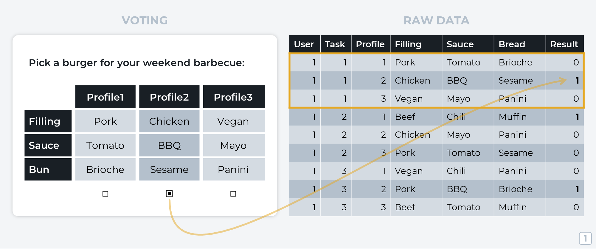
Step 1: Logging Respondent Voting Data
Each time a respondent votes on a set of profiles, the winning profile is marked with a 1 and the losing profiles get a 0.
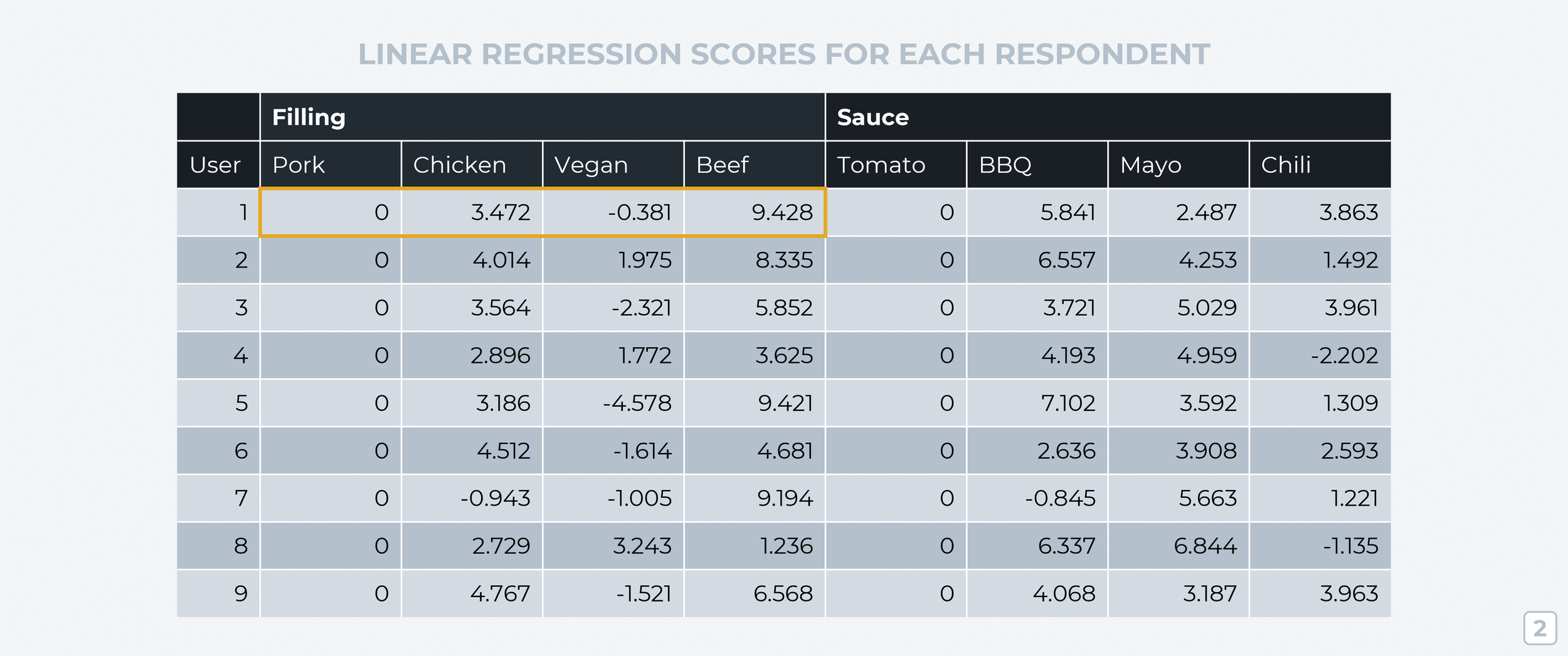
Step 2: Linear Regression
Next, we have to turn these raw votes into comparable data. To do that, we’ll use a data analysis technique called linear regression that analyzes respondent voting patterns and assigns each ‘level’ a score that shows its relative importance within its attribute group (on an individual participant basis). These scores from linear regression are technically known as “part-worth utilities” but I’ll stick to calling them “scores” throughout this guide to keep things simple.
But before linear regression can create these scores, it needs some sort of anchor data point to compare the other ‘levels’ against. To do this, we set the score for the first ‘level’ in each attribute group as zero (known as the attribute’s “reference point”). In the example below, we’ll set pork as the reference point. The linear regression scores tell us that User1 likes beef (9.428) a lot more than pork, chicken (3.472) a little more than pork, but they prefer pork to the vegan option (-0.381).
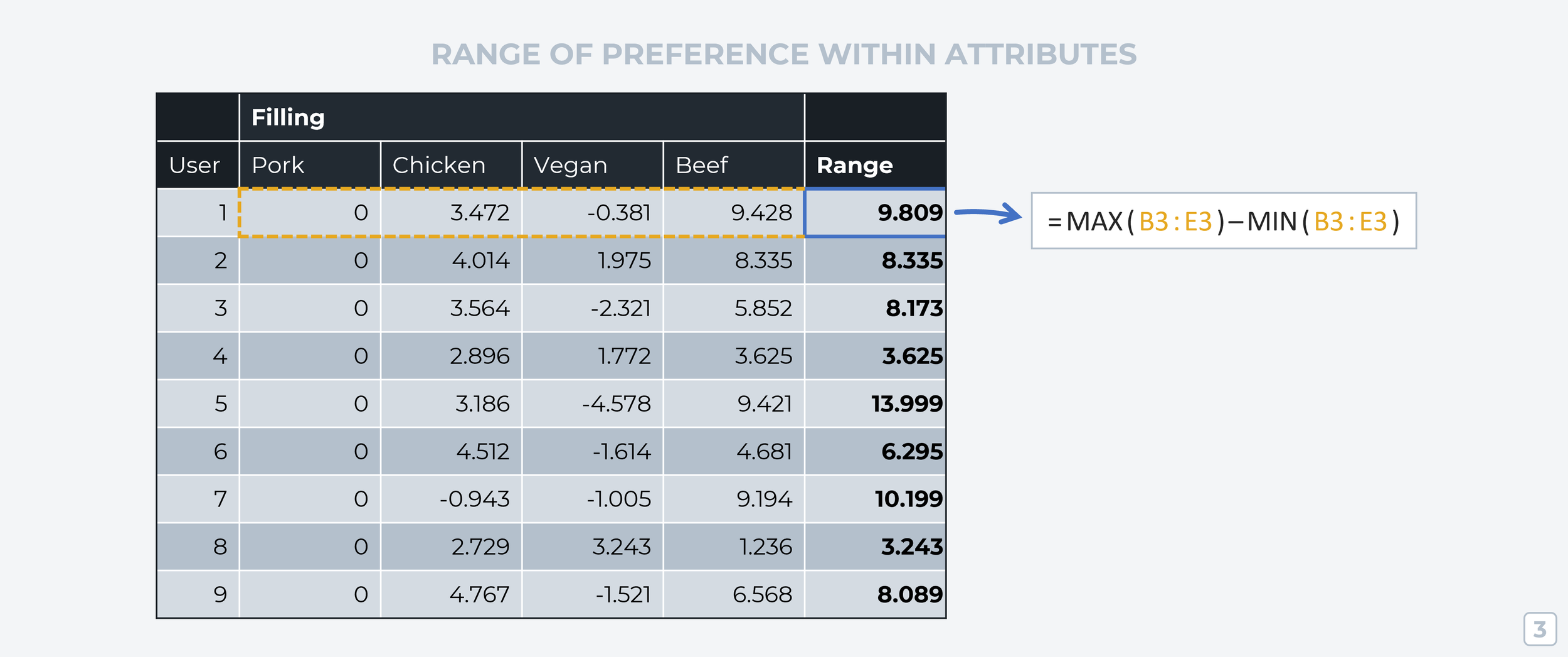
Step 3: Preference Range Within Attributes (By Respondent)
Now that we’ve got scores for every ‘level’ according to each respondent, we can calculate how much each attribute group influences a respondent’s choice of profile. To do this, we take the highest value in an attribute group and subtract the lowest value from it (=MAX(RANGE)-MIN(RANGE)).
This tells us something really important about each participant; how much does changing this attribute’s ‘level’ impact their choice of profile? If the range is high, then changing the ‘level’ has a big impact on their interest in the attribute. If the range is low, then changes to that attribute have less impact on the respondent’s decision.
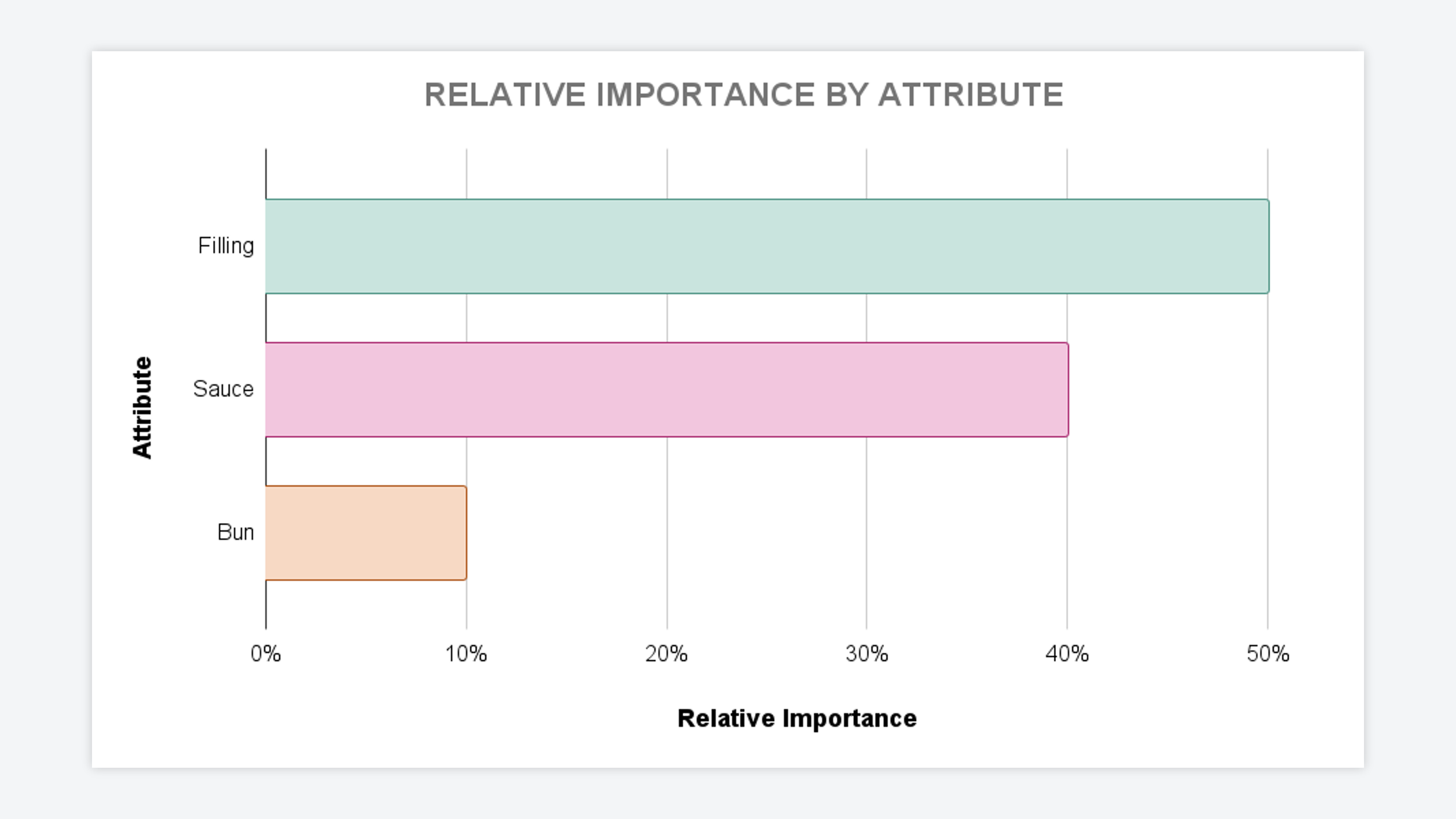
Step 4: Attribute Preference Ratio
Adding together a respondent’s preference range across all attributes would represent their total range of preference. If we divide the range for one attribute by the total range of all attributes, we can see how much preference that person allocates to that one attribute — this number of called the “attribute preference ratio.”
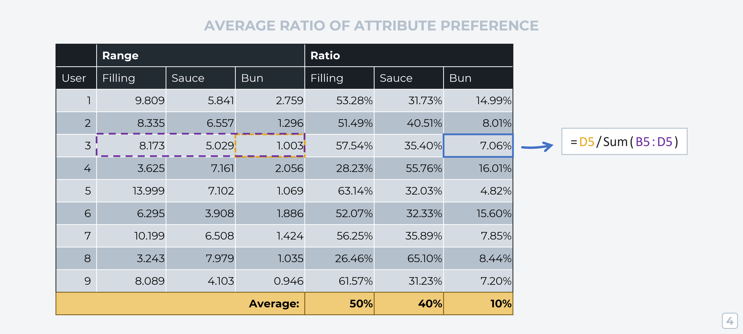
Taking an average of all attribute preference ratios for each attribute group shows us how much each attribute affects the profiles respondents tend to pick. This is one of two key results from Conjoint Analysis — now we know which product attributes are most influential in the customer’s purchase decision.
The second output we want from Conjoint Analysis is one that measures the preference of the ‘levels’ within each attribute group.
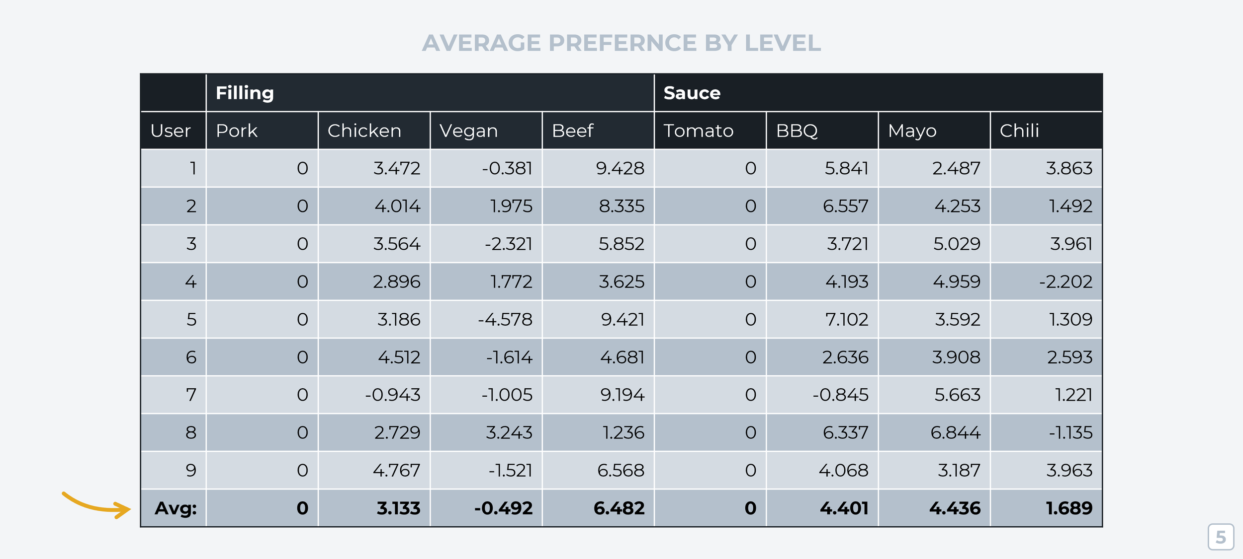
Step 5: Average Preference Per Level
Going back to our linear regression data, we’re going to calculate a simple average across all respondents for each level, like this:
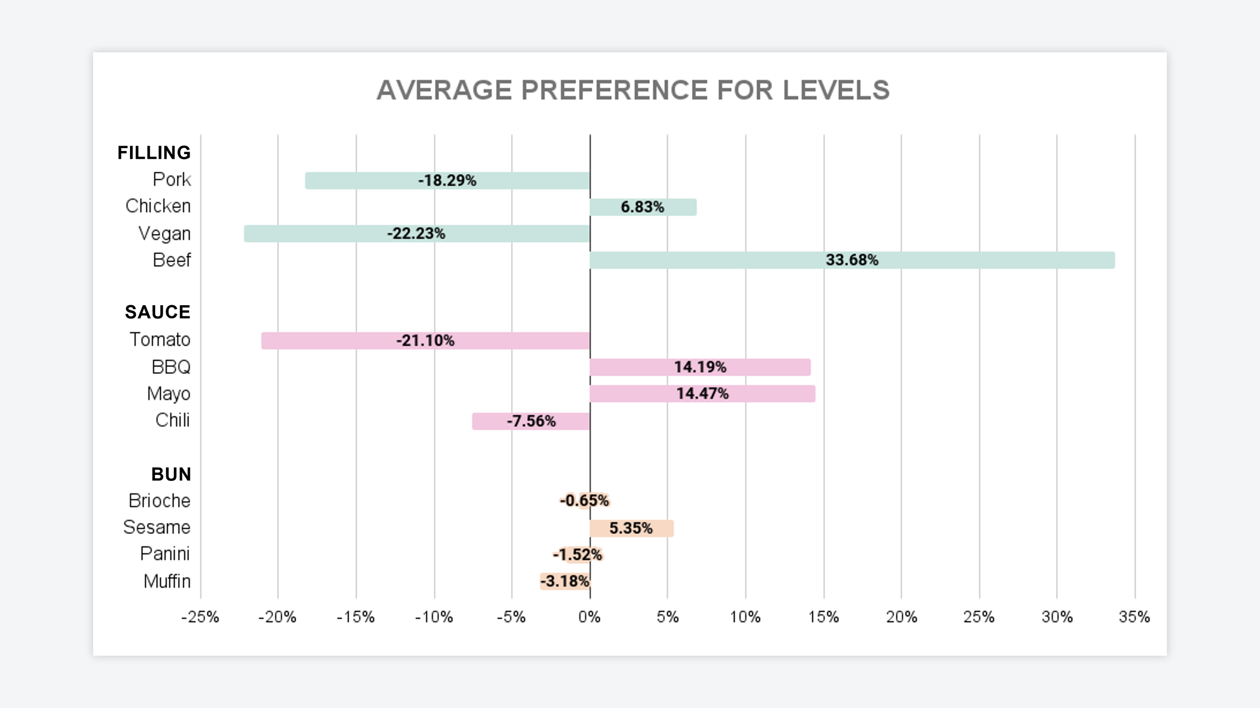
Step 6: Setting Zero As The Average
Any ‘levels’ you want to compare right now will be based on the first attribute ‘level’ being scored as a zero. This isn’t a great way to compare things! It’d be better if we could reference each ‘level’ against the attribute group’s average score. But the average is different for every attribute group, so turning our end results into understandable graphs would be pretty confusing this way. To fix this, we’ll change the average ‘level’ score within each attribute group to 0 and adjust all the individual scores accordingly.

Step 7: Preference Range Within Attribute Groups (Via Reset Averages)
We’re going to calculate the preference range again like we did in Step 3, but this time we’re calculating the range within each averaged attribute group (using the updated averages we just calculated in the previous step).

Step 8: Calculate Ratio For Each Level
If we take an individual level score (for example Pork’s score is -2.281) and divide that by the sum of all attribute ranges, we get the influence each ‘level’ has on respondents’ preference.

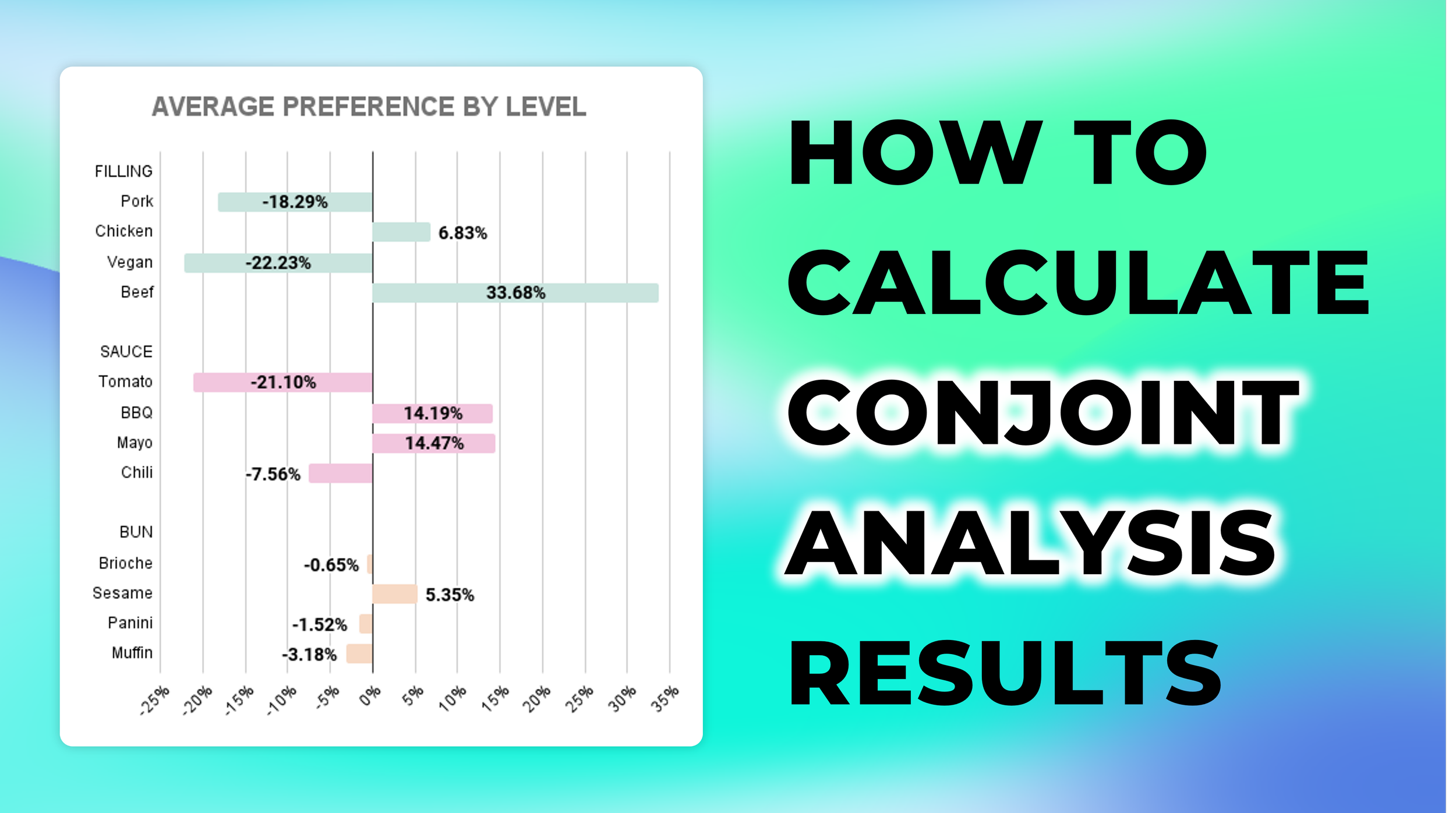
This number is our second key output for Conjoint Analysis research — it allows us to visualize the relationship between the ‘levels’ in each attribute group and their influence on the customer’s product preferences.
— — —
Recommended follow-on reading about Conjoint Analysis:
• The Ultimate Guide To Conjoint Analysis
• 5 criteria for assessing whether conjoint analysis suits your research scenario
• 10 examples of research scenarios that should NOT use conjoint analysis
• 7 alternatives to conjoint analysis that also use trade-off questions
About The Author:
Daniel Kyne is the Co-Founder of OpinionX, a free research tool for stack ranking people’s priorities — used by thousands of product teams to better understand what matters most to their customers.