
“Crosstab analysis puts two variables across from each other on a table to show how often they overlap. It’s how you find that boys picked chocolate and girls picked strawberry when the aggregate result only said “strawberry”. This guide covers building one by hand, the terminology, eight situations where it earns its place, and nine tools that produce them.”
Contents:
What is crosstab analysis?
How to create a crosstab table by hand
The advantages of crosstab analysis, with worked examples
When to use crosstab analysis
Comparing the top 9 tools
The crosstab dictionary
What is crosstab analysis?

What is crosstab analysis?
A crosstab is a table that lets you compare two or more types of data to see how often they overlap. In surveys it shows how often two different answers appear in the same participant profiles.
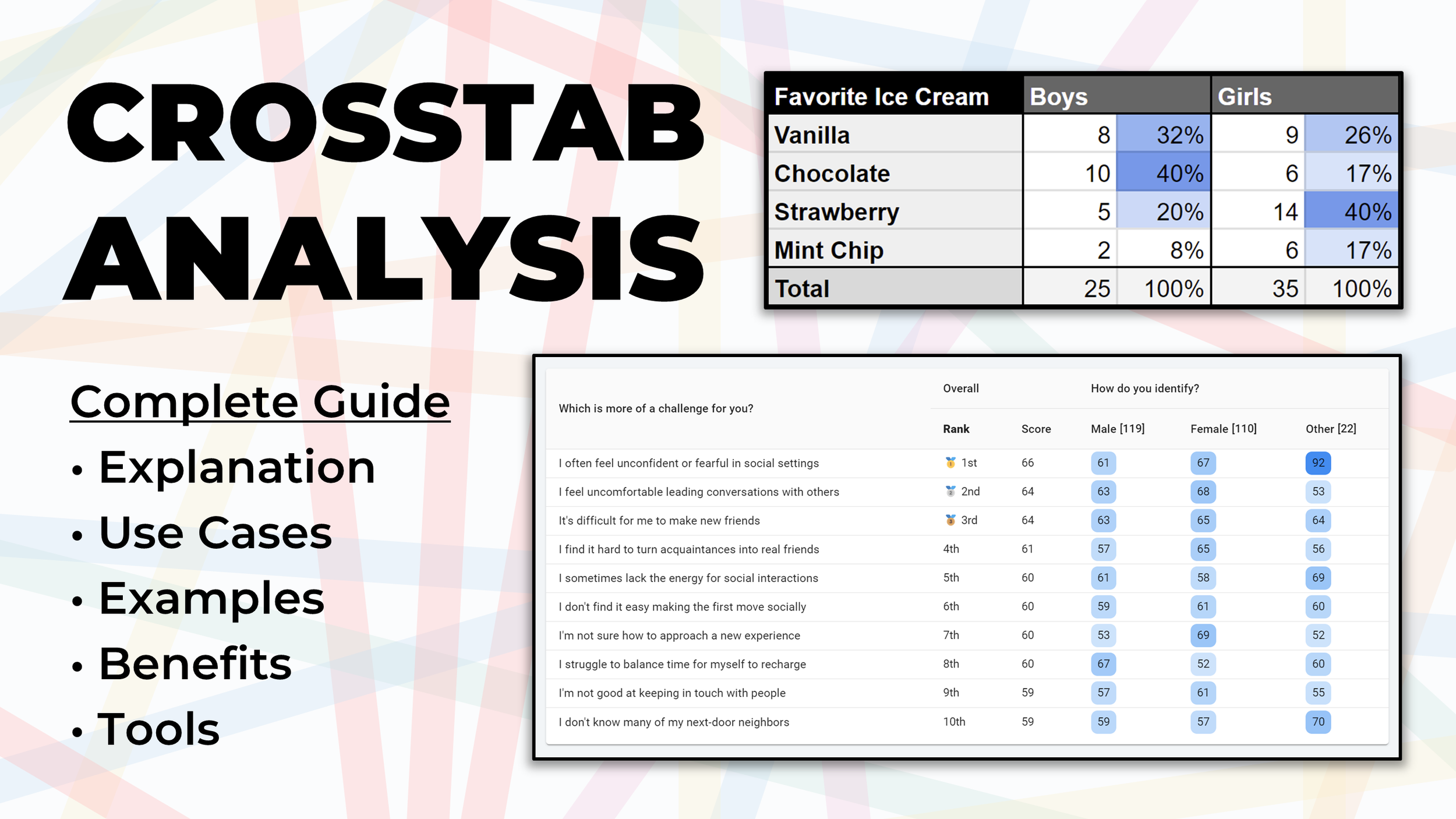
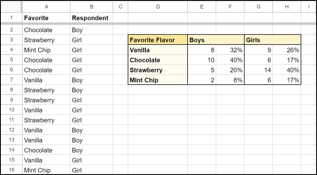
Picture a playground survey: fifty kids, one question about their favourite ice cream flavour, and a suspicion that boys and girls answered differently. Counting by hand tells you nothing useful.
Two columns, two different winners. Strawberry takes the aggregate, so a summary result would have handed you strawberry and moved on, while 80% of the boys quietly disagreed.
That's the whole argument for the format in one table. An averaged total is a claim about a group that may contain nobody, and splitting it is how you find out.
The full name, cross-tabulation analysis, makes it sound harder than it is. Two variables, one across and one down, and every cell reports where they meet. Reach for it any time you suspect one variable is pulling another around.
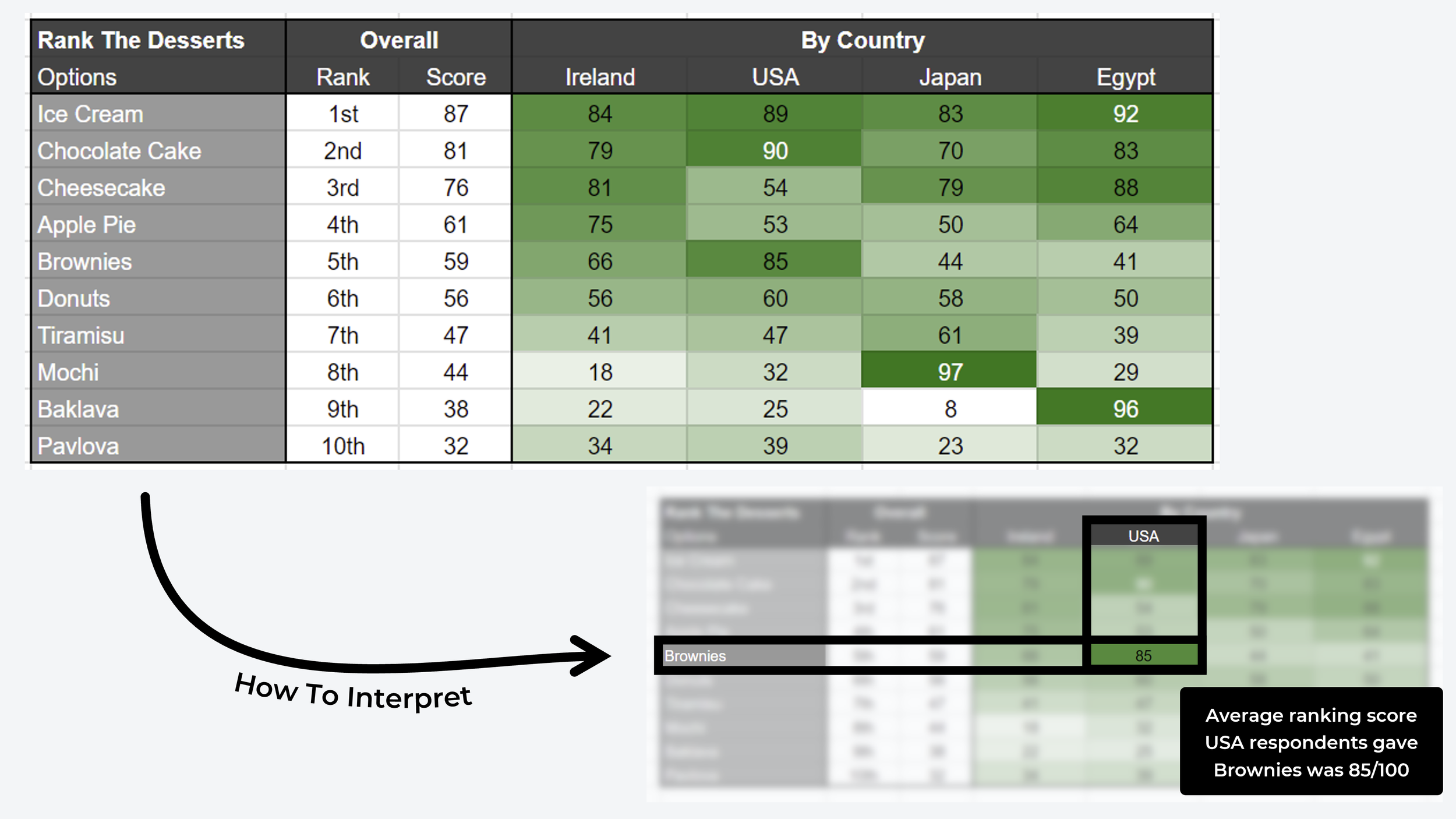
Categorical data like flavours is the usual case, and it isn't the only one. Treat the table as a comparison matrix and you can put quantitative scores in the cells instead. Below, ranked data compares the favourite desserts of four countries.
How to create a crosstab table by hand

Four steps for the traditional version in a spreadsheet.
1. Pick your questions. Two survey questions, one supplying the rows and one the columns. Orientation barely matters mechanically, though convention puts identifying variables (who they are) across the top and opinion variables (what they think) down the side.
2. Count overlapping variables. Do it manually with a formula combination like COUNTIFS and VLOOKUP, for example =COUNTIFS(A:A, "Chocolate", B:B, "Boy"), or use your spreadsheet's built-in pivot feature.
3. Convert counts to percentages. Work column by column, expressing each row's count as a share of that column's total. Every column should land on 100%. Five of the 25 boys chose strawberry, so that cell reads 20%.
4. Add a heatmap. Conditional formatting across the percentage columns, running white at the bottom of the range to a solid colour at the top. The eye then does the work the numbers were making you do.
What are the advantages of crosstab analysis?
The examples below come from user research surveys we ran, with screenshots from the automated reports included in OpinionX surveys.
1. Crosstab analysis checks your sample is representative
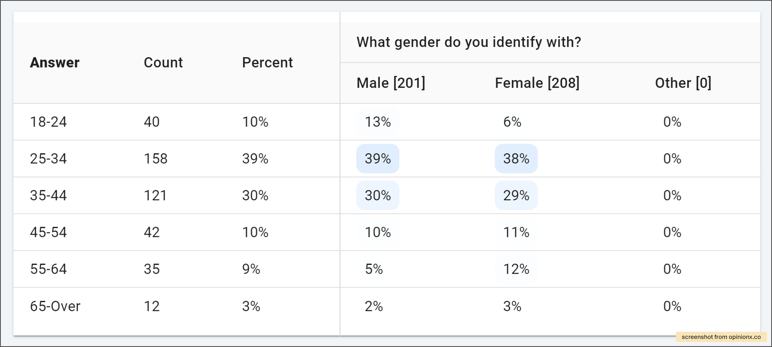
Before reading any finding, check who produced it. The screenshot above sets three gender columns against six age brackets. Male and female participants are spread evenly enough across the age categories, and the 25 to 44 bracket is carrying almost 70% of the sample, which is worth knowing before anyone quotes a headline number from it.

2. Crosstab analysis handles more than categorical data
Ranked scores work in the cells just as well as counts. The example above put concept candles, each an image with a caption, through image ranking. What the table holds is pairwise win rates, split between people who use decorative candles and people who don't. Lavender Dream tops both columns.

3. Identifying outliers
One dark cell in a pale grid is the fastest finding you'll get from any analysis format. In the challenges example above, ranked by pairwise voting, the "other" gender group put the statement about low confidence in social settings far above where male and female participants placed it. Once a cell like that appears, participant-level data tells you who to go and talk to.
4. Crosstab analysis compares many groups at once
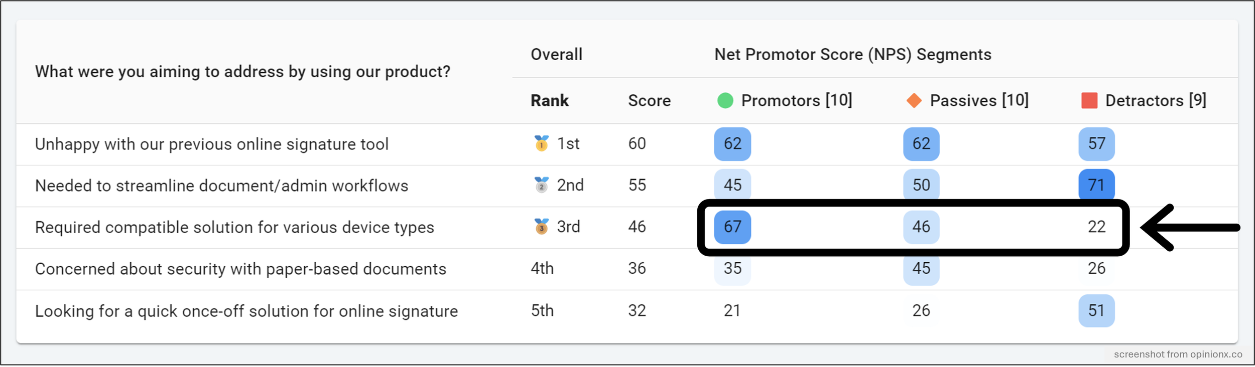
Filtering to one segment at a time assumes you already know which segment to look at. A crosstab removes that assumption by putting every group beside every other one.
Below, customers ranked why they signed up. The interesting statement isn't either of the two that scored highest overall. It's the one sitting top for happy customers and bottom for unhappy ones, which is a finding you only see when both columns are visible at once.
5. Stacking variables into custom segments
You can build custom segments by combining variables with Boolean operators, using AND and OR to stack multiple data points.
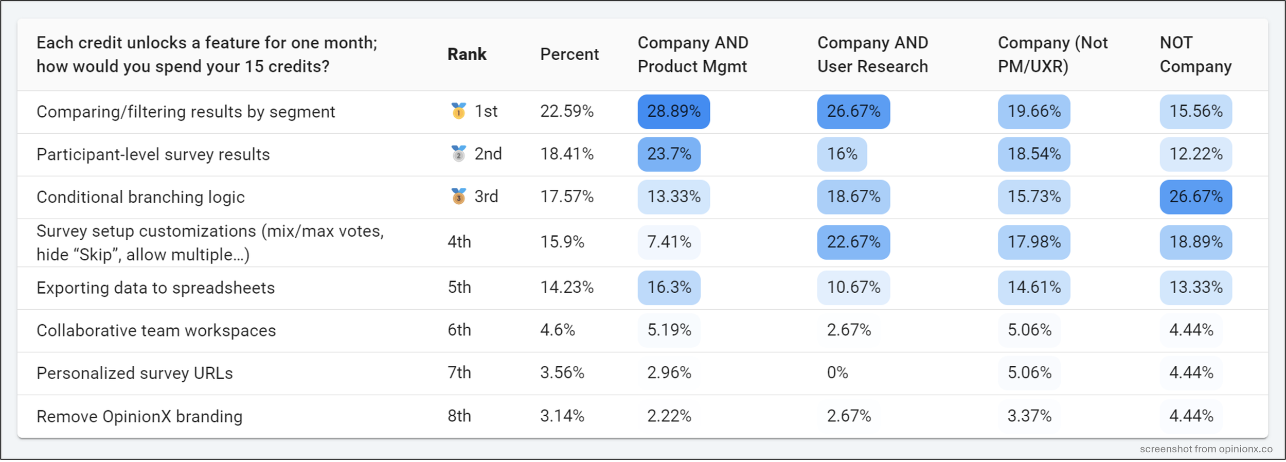
The screenshot below is from customer research we ran at OpinionX in late 2023. Read the four custom segments left to right and the top-ranked option overall, "comparing and filtering results by segment", loses ground with every group. That single row told us what we were actually valued for, and it set the direction for the following year's strategy.
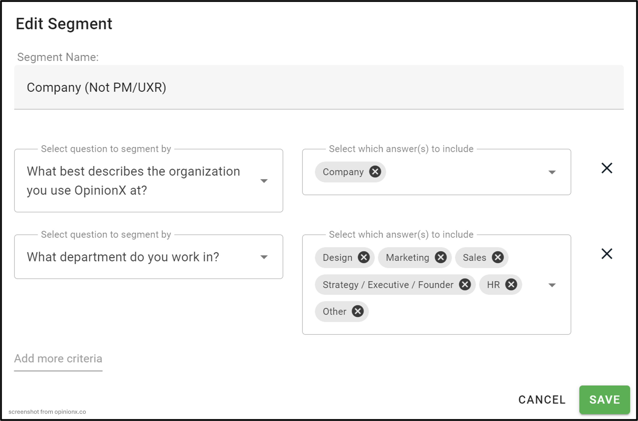
Saved Segments built those groups from answers spread across several questions. The logic reads as AND between rows and OR within a row, so one segment resolves to "picked Company, and picked any of Design, Marketing, Sales or Strategy".
That stacking is what makes the format useful on customer data, where the group you care about is defined by pricing plan and account size and usage frequency all at once.
None of this makes crosstab analysis advanced statistics wearing a lab coat. The format bends to a plain demographic split, a stack of Boolean conditions or a grid of ranked scores. Percentages and colour do the interpretation. And if your survey tool builds them for you, the setup cost is zero.
When should you use crosstab analysis?
Any time you have two or more categories of data to compare. Eight situations where it's particularly valuable:
Market segmentation. Lay every candidate segment out in one grid and the ones that behave unlike the rest of your market stop hiding. That's the core move in needs-based segmentation, and how Glofox found that gym size, not gym type, determined which problem mattered.
Feature usage. Firmographics across the top (industry, title, plan), features down the side. The grid answers two questions at once: what different customer types actually hire the product to do, and which parts of it your best accounts have never opened.
Roadmap prioritisation. A single ranked list flattens the disagreement between customer types, and the disagreement is the useful part. Every quarterly roadmap survey we run finishes here, whether the input was problem statements in pairs or ranked feature ideas.
Net Promoter Score. A single NPS number is close to useless on its own. Put Promoters, Passives and Detractors across the top and the same survey suddenly tells you what loyalty is built on and what's blocking everyone else.
Needs assessment. Once a needs-based or psychographic segmentation study is done, the grid is where you find which segment feels which pain hardest. Cross it against product usage data and you learn what your most engaged customers are still struggling with.
Customer satisfaction. CSAT has the same weakness as NPS: an average conceals both the thing you're doing well and the thing you're not. Splitting by satisfaction level gives you both halves.
Employee engagement. Pulse survey or full culture assessment, the same rule holds: experience varies by department, by seniority and by tenure. One grid replaces a company-wide objective nobody can act on with three specific ones somebody can.
Customer feedback. Service quality perception is rarely uniform across channels. Chatbot, phone, email and in-person as four columns will usually show you which one is quietly costing you.
Comparing the top 9 tools for crosstab analysis
Three questions decided each entry: does the tool offer crosstab analysis at all, what does it cost to reach it, and what limitations apply once you get there.

1. OpinionX
A ranking tool first, with pairwise comparison, ranked choice voting and points-based ranking, and the segmentation and crosstab reporting built around them. Disney, LinkedIn and Google are among the teams using it.

Automated. Plenty of tools claim this and still hand you a blank grid to configure. Here the Segments tab arrives already holding one crosstab per question in the survey.
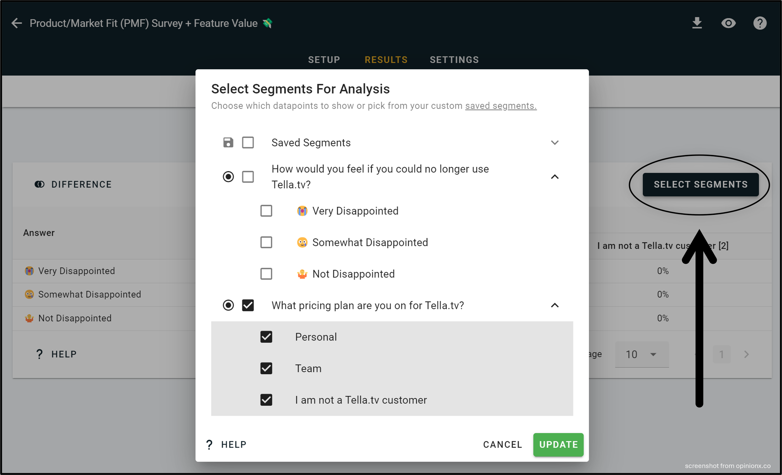
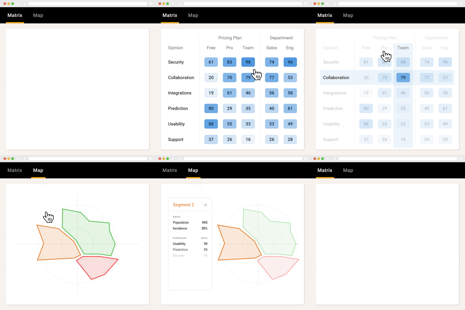
Easy to edit. "Select Segments" in the corner of any table opens a picker for what goes in and what comes out. Saved Segments handles the more elaborate case, building groups from AND/OR logic across several questions at once.

That example holds part-worth utilities from a smartphone conjoint study. iPhone and Android owners split cleanly, and the Android column shows noticeably more price sensitivity.
Every question type. No other tool on this list manages that. Multiple choice, rating scale, pairwise, image voting, points ranking, MaxDiff, ranked choice, conjoint and consensus ballots all produce one.

Price. Nothing here is paywalled. Crosstabs, segmentation and persona clustering all run on the free tier, which stops at 25 participants per survey. Lifting that cap is $900 a year.
Verdict: automatic generation across every question format, and the only entry on this list you can evaluate properly without a purchase order. Sample surveys come pre-loaded with the analysis unlocked.
2. Manual spreadsheet
If your data is categorical, a spreadsheet handles this without much fuss.
Step 1: get the data in. Export from wherever you collected it, then open a fresh Sheets document and paste.

Step 2: pivot it. Select everything, then Insert → Pivot Table → New Sheet.

Step 3: assign the variables. One data point to Rows, the other to Columns, and either of them again into Values.

Step 4: colour it. Select the numbers, leaving out any Total rows on a count-based table, then fill colour → Conditional Formatting → Color Scale.
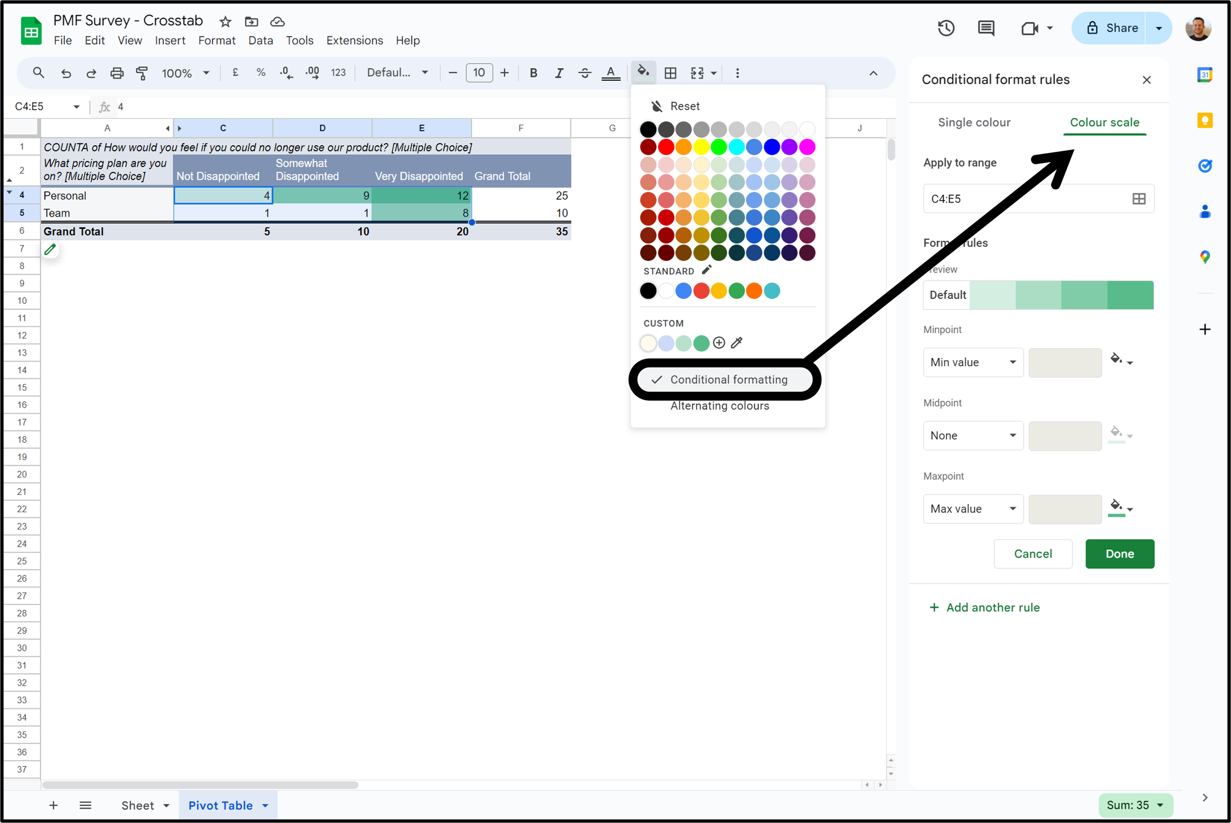
Verdict: costs nothing, runs anywhere, entirely sufficient for counting categories. Ask it for ranked or scored cells and it falls over.
3. R
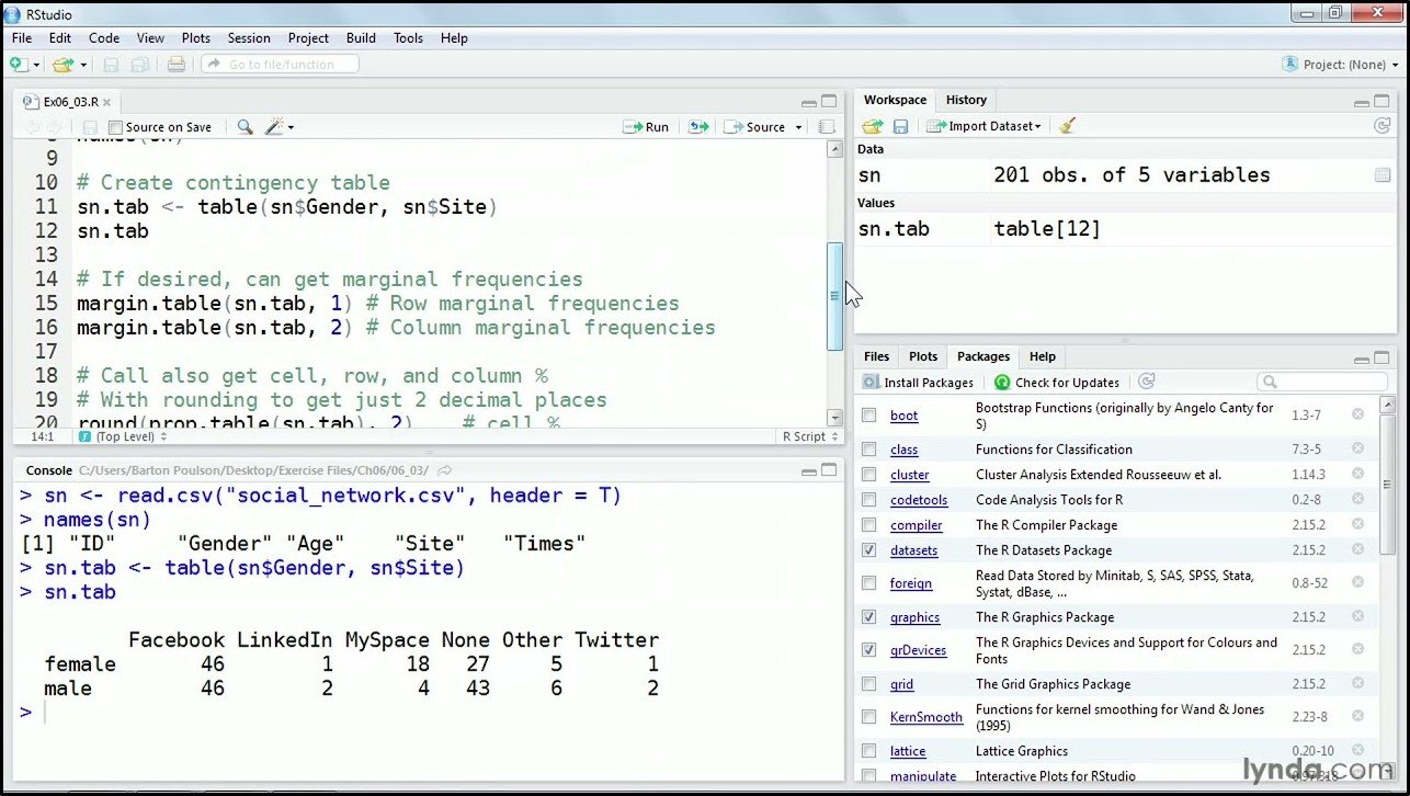
The statistician's language, used for analysis and graphics. Building a crosstab in it doesn't require statistical expertise, just familiarity with the syntax and somewhere to run it. One to two weeks gets most people through data structures, functions and dplyr, and R's own documentation is the starting point.
Verdict: nothing else here can do as much, and no other entry asks you to learn a language first. The skill transfers well beyond crosstabs, which is what makes the trade worth it.
4. Typeform
Typeform doesn't do this at all. Their own community manager's answer is to export and build it somewhere else.
Verdict: rule it out. Collecting on Typeform means budgeting for Sheets or a separate analysis product.
5. Displayr
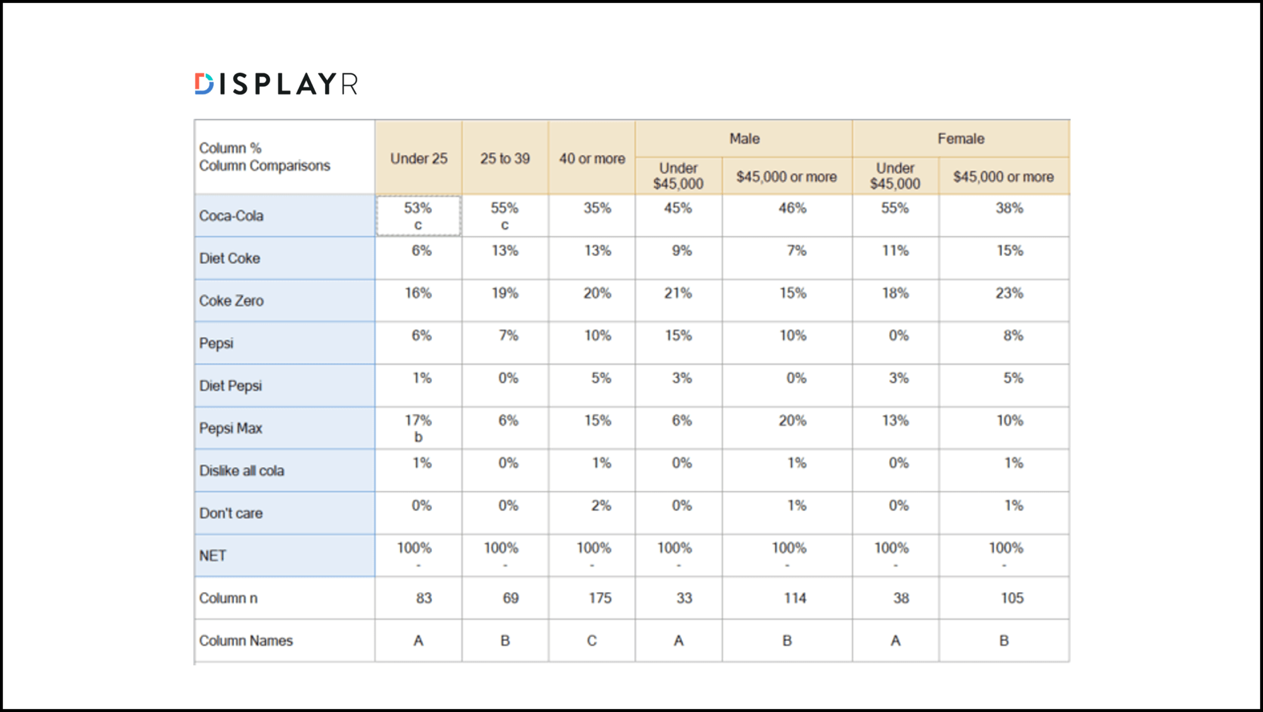
Not a survey tool. Displayr takes results collected elsewhere and turns them into dashboards, charts and reports. Cross-tabulation lives in a separate pricing module called Data Stories instead of the main product.
Verdict: worth it when your collection tool does no analysis at all and the data needs a home.
6. Qualtrics
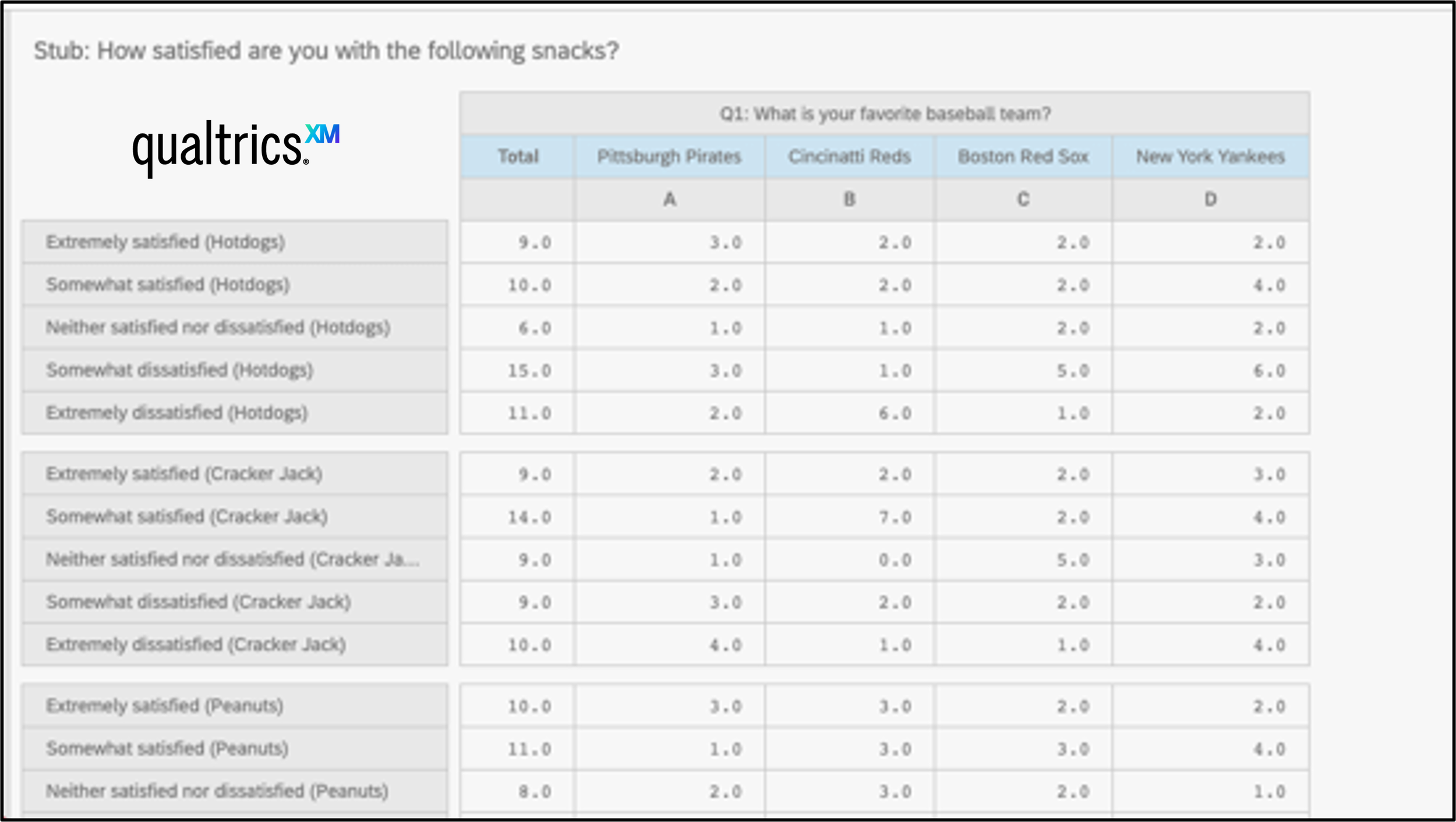
A QualtricsXM subscription doesn't get you this. It was repackaged behind StatsIQ, so a paid Qualtrics licence and the ability to crosstab your data are two separate purchases. Even then, MaxDiff and conjoint questions are excluded.
Verdict: paying Qualtrics money buys no guarantee here, and the two formats most worth cross-tabulating are off the table anyway.
7. SurveyMonkey
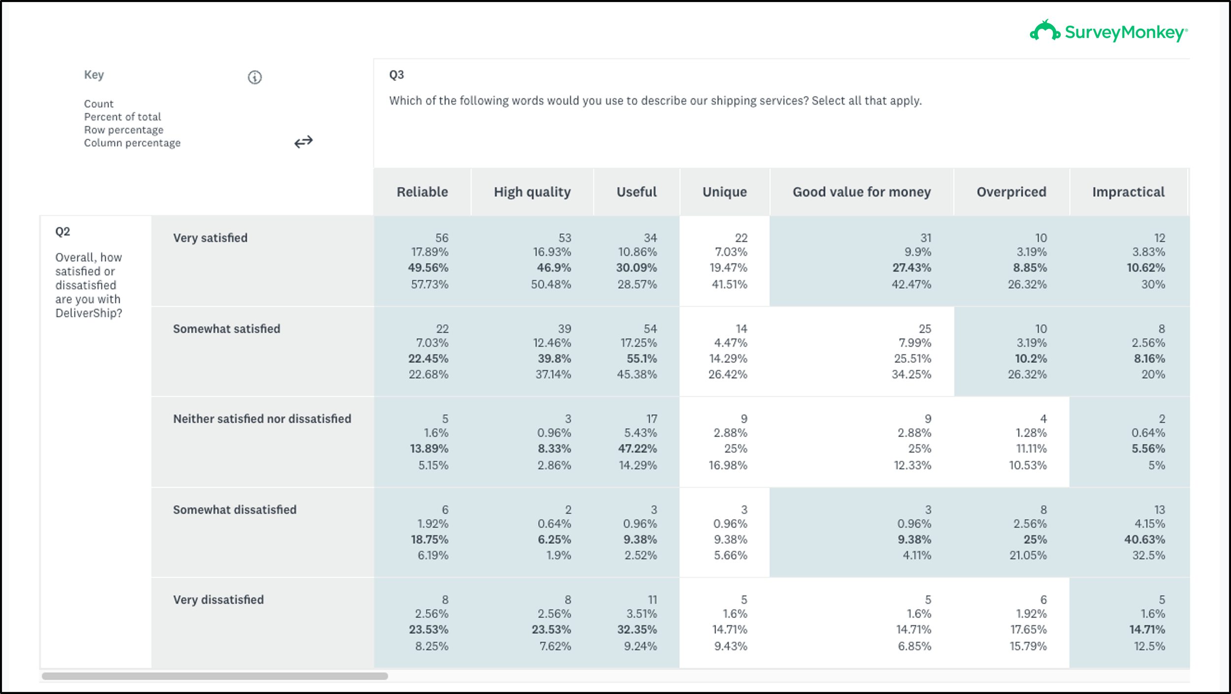
The format exists, and multiple choice is the only question type it accepts. Rating scales, sliders, ranking questions, best/worst scales and matrix questions are all shut out, which covers most of what the platform offers.
Access sits on Premier, their priciest self-service tier.
Verdict: you pay the most and get the least, in question-type terms.
8. Alchemer
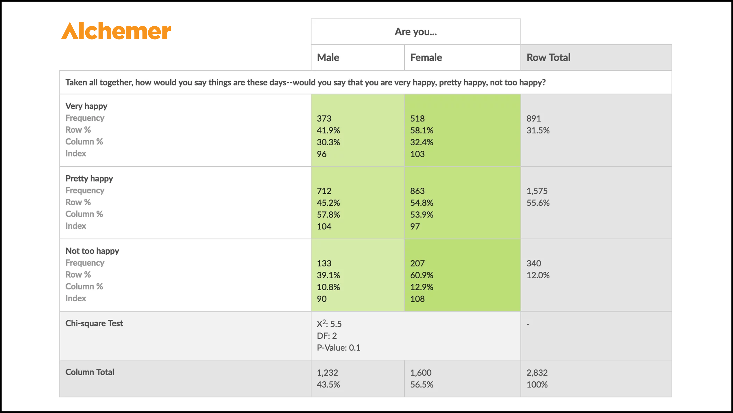
Crosstab reports are only available on Alchemer's enterprise plans, negotiated with their sales team. Alchemer supports a few more compatible question types than SurveyMonkey: as well as choice questions, it handles rating scales and URL variables.
Get through the contract and what's waiting is the strongest statistical output on this list: Pearson Chi-Square, degrees of freedom, P-value and Fisher's Exact Test.
Verdict: better statistics than we offer, sold in the most obstructive way possible. If significance testing on a crosstab is non-negotiable and procurement isn't a problem, take it.
9. QuestionPro

Both paid tiers, Advanced and Team, include this. What they include is the plain version: counts, averages, percentages and nothing else. Colour formatting and any statistical testing sit behind the Research Edition enterprise plan.
Verdict: the table costs money and making it legible costs money again.
The crosstab dictionary
Crosstab, cross tabulation or contingency table?
Three names, one object. Which one you hear depends on the room: commercial research, user research and polling say crosstab or cross tabulation, academic papers say contingency table. All three describe a matrix, a grid of numbers laid out in rows and columns.
Categorical or numerical data?
The received wisdom is that this only works on categorical data. It's wrong, and repeating it costs people useful analysis. The only requirement is that a cell reports where the row and column meet. Average rating scores per segment satisfy that. So do ranked results.
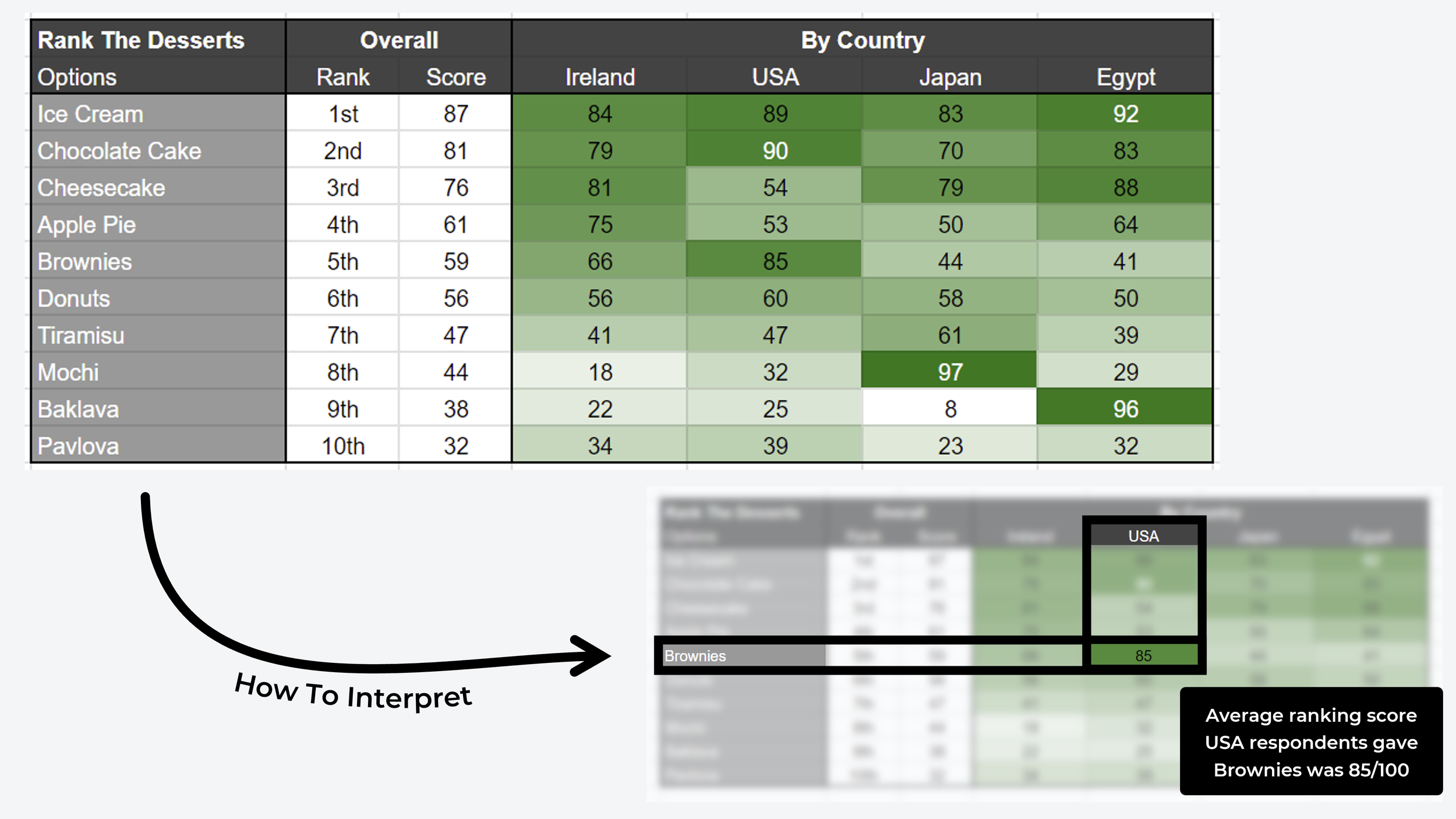
^ Example of a crosstab matrix table that uses average scores from a pairwise comparison ranking survey (ie. non-categorical crosstabulation!)
The terminology
| Term | What it means |
|---|---|
| Stub | A row in the table |
| Banner, or cut | A column in the table |
| Category | A grouped set of variables, such as the age ranges 18-24, 25-34 and 35-44 |
| Count, or frequency | The number of times two variables appeared together in a participant profile |
| Filter | Restricts the table to a particular view of your data |
| Pivot table | A spreadsheet format for summarising data, commonly the basis for a crosstab in Excel and Sheets |
| CSV | Comma-separated values, a text-only version of a spreadsheet and a common source for crosstab data |
| Statistically significant | The test for whether your result could have happened by chance |
Advanced terminology
Pearson Chi-Square. Compares what your survey actually returned against what you'd expect to see if the two variables had nothing to do with each other. A large gap means a relationship.
Degrees of freedom (DF). How many independent pieces of information feed the calculation. For a crosstab it comes from the grid's dimensions, specifically (rows − 1) × (columns − 1).
P-value. The probability of seeing a gap that large by chance alone. Small p-value, unlikely to be coincidence.
Frequently asked questions
What is crosstab analysis used for?
Comparing two or more variables to show how often they overlap, which reveals relationships hidden inside an aggregate result. In survey analysis that means seeing how one group answered differently from another, instead of reading a single combined total that averages both away.
How do you interpret a crosstab table?
Read down the columns, not across the rows. Each column should total 100%, so a cell tells you what share of that group chose that answer. Comparing the same row across two columns is where the finding usually is: 52% of boys against 24% of girls is the insight, not the 38% overall.
What's the difference between a crosstab and a contingency table?
Nothing, other than who's speaking. Crosstab and cross tabulation are the commercial terms used in market research and polling. Contingency table is the academic term. Both describe a matrix where each cell shows the overlap between a row variable and a column variable.
Can crosstab analysis use non-categorical data?
Yes, despite most guides saying otherwise. Any matrix where a cell represents the overlap between the row and column variable qualifies, so average rating scores or ranked results per segment work perfectly well.
What is the Pearson Chi-Square test?
A test of whether two variables in a crosstab are independent or genuinely related, comparing the data you observed against the data you'd expect if there were no relationship. Alchemer includes it; most survey platforms don't.
Over 42,000 researchers and product people get one method breakdown like this each week in The Full-Stack Researcher.
The pattern across this list is depressingly consistent: top-tier pricing for a feature that only works on one or two question formats. OpinionX builds them for every question type, without configuration, free up to 25 participants per survey.
About The Author:
Daniel Kyne is the Co-Founder of OpinionX, a free research tool for stack ranking people’s priorities — used by thousands of product teams to better understand what matters most to their customers. OpinionX comes with a bunch of research methods for measuring people’s preferences — including automated crosstab analysis reports for a range of survey methods. Try it now!