
“A contingency table compares two or more variables to show how often they overlap, which is how you find that boys picked chocolate and girls picked strawberry when the aggregate result only said “strawberry”. This guide covers how to build one by hand, what the terminology means, eight situations where the format earns its place, and nine tools that produce them.”

Contents:
What is a contingency table?
How to create a contingency table manually
Advantages of contingency tables
When to use contingency tables
Comparing the top 9 tools for contingency tables
The contingency table dictionary
What is a contingency table?
A contingency table lets you compare two or more types of data to see how often they overlap. In surveys it shows how often two different answers appear in the same participant profiles.
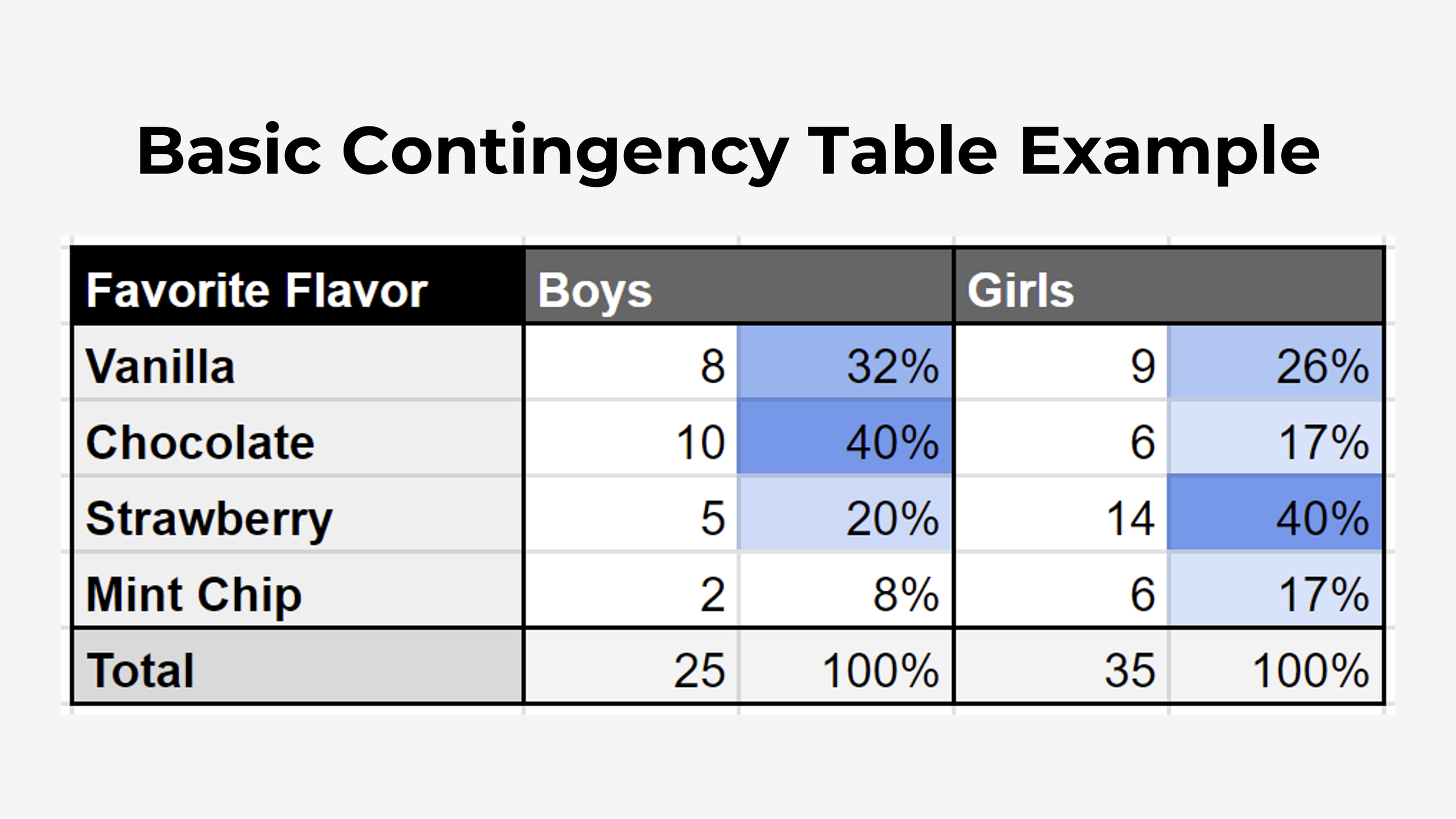
Say you have surveyed a group of kids about their favourite ice cream flavour and you want to know whether boys and girls answered differently. Instead of counting each answer manually, the table breaks it down for you.
Calculate the percentage for each cell and you can see immediately that boys prefer chocolate and girls prefer strawberry. Relying on the overall result alone, you'd have picked strawberry as the winner without noticing that 80% of boys didn't select it.
That's a basic example, but it shows how quickly a relationship that was invisible in a combined total becomes obvious once you split it.
This is a form of crosstab analysis. Both terms mean putting two things across from each other on a table to see how they overlap. Whenever you want to know how variables in a dataset influence one another, this is the analysis method to reach for.
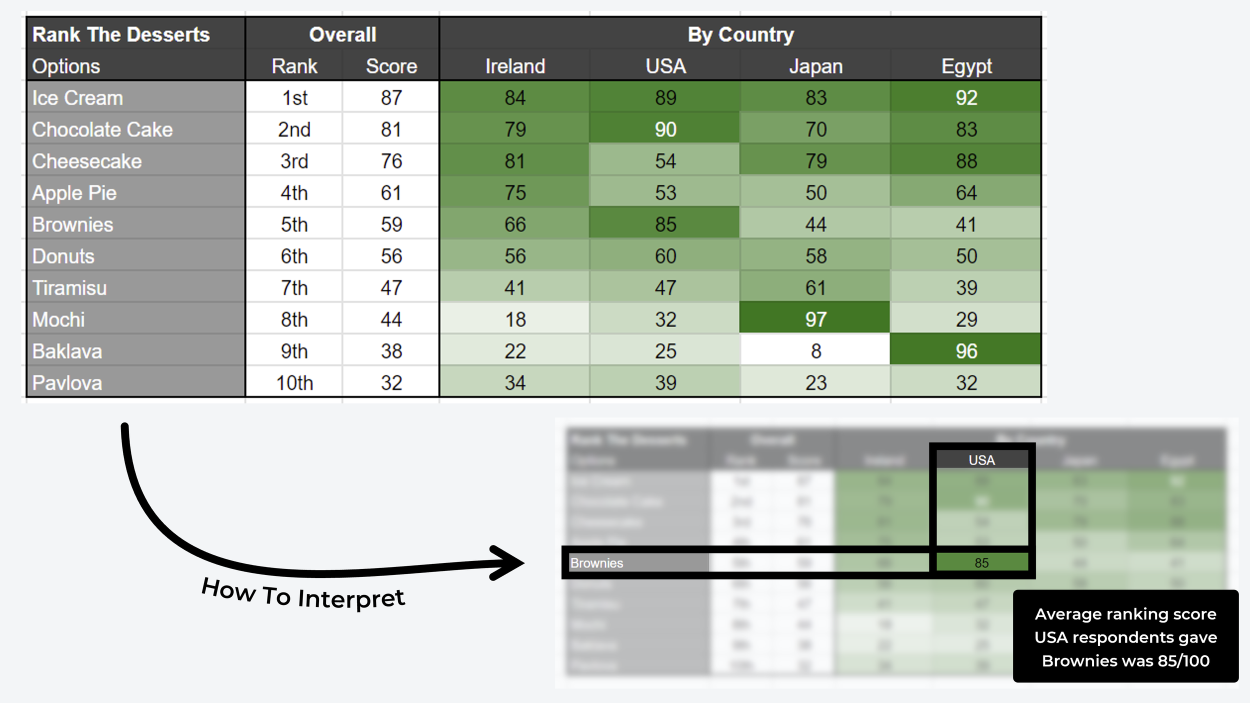
While the format is usually used for categorical data, like the ice cream example, you can also use it as a comparison matrix to see how quantitative data differs across segments. The example below uses ranked data to compare the favourite desserts of four different countries.
How to create one manually

This section covers a step-by-step approach for building your own. The first example follows the traditional route in a Google Sheets spreadsheet. The second is a more advanced matrix table for quantitative data.
1. Pick your questions. Choose the two survey questions you want to compare and add the variables from each as the row and column headers. It doesn't much matter which goes where, but best practice puts identifying variables as columns and opinion variables as rows.
2. Count overlapping variables. Do it manually with a formula combination like COUNTIFS and VLOOKUP, for example =COUNTIFS(A:A, "Chocolate", B:B, "Boy"), or use your spreadsheet's built-in pivot feature.
3. Calculate frequency percentage. Focusing on the column, calculate the percentage of entries each row variable accounts for. Columns should total 100%. In the screenshot above, 5 of 25 boys picked strawberry, which is 20% of boys.
4. Add a heatmap. Apply conditional formatting to the percentage columns, with the lowest value set to white and the highest showing as a solid colour. Outliers and strong correlations then become visible at a glance.
What are the advantages of contingency tables?
The examples below come from user research surveys we've run, with screenshots from the automated crosstabs included in OpinionX surveys.
1. Checking your sample is representative
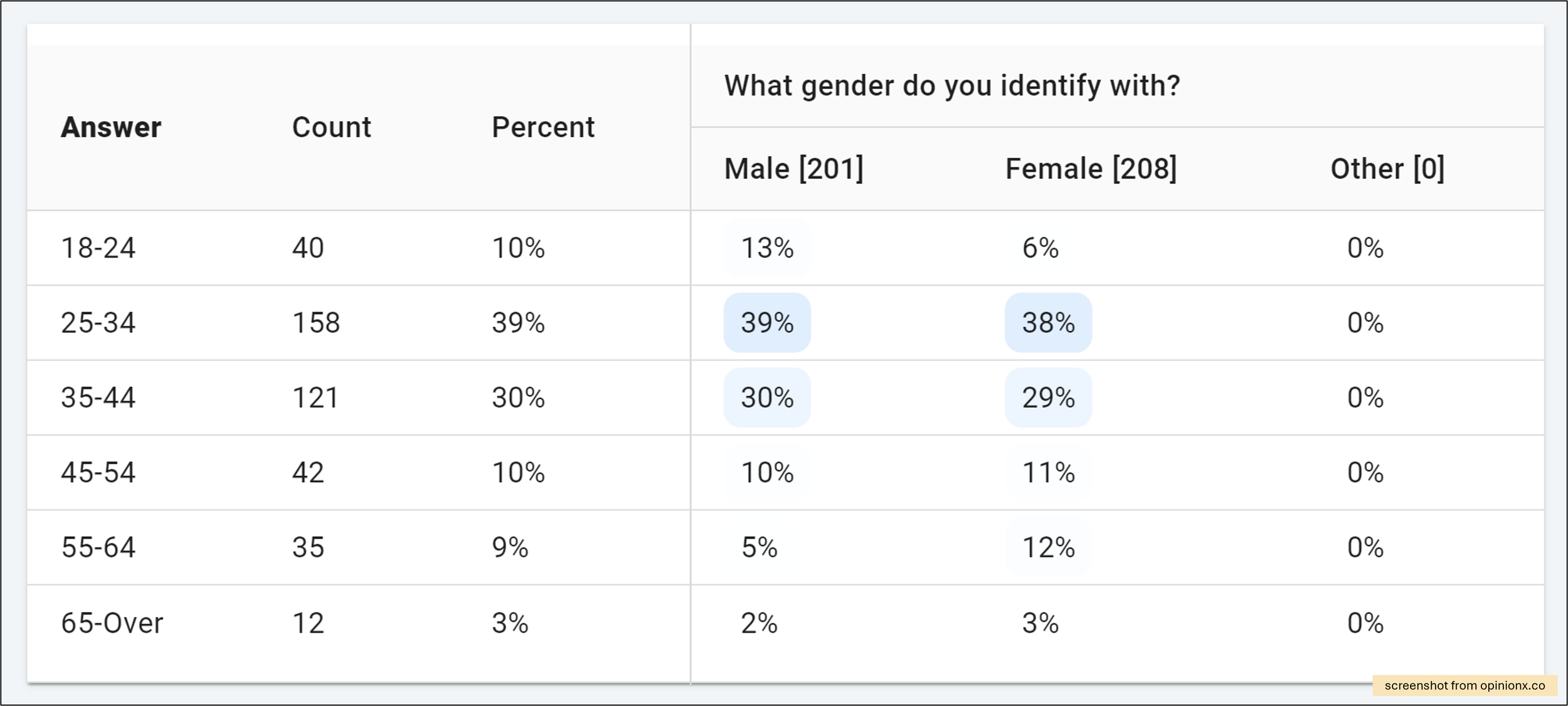
A crosstab shows quickly whether your participants are balanced or whether one group is overrepresented. The screenshot above has three gender columns and six age bracket rows. It tells us two things: the balance of male and female participants across age categories is solid, and adults aged 25 to 44 are overrepresented, at almost 70% of participants so far.

2. It handles more than categorical data
The format isn't restricted to categorical answers. You can build one from average scores for ranking questions too. Above, participants ranked a list of concept candles, each an image with a caption, using image ranking. The table compares pairwise votes, meaning the percentage of pairs each candle won, against two segments: people who use decorative candles and people who don't. Lavender Dream ranks highest for both.

3. Identifying outliers
Heatmap colour formatting makes outliers jump out. Above is a list of challenges ranked using pairwise comparison voting, where the score is the percentage of pair votes each option won. The dark blue cell shows participants in the "other" gender group picked the statement about low confidence in social settings far more often than male or female participants. Reading participant-level data is the next step once an outlier like that appears.
4. Comparing many groups at once
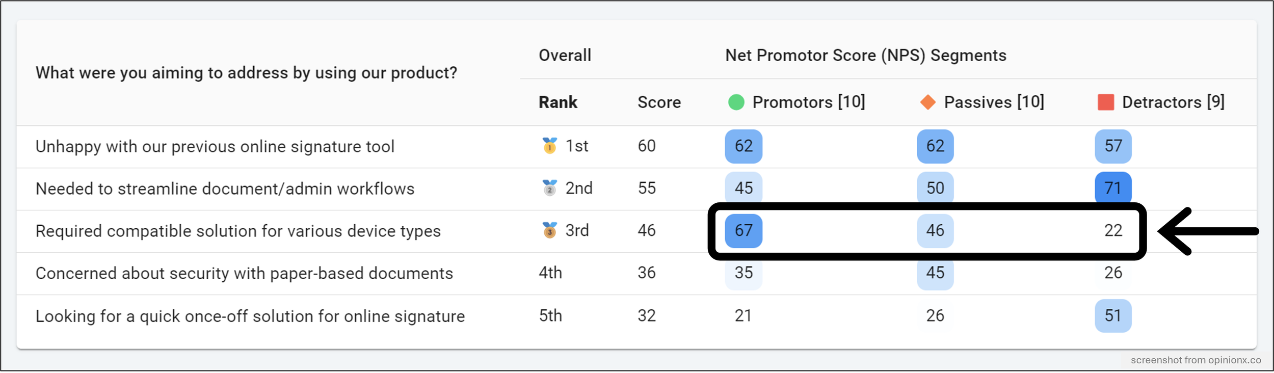
Some survey tools let you filter results to one group at a time, which works if you already know which groups matter. A crosstab compares many groups in a single view, so differences show up on their own instead of having to be hunted for one filter at a time.
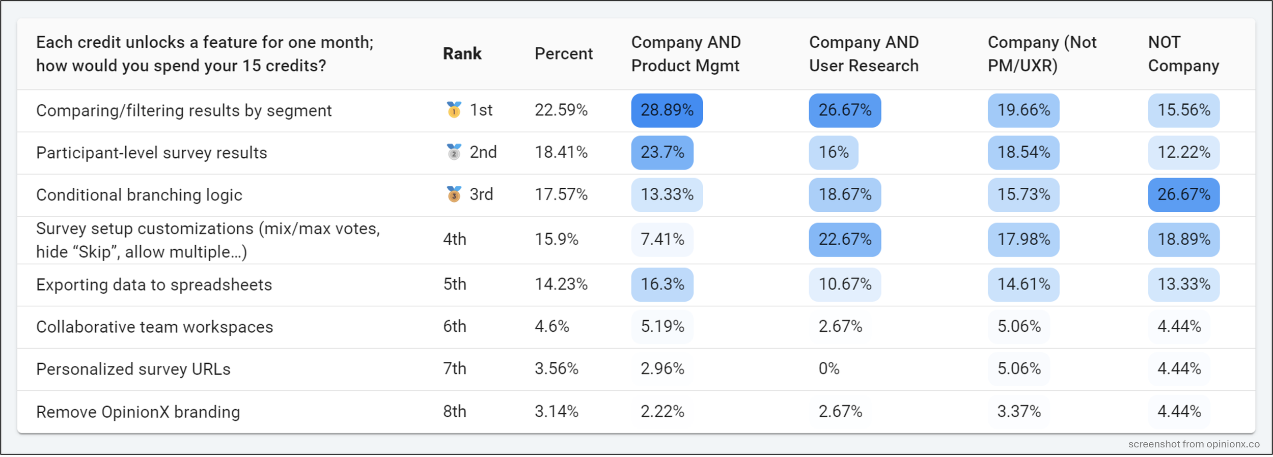
In the example below, customers ranked the reasons they signed up for a product. One statement ranks highest for happy customers and lowest for unhappy ones, which makes it more interesting than the two that scored higher overall. Without the table, that gets missed.
5. Stacking variables into custom segments
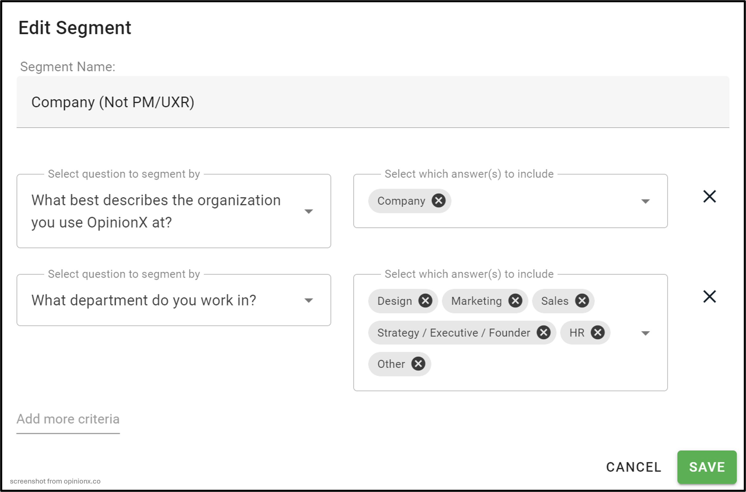
You can build custom segments by combining variables with Boolean operators, using AND and OR to stack multiple data points.
The example comes from a customer research project run at OpinionX in late 2023. Across four custom segments, the score for the top-ranked option overall, "comparing and filtering results by segment", decreases in importance for each subsequent group. That finding clarified our unique value and informed the following year's company strategy.
“Without four segments side by side, the aggregate ranking would have told us the opposite of what we needed to know.”
Those groups were configured using data from multiple questions through the Saved Segments feature. Each row forms an AND statement, with the answers inside a row tied together by OR logic. Read aloud, one of them is "participants who selected Company AND (Design OR Marketing OR Sales OR Strategy)".
Stacked variables like these work well with customer data, where you want to account for pricing plan, account size, usage frequency and similar.
Crosstabs don't have to be an intimidating advanced format. Percentages and heatmap formatting make the answer visible without any statistical training, and the same table handles a simple demographic breakdown, stacked variables or ranked scores. If your survey tool generates them for you, there's no setup work either.
When should you use a contingency table?
Any time you have two or more categories of data to compare. Eight situations where the format is particularly valuable:
Market segmentation. One of the strongest analysis tools available during customer or needs-based segmentation research. It maps all possible segments in a single table and lets you visually compare them, which is how you spot the outlier segments that think differently from the rest of your market. Glofox used this approach for their own segmentation work.
Feature usage. Put customer firmographics like industry, title and pricing plan as the columns, and feature usage as the rows. That shows which features are most used by which types of user, so you learn what jobs customers hire your product for and which areas of functionality your key customers never touch.
Roadmap prioritisation. Whether users are voting on problem statements in pairs or ranking feature ideas, the format shows how different segments prioritise differently. Every quarterly roadmap survey we run ends in one.
Net Promoter Score. The value in NPS is always in the segmented results. Bringing Promoters, Passives and Detractors into one table shows what drives loyalty for Promoters while isolating the barriers hurting adoption everywhere else.
Needs assessment. After a needs-based or psychographic segmentation study, bring the data into a crosstab to find segments that care about specific needs more than others. Comparing survey data against product usage data identifies the problems your most engaged customers most want solved.
Customer satisfaction. Like NPS, CSAT research is incomplete without segmentation. A crosstab shows how results differ at each satisfaction level, so the findings tell you both what to keep doing and where you're underperforming.
Employee engagement. For pulse surveys or culture assessments, the format shows differences in perceived employee experience across departments, seniority levels or years employed. Those granular findings support targeted action instead of vague company-level objectives.
Customer feedback. Analysing how perceptions of service quality vary by the type of service received: AI chatbot against phone call against email thread against in-person support.
Comparing the top 9 tools for contingency tables
Three questions decided each entry:
Does the tool offer crosstabs at all?
What does it cost to reach that functionality?
What limitations apply once you get there?
| Tool | Available on | Question types supported | Verdict |
|---|---|---|---|
| OpinionX | Free tier, then $900/year | All of them | 🟢 Generated automatically, no setup |
| Google Sheets / Excel | Free or existing licence | Categorical, exported | 🟢 Free and fine, if you enjoy pivot tables |
| R | Free, open source | Anything you can code | 🟡 Most capable, needs 1 to 2 weeks to learn |
| Typeform | Not available | None | 🔴 Export and build it elsewhere |
| Displayr | Separate Data Stories module | Imported data | 🟡 Good if your survey tool has no analysis |
| Qualtrics | StatsIQ purchase, on top of XM | Not MaxDiff or Conjoint | 🔴 A paid licence may still not include it |
| SurveyMonkey | Premier tier | Multiple choice only | 🔴 Top tier for one question type |
| Alchemer | Enterprise, negotiated | Choice, rating, URL variables | 🟡 Best statistics here, if you sign a contract |
| QuestionPro | Paid tiers, heatmaps on enterprise | Count, average, percentage | 🔴 Basic tables paid, formatting costs more |
1. OpinionX

OpinionX specialises in ranking preferences and priorities. It offers a range of ranking methods, including pairwise comparison, ranked choice voting and points-based ranking, alongside automated segmentation and crosstabs. Teams at Disney, LinkedIn and Google use it.

Automated. Tables are populated for you. When some tools say "automatic" they mean you still do the setup work. Here the results page has a Segments tab preset with one crosstab per question in your survey.
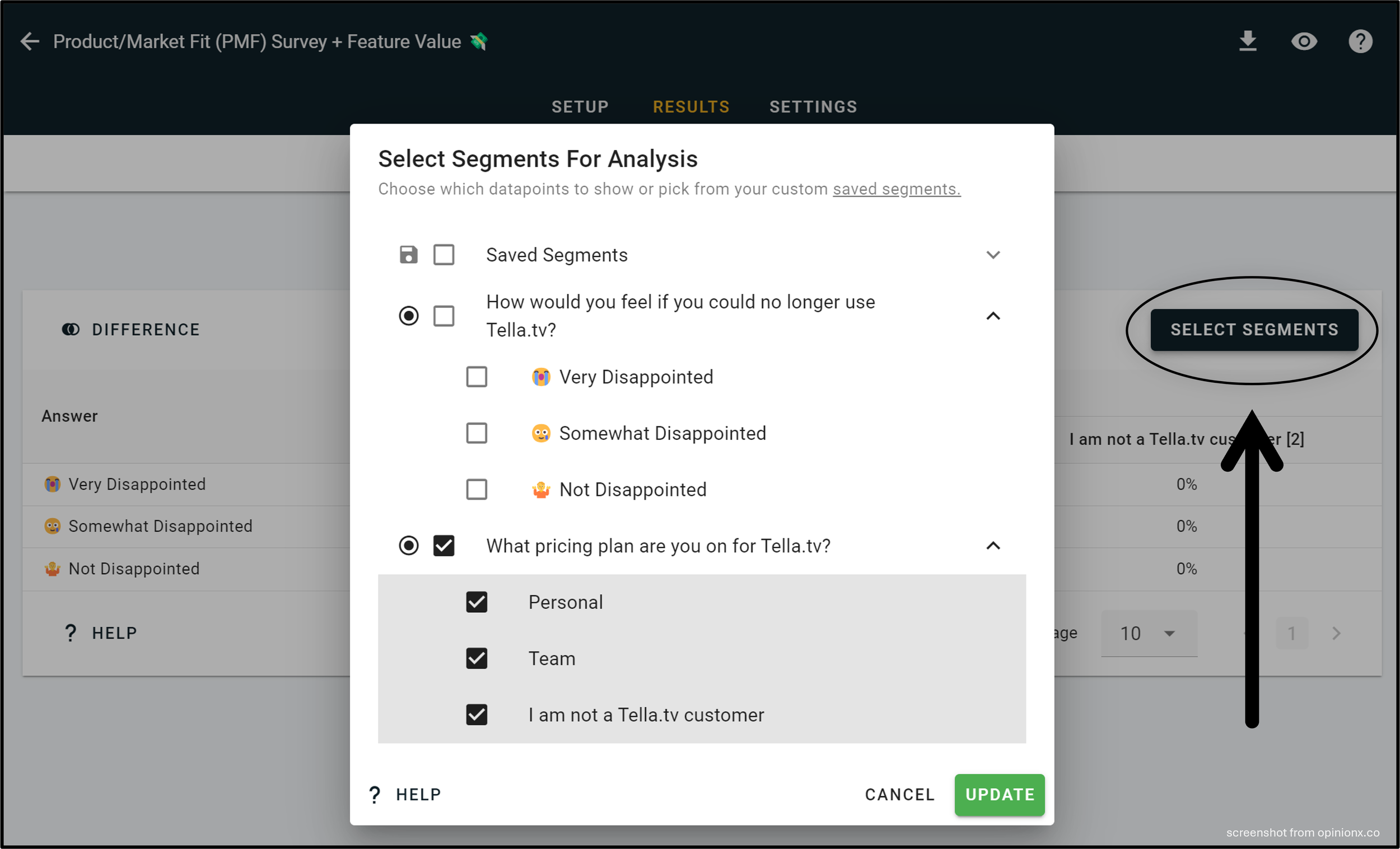
Easy to edit. Click "Select Segments" on the corner of any table to choose which data to include or exclude. The Saved Segments feature creates custom participant groups using AND/OR logic across answers from multiple questions.

^ This contingency table example shows the part-worth utility scores for a conjoint analysis survey about smartphone buyer preferences, where we can see a clear rivalry between iPhone and Android owners and a higher price sensitivity amongst Android users.
The table above shows part-worth utility scores from a conjoint analysis survey on smartphone buyer preferences, where a clear split appears between iPhone and Android owners, along with higher price sensitivity among Android users.
Every question type. Unlike the other tools here, crosstabs work with all of them: multiple choice, rating scale, pairwise comparison, image voting, points ranking, MaxDiff, ranked choice voting, conjoint analysis and consensus ballots.
Price. Crosstabs, segmentation and persona clustering are all included on the free tier, capped at 25 participants per survey. Removing the cap costs $900 a year.
Verdict: the only tool here that generates tables automatically across every question type, and the only one where you can test the analysis before paying anything. Every account comes with pre-populated sample surveys and all analysis features unlocked.
2. Manual spreadsheet
Building crosstabs in Google Sheets or Excel is straightforward if your data is categorical, meaning answers to a multiple choice question.
Step 1: add your data. Export from your survey tool and upload to a new Google Sheets document.

Step 2: insert a pivot table. Highlight all your data, open the Insert menu, and choose Pivot Table (New Sheet).

Step 3: configure values. Drag your two data points into the Rows and Columns areas, and one of the two into Values.

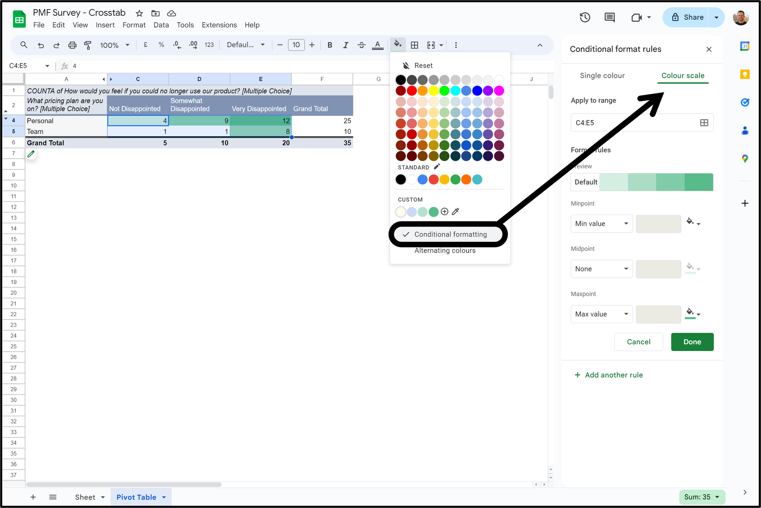
Step 4: heatmap formatting. Highlight your number values, excluding Total rows if your table is count-based, open the fill colour menu, click Conditional Formatting and switch to Color Scale.
Verdict: free, universal and perfectly adequate for categorical data. It stops working the moment you want ranked or scored data in the cells.
3. R
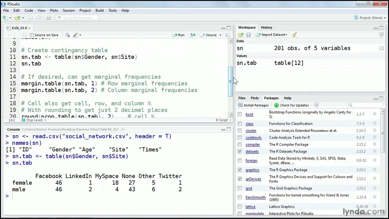
R is a programming language statisticians use for analysing data and creating graphics. You don't need to be an advanced statistician to build one in R, but you do need a basic understanding of the syntax and access to software that supports it. Starting from scratch, most people get up and running with basic data structures, functions and packages like dplyr inside one to two weeks. R's own documentation is the place to start.
Verdict: the most capable option on this list and the only one with no ceiling, at the cost of a genuine learning curve. Worth it as a transferable skill, since R is open source and handles far more than crosstabs.
4. Typeform
There's no crosstab functionality on Typeform. According to Typeform's community manager, you export your data to a spreadsheet and build the table there yourself.
Verdict: not an option. If you collect on Typeform, plan on Sheets or a separate analysis tool.
5. Displayr
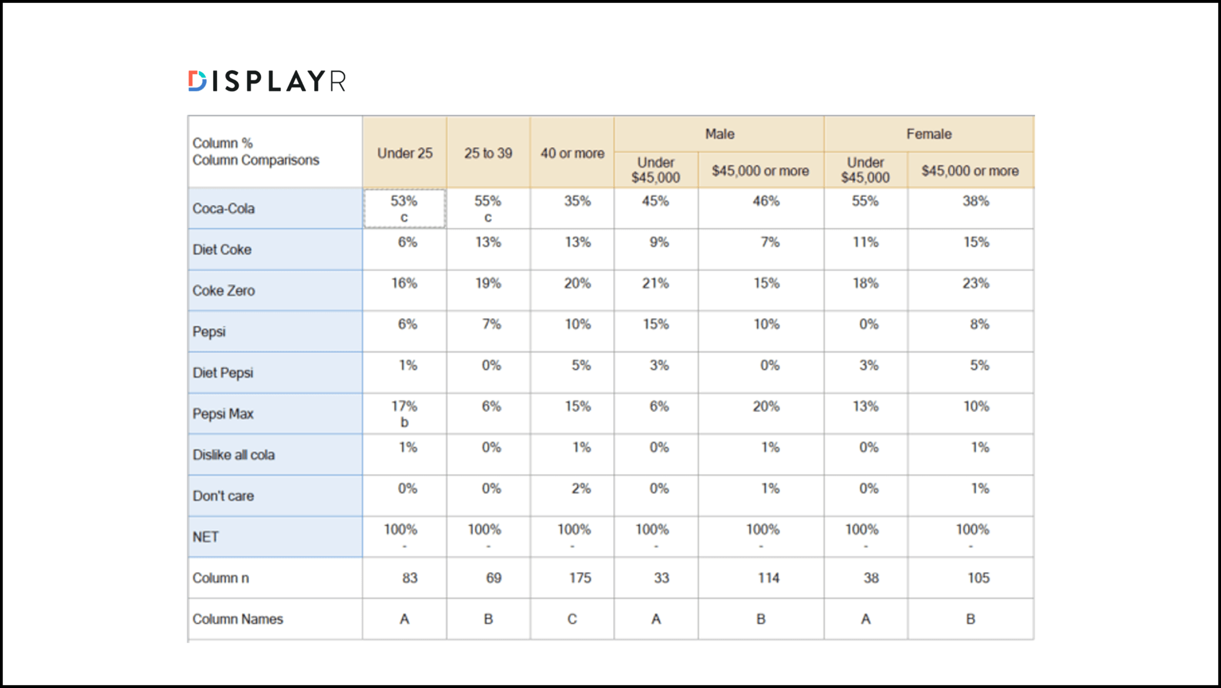
Displayr is a data analysis tool that takes survey results from a collection tool and turns them into custom dashboards, charts and reports. Crosstabs sit in Displayr's Data Stories pricing module, which is separate from the core product.
Verdict: the right pick if your survey platform has no analysis features and you need somewhere to bring the data.
6. Qualtrics
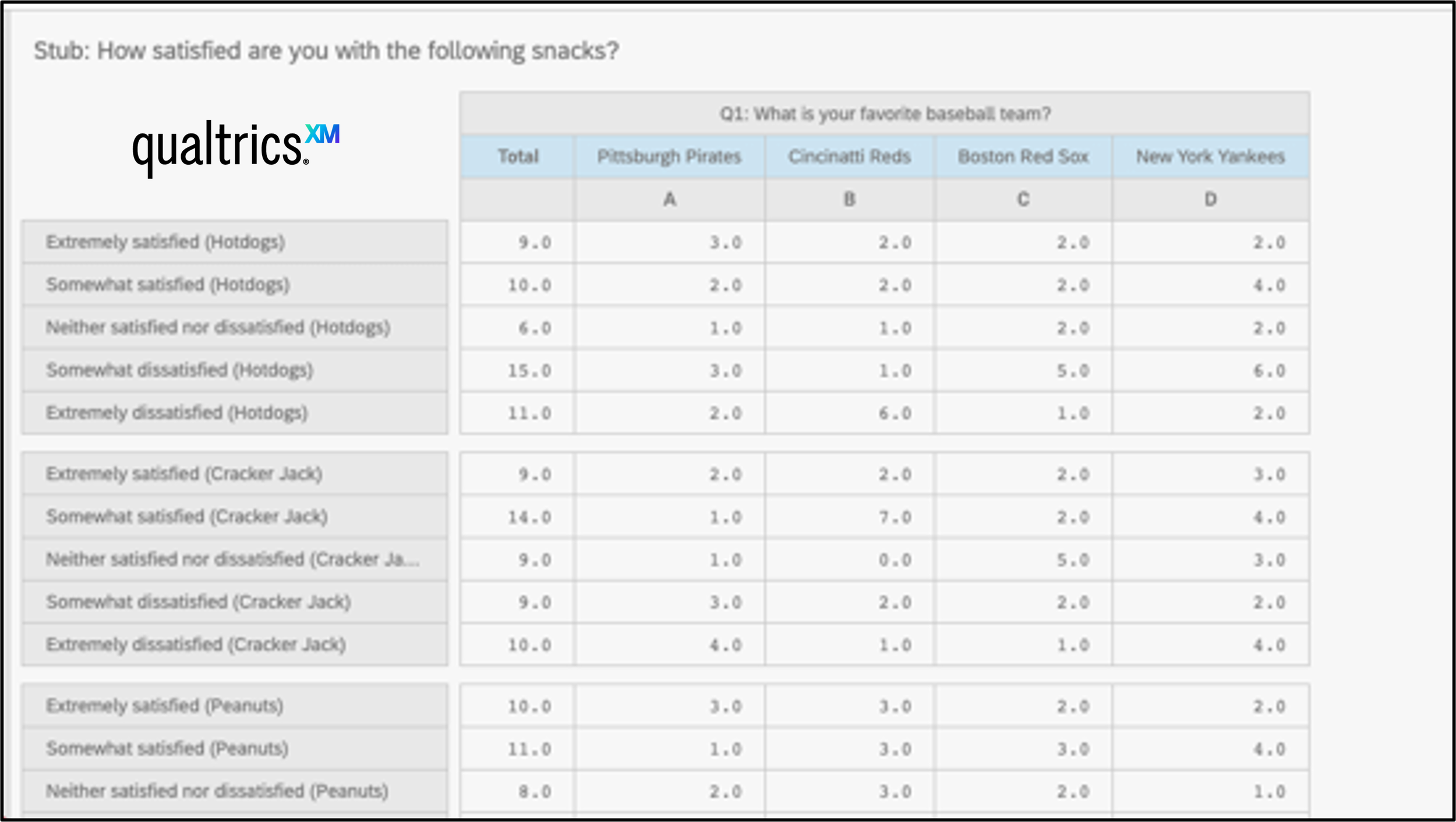
Crosstabs are not included in QualtricsXM subscriptions. Qualtrics repackaged them so they arrive only with a StatsIQ purchase, which means some paid QualtricsXM licences don't include the functionality at all. They also don't work with MaxDiff or conjoint analysis questions.
Verdict: paying for Qualtrics is no guarantee you can crosstab anything, and the two most advanced question types are excluded regardless.
7. SurveyMonkey
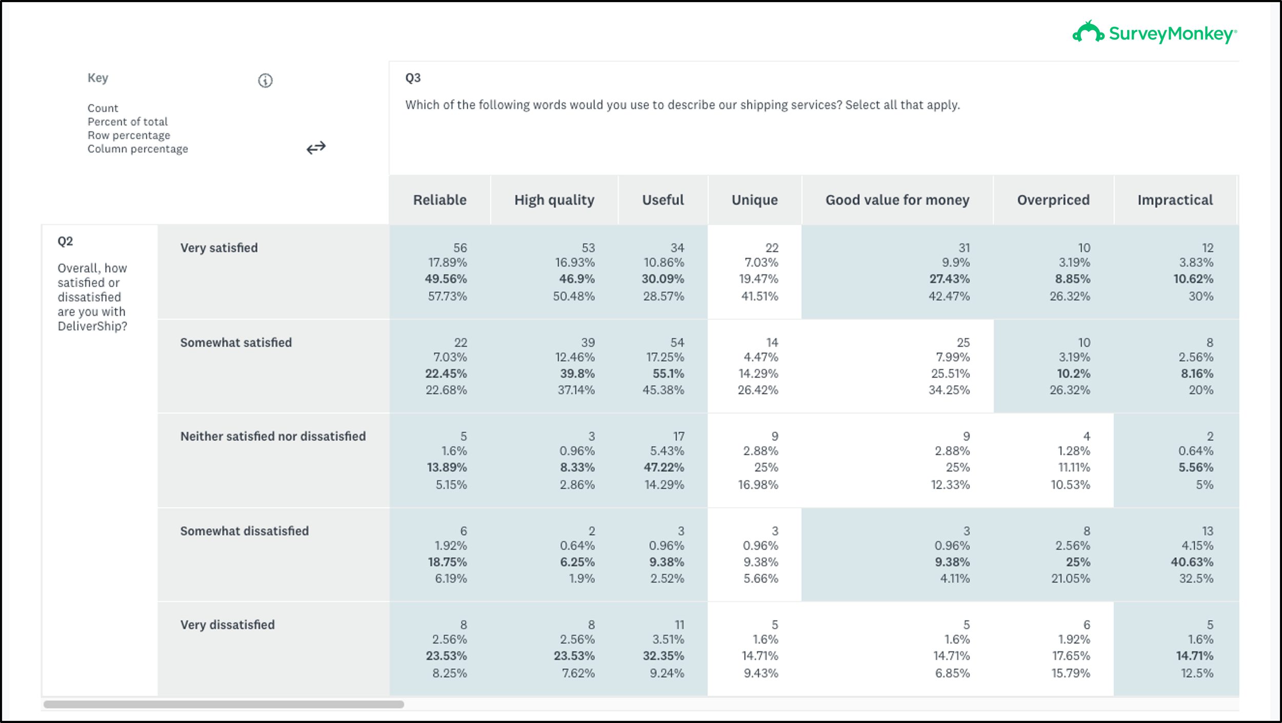
SurveyMonkey has a crosstab reporting format, but it only works with multiple choice questions. Rating scales, sliders, ranking questions, best/worst scales and matrix questions are all incompatible, which rules out most of the platform's formats.
They sit on the Premier tier, the most expensive self-service option.
Verdict: the most expensive self-service tier, for the narrowest question-type support on this list.
8. Alchemer
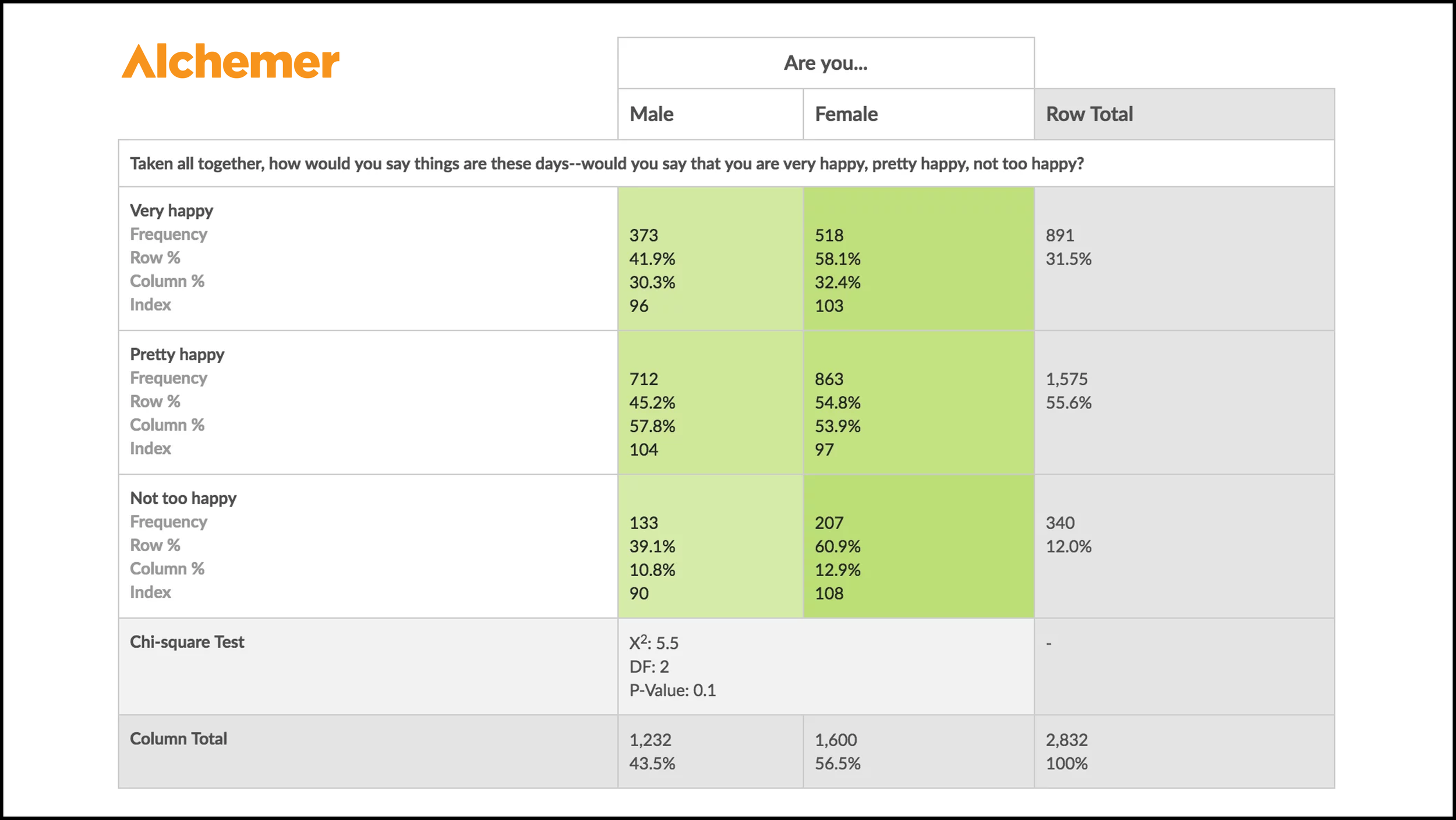
Crosstabs are only available on Alchemer's enterprise plans, negotiated with their sales team. Alchemer supports a few more compatible question types than SurveyMonkey: as well as choice questions, it handles rating scales and URL variables.
If you're willing to sign an enterprise contract, Alchemer's tables come with genuinely advanced statistics, including Pearson Chi-Square, degrees of freedom, P-value and Fisher's Exact Test.
Verdict: the best statistical output in this comparison, including ours, behind the least accessible commercial process. If you need significance testing on a crosstab and have procurement on side, this is your tool.
9. QuestionPro

Crosstabs are available on QuestionPro's paid survey plans, on either the Advanced or Team tier. Those tiers only include a basic count-based table, showing count, average and percentage. Heatmap colour formatting and statistical analysis require an upgrade to their Research Edition enterprise plan.
Verdict: you pay once to get a table and again to make it readable.
The contingency table dictionary
Contingency table, crosstab or matrix?
This format is often called cross tabulation or crosstab analysis, because they mean the same thing. "Crosstab" tends to be used in commercial settings like market research, user research and political polling, while "contingency table" is more common in academic research. Both are matrices, meaning a table of numbers arranged across rows and columns.
Categorical or numerical data?
Almost every guide online says the format only works with categorical data. There's no reason for that restriction. As long as the table is a matrix where each cell represents the overlap between the row variable and the column variable, the format works. That means you can show average scores from rating scales or ranking exercises for each segment.
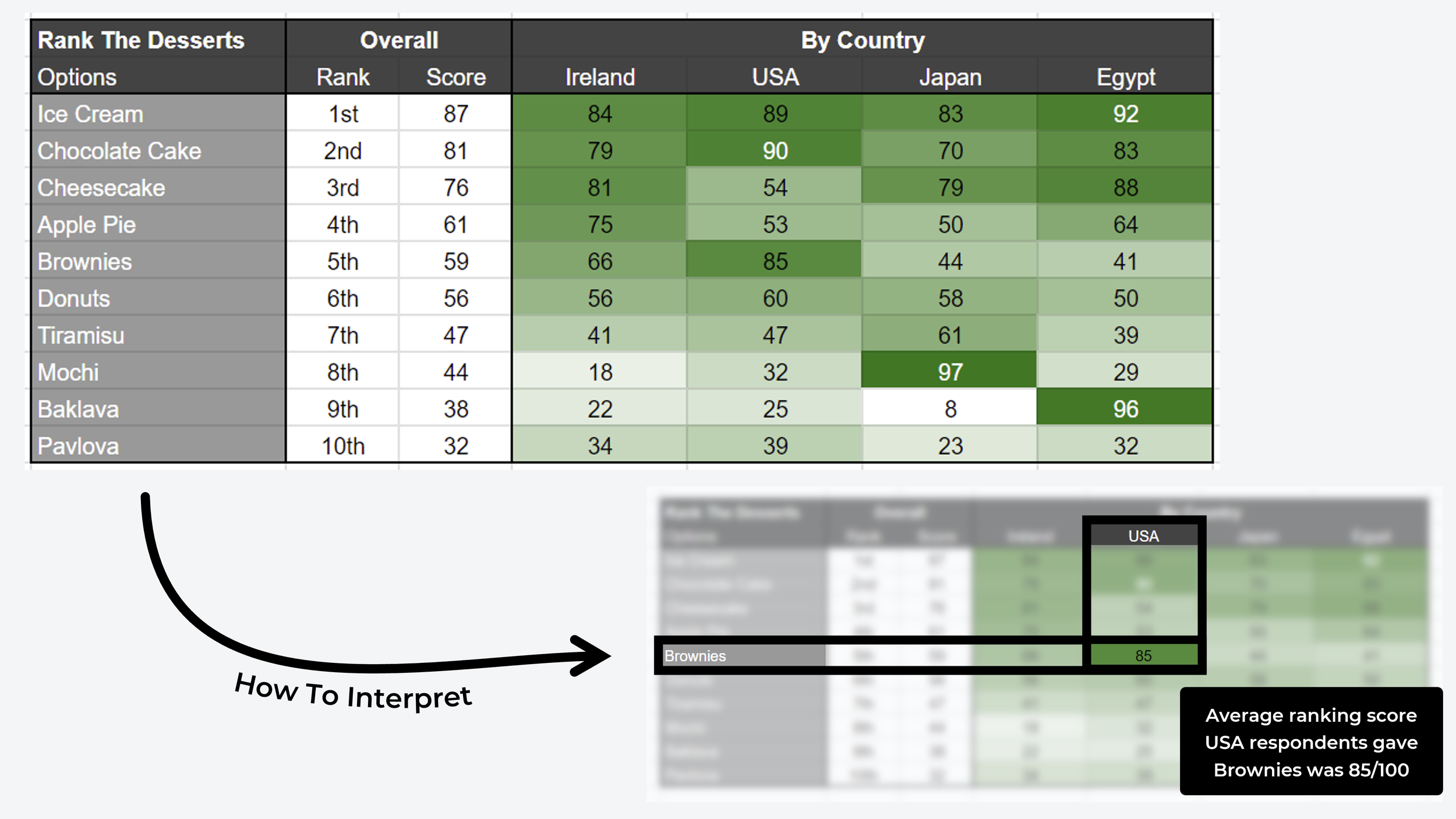
^ Example of a contingency table that uses average scores from a pairwise comparison ranking survey (ie. non-categorical contingency tables!)
Basic terminology
Stubs and banners. Rows are known as stubs, columns as banners or cuts.
Category. A grouped set of variables. In a question where people pick their age from a set of ranges (18-24, 25-34, 35-44), that collection of variables is a category.
Count and percentage. Each cell holds either a count, also called frequency, meaning the number of times two variables appeared together in a participant profile, or a percentage.
Filters. Used to focus the table on a particular view of your data.
Pivot table. A format for summarising and manipulating data in a spreadsheet, commonly used as the basis for one in Excel and Sheets.
CSV. Comma-separated values, a text file format using commas to separate values and newlines to separate records. A text-only version of a spreadsheet, and a common way to populate one.
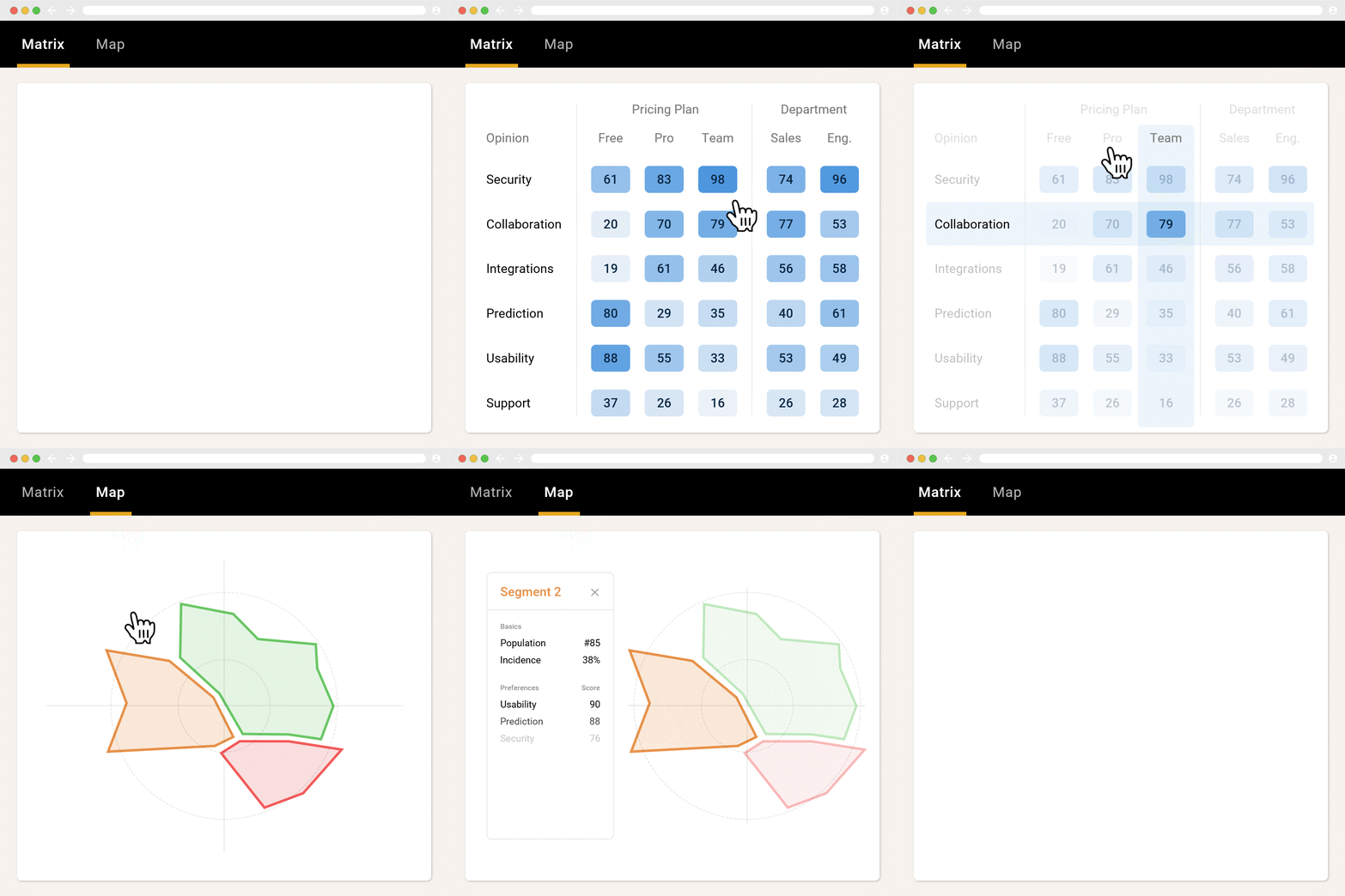
Statistical significance. The test for whether your result could have happened by chance or reflects an underlying relationship between your variables.
Advanced terminology
Pearson Chi-Square Test. Determines whether two variables in the table are independent or have a statistically significant relationship, by measuring actual data against expected data.
Degrees of freedom. Also written as DF. The number of independent pieces of information used in calculating a statistical test such as the Pearson Chi-Square.
P-value. A statistical measure of the confidence that the two variables in your table are correlated.
Frequently asked questions
What is a contingency table used for?
It compares two or more variables to show how often they overlap, which reveals relationships hidden inside an aggregate result. In survey analysis that means seeing how one group answered differently from another, instead of reading a single combined total that averages both away.
What is the difference between a contingency table and a crosstab?
Nothing, other than who is speaking. "Crosstab" and "cross tabulation" are the commercial terms used in market research, user research and polling. "Contingency table" is the academic term. Both describe a matrix where each cell shows the overlap between a row variable and a column variable.
Can a crosstab use non-categorical data?
Yes, despite most guides saying otherwise. Any matrix where a cell represents the overlap between the row and column variable qualifies, so average rating scores or ranked results per segment work perfectly well.
How do you make a crosstab in Google Sheets?
Export your survey data, insert a pivot table from the Insert menu, drag your two variables into the Rows and Columns areas with one also in Values, then apply Conditional Formatting set to Color Scale to add a heatmap.
What is the Pearson Chi-Square test?
A test of whether two variables in a crosstab are independent or genuinely related, comparing the data you observed against the data you would expect if there were no relationship. Alchemer includes it; most survey platforms don't.
Over 42,000 researchers and product people get one method breakdown like this each week in The Full-Stack Researcher.
Most survey tools put crosstabs behind their most expensive tier and then limit them to one or two question types. OpinionX generates them automatically for every question type, with no configuration, on the free tier up to 25 participants per survey.
About The Author:
Daniel Kyne is the Co-Founder of OpinionX, a free research tool for stack ranking people’s priorities — used by thousands of product teams to better understand what matters most to their customers. OpinionX comes with a bunch of research methods for measuring people’s preferences — including automated contingency tables for a range of survey methods. Try it now!