
Best Conjoint Analysis Tools for Mobile Phone Surveys
Conjoint analysis is one of the most powerful tools in a researcher’s toolkit. Whether you're testing price sensitivity, perceived feature value, or customer preferences, it delivers insights that no other survey method can match.
But while conjoint is invaluable for researchers, it’s often not an easy experience for respondents. Completing a conjoint survey means evaluating complex trade-offs across multiple options, which is a cognitively demanding task even in ideal conditions.
What makes that experience exponentially worse is when a survey platform was designed only with desktop respondents in mind, with little thought given to mobile usability.
The share of surveys completed on mobile devices continues to rise. Any researcher selecting a survey platform today who overlooks its mobile experience is setting themselves up to fail -- especially for conjoint analysis.
After testing the most widely used conjoint analysis tools, one thing is clear -- mobile user experience varies wildly. Some platforms feel purpose-built for mobile, while others are borderline unusable on smaller screens. Below you’ll find phone screen recordings from each tool to help you choose the right platform for delivering conjoint surveys that work seamlessly on any device.

What is Conjoint Analysis?
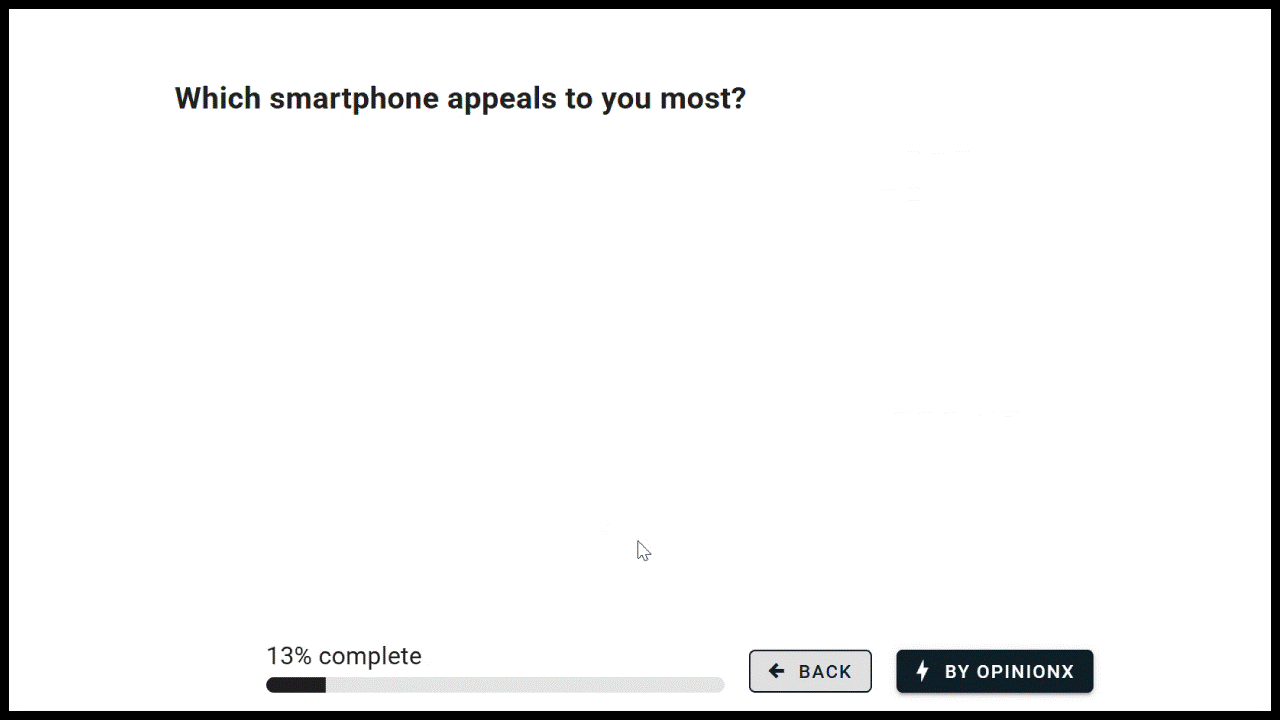
Let’s cover this quickly… Conjoint Analysis is a survey method for ranking the importance of things that have multiple layers of information.
For example, imagine you're trying to buy a new smartphone. Each phone has multiple attributes (brand, storage, color, battery life) and within each attribute there are various options (for brand it could be iPhone, Samsung, Google Pixel, etc). Conjoint analysis helps you answer which attributes influence people’s decisions the most and which specific options within each attribute are preferred most.
Participants are shown sets of 2-5 profiles at a time. Each profile includes one option from each attribute. The participant’s task is to pick the profile they prefer most in each round. After a few rounds, the system has enough data to estimate which attributes matter most and which options are driving their decisions.
— — —
How important is mobile-native UX in surveys?
Surveys today are created on desktop but completed on mobile.
58.2% of all surveys last year were completed via smartphone and by the end of 2030 this will be over two-thirds of all surveys.
This shift is drastically affecting how researchers design their surveys. Back in 2015, 43% of surveys had a matrix question, but just five years later this number had collapsed to only 19% of surveys. Why did people stop using matrix questions so suddenly? Because they don’t fit on phone screens. You have to scroll over and back repeatedly to read the text rows and see the voting columns.
In a 2015 study by GfK with 4555 participants, they found that surveys correctly designed for smaller mobile phone screens had 50% lower drop-off rates and were completed 33% faster. This is a HUGE difference.

GfK’s main criteria for mobile-responsive survey design was that the whole question fit on a smartphone screen without requiring horizontal scrolling. And that is exactly where the majority of conjoint analysis surveys fail — they’re almost all designed as horizontal tables that don’t work on mobile.
Which Conjoint Analysis Tool Offers The Most Mobile-Friendly Survey UX?
So, on that note, let’s look at various survey platforms to see which offer mobile-friendly conjoint analysis surveys and which ones fail.
— — —
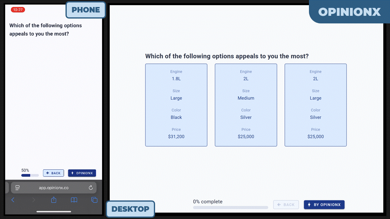
OpinionX
Mobile Conjoint Usability Score: 5/5
OpinionX is the only survey platform that is fully optimized for mobile. Not only do profiles stack vertically, each profile is given two columns so that data is more efficiently displayed on screen.
As you can see in the example below, unlike any other tool, OpinionX is the only platform where no scrolling is required to vote on each set of conjoint profiles from a mobile phone. This was recorded on an iPhone 13 (smaller screen than current models) and on the default zoom level of 100%.
— — —
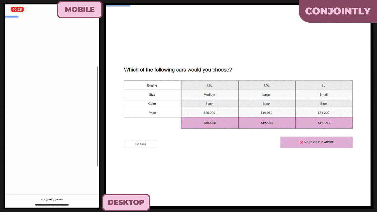
Conjointly
Mobile Conjoint Usability Score: 3/5
Conjointly uses a table view on desktop for conjoint analysis and has a mobile optimized version on mobile that turns each column into a separate card to avoid horizontal scrolling.
However, mobile conjoint analysis surveys on Conjointly require vertical scrolling to view all options. The same survey options on OpinionX need less than half the same screen space, making OpinionX’s UX considerably more efficient and mobile-optimized for conjoint surveys on small screens.
As of April 2026, Conjointly’s entry premium plan costs $2895/year — which is five times more expensive than OpinionX’s Ask plan.
Additionally, there is one important limitation on Conjointly to be aware of. Conjointly treats survey questions (multiple choice, rating scale, text input) different to market research methods (conjoint analysis, maxdiff analysis). While you can add extra survey questions to your studies on Conjointly, each questionnaire can only have one market research method section. This means you can’t mix maxdiff and conjoint analysis in the same survey on Conjointly, and that you can’t have multiple separate conjoint sections in the same survey. If you need this level of flexibility, like mixing research methods or having multiple of each format, you should choose OpinionX’s more flexible survey builder instead.
^ This is a screen recording I took in July 2025. Product interfaces change over time, check Conjointly’s website for their latest version.
— — —
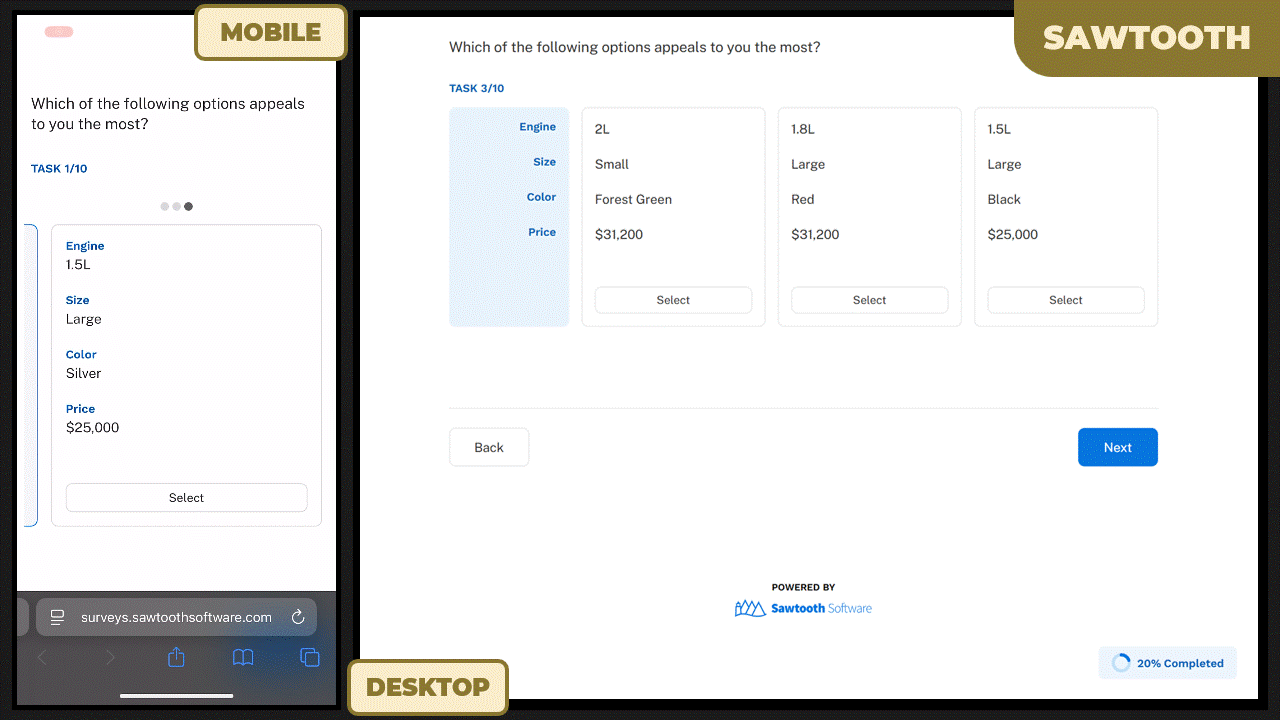
Sawtooth Software
Mobile Conjoint Usability Score: 2/5
Sawtooth Discover is an online survey platform from Sawtooth Software and costs $4500 per user per year. Sawtooth’s conjoint analysis survey receives a score of just 2 out of 5 for mobile-optimized design as it requires both horizontal and vertical scrolling.
Horizontal swiping cards prevents you from viewing multiple conjoint profiles at the same time (comparing profiles is the entire point of conjoint analysis). Vertical scrolling is required to find the “Next” button to move ahead in the survey. Overall, the mobile UX was buggy and I got error messages and stuck in places multiple times.
— — —
QuestionPro
Mobile Conjoint Usability Score: 0/5
Not only does QuestionPro not offer any examples or free trial of their conjoint analysis surveys, they also think we’re all too stupid to be able to test their conjoint feature ourselves -- “Due to complex nature of the analysis and the level of expertise required to support such an offering, unfortunately we cannot provide free trials.”
I’ve said it before and I’ll say it again -- people need to stop acting like conjoint analysis is a mind-meltingly complicated research method. It’s not. The only reason companies like QuestionPro say that conjoint analysis is so complex is so they can charge you $5000+ for what is otherwise just another survey method.
A big 0/5 for QuestionPro from me. And please, let’s put an end to this sort of condescending complexity warnings about conjoint analysis.
— — —
Alchemer
Mobile Conjoint Usability Score: 3/5
Alchemer earn a 3/5 for the mobile interface on their conjoint analysis surveys. It has no horizontal scrolling and the “next” button is shown as a sticky footer -- which may have been hard to find initially, but at least reduces the need for scrolling once you’ve made your selection.
Overall, this falls short of a higher score due to the low density of information on screen which cases unnecessary vertical scrolling for mobile phone respondents. The levels/options take up less than a quarter of each voting card, just 22% in the phone example below), leaving most of the screen blank and unused.

— — —
SurveyMonkey
Mobile Conjoint Usability Score: -1/5
Despite what you may believe from reading their blog posts and website, SurveyMonkey does not actually have a conjoint analysis question type available in their surveys. Instead, you can hire one of their in-house researchers to custom build you a conjoint project (not a survey, just a standalone conjoint) for a minimum of $10,000 per conjoint.
As such, it’s not possible for me to test how SurveyMonkey’s conjoint analysis surveys work because SurveyMonkey does not actually have any conjoint analysis surveys. Yeah, that’ll be a -1/5 so…
— — —
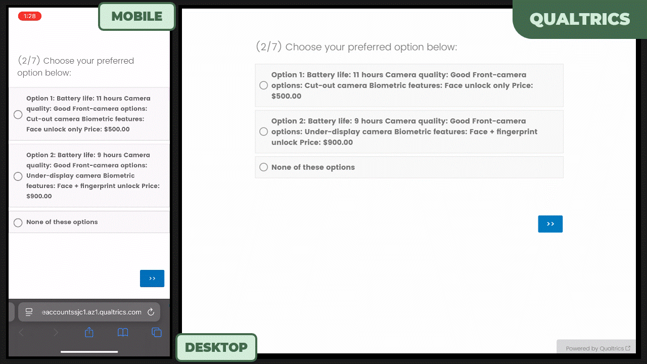
Qualtrics
Mobile Conjoint Usability Score: 1/5
Those sneaky people at Qualtrics, it’s like they hacked my review criteria. Their conjoint analysis UI on mobile doesn’t require any horizontal or vertical scrolling and has high information density. However, this comes at the expense of the UI basically not being a conjoint analysis survey at all.
Unfortunately Qualtrics’ demo mode doesn’t allow any editing, so I couldn’t confirm if a better format exists that just wasn’t available to me. Anyway, the below screen recording is genuinely listed as “conjoint analysis” on Qualtrics. Make of that what you will…
— — —
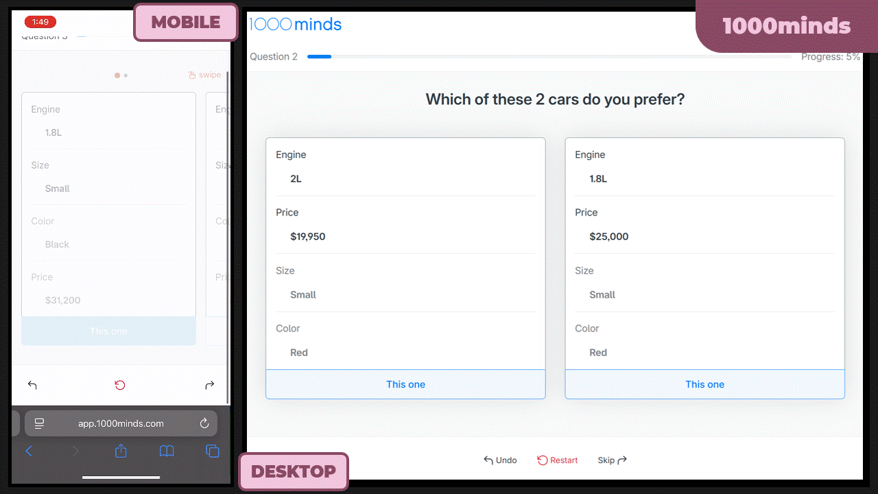
1000minds
Mobile Conjoint Usability Score: 2/5
1000minds is not a standard conjoint analysis survey tool. It’s built for policy decision making input and comes with a range of opinionated decisions that, personally, I found frustrating to deal with.
Their patented PAPRIKA scoring algorithm is their secret sauce, but seemingly also restricts you to only 2 profiles per voting set in conjoint analysis. You also can’t edit options after publishing your survey, so I found myself going over and back between publishing, testing the survey, deleting all participants, unpublishing to make edits, and then republishing to test again.
As for the mobile user experience, 1000minds uses horizontal swiping cards like Sawtooth Software. As you can see in the screen recording below, this left me constantly swiping between profiles to compare them before voting.
— — —
Summary of the Best Mobile-Optimized Conjoint Analysis Software Platforms:
The entire point of conjoint analysis is to compare profiles. Almost every tool reviewed for this article has a user interface that makes it unnecessarily difficult to compare multiple profiles on screen at the same time, except OpinionX.
The following summary and scores are based on my personal experience testing the conjoint analysis mobile UX offered by each survey platform and comparing it against the Gfk’s criteria:
| Platform | Design | Comment | ||
|---|---|---|---|---|
| OpinionX | OpinionX | 5/5 | 🏆 OpinionX easily wins as the best user experience for conjoint analysis surveys on mobile phones. | |
| Alchemer | ||||
| Alchemer | 3/5 | Vertically stacked profiles are good but so much unused space makes this an inefficient UI for mobile voting. | ||
| Conjointly | Conjointly | 3/5 | Lacks sufficient information density for mobile screens, as of July 2025. | |
| Sawtooth | ||||
| Sawtooth | 2/5 | Requires both horizontal and vertical scrolling, so you can’t much on screen simultaneously -- not ideal for phones. | ||
| 1000minds | 1000minds | 2/5 | Horizontal swiping cards prevent easy comparison on mobile, limited to two profiles per comparison set. | |
| Qualtrics | ||||
| Qualtrics | 1/5 | This survey UI barely qualifies as conjoint analysis. | ||
| QuestionPro | QuestionPro | 0/5 | QuestionPro says conjoint analysis is too complicated for you to test yourself (insert eye roll here). | |
| SurveyMonkey | ||||
| SurveyMonkey | -1/5 | SurveyMonkey claims to offer conjoint surveys but conjoint analysis literally does not exist on SurveyMonkey. | ||
The good news is that OpinionX is also the most affordable of any conjoint analysis survey platform.
While other tools from this list charge between $1,795 to $25,000 per year, OpinionX offers a generous free tier so that you can build the survey you need and the cheapest premium plans for conjoint research, starting at just $360/year.
Give it a try yourself and create your own conjoint analysis survey for free right now on OpinionX:
— — —
Did you enjoy this article? Join our newsletter for more: