
Steal This Research Playbook from Uber (Conjoint Analysis Case Study)
Back in 2017, Uber had a big problem.
Over 20% of city rides were on UberPool, its cheaper service that matched strangers heading in the same direction to a shared driver.
Despite facilitating one billion UberPool trips in just three years, riders weren’t happy. Complaints about inefficient routes and unfair prices were piling up so high that Uber deemed it a strategic risk to their brand and growth.
This case study breaks down how Uber’s research team tackled this challenge -- the methods they used, the insights they uncovered, and how the redesigned product experience helped cement Uber as the market leader in carpooling for years to come…

The UberPool Research Playbook
Each stage of this playbook built on the insights of its preceding step:
Identifying Trade-Offs → User Interviews
Measuring Trade-Offs → MaxDiff Analysis
Optimizing Trade-Offs → Conjoint Analysis
Implementing Trade-Offs → Usability Workshops
The best part? Uber wants you to steal this playbook. They published this case study as an academic paper specifically to “assist readers in executing similar research methods.”
I love seeing teams sharing their knowledge like this. We’ve recently published research playbooks from Dogo, Labster, & OpinionX (yes, a case study about our own research!) and we’re keen to keep this anti-gatekeeping movement going.
If your team has an interest research project that can be posted publicly, email daniel@fullstackresearcher.com. Together we’ll turn it into a research playbook and share it with tens of thousands of user researchers worldwide :)

Step 1: Identifying Trade-Offs
UberPool expands access to Uber’s services by driving down the price per user through shared rides. But as the screenshot above shows, the trade-off was painful with unreliable arrival times and unpredictable detours for extra pickups along the way.
To fix this, the UberPool team first needed to understand how people think about their transportation choices. They interviewed 23 people in Chicago and Washington DC, mixing new Uber users, experienced riders, and people who had never tried Uber before.
Each 2.5-hour interview took place in the person’s home and began with a ‘travel mapping’ exercise to lay out their typical trips like school runs, work commutes, and grocery shopping.

^ Real examples of artefacts used or created by interviewees during the ‘travel mapping’ exercise.
Next, the researchers dug deeper into each individual trip identified during the mapping exercise. Using Ulwick’s Eight Process Steps (define, locate, prepare, confirm, execute, monitor, modify, and conclude), they unpacked the details of the trip step by step.
As interviewees described their trips, the researchers looked for examples of three key influences:
Functional → What the person needed to accomplish (price, timing, logistics).
Emotional → How the person wanted to feel or avoid feeling (emotions, frustrations).
Aspirational → How they want to be perceived by others (status, values, identity, image).
Functional influences dominated the interviews, especially efficiency -- things like route planning, waiting time, and arrival reliability. These factors were the non-negotiables shaping people’s everyday travel decisions.
When the researchers compared these needs against the UberPool experience, the gap was obvious. Unlike a regular Uber trip, where drivers can reroute to avoid traffic, UberPool’s algorithm locked trips to a fixed route. Riders had little control over other important factors on UberPool too, like detours, pickup time, co-passengers, or car size.
This raised a critical question -- what if Uber gave riders more visibility or control over these inefficiencies? Any new information or flexibility would come at a cost to Uber, so it would only be worth it if riders truly valued these changes…
— — —
Step 2: Measuring Trade-Offs
The researchers created a list of all the functionality factors that shaped the UberPool rider experience. Next, they removed price (tested separately later) and anything they couldn’t directly control in the product experience.
This left them with six factors:
Expected Arrival Time
Fixed Route
Number of Stops
On-Demand Availability
On-Trip Duration
Walking
The challenge was figuring out how much each factor actually mattered to riders.
In scenarios like this, academic research warns against using simple rating (1-10 scale) or full ranking polls (1st to last). Since both approaches tend to produce flat clustered results — everything ends up looking kind of important.
Instead, they chose to run a MaxDiff Analysis survey…

^ Example of a MaxDiff Analysis survey hosted for free on OpinionX
Their MaxDiff survey showed four factors at a time and asked respondents to pick the most important and least important factor from that set. After each vote, another random set of four factors appeared, repeating until the respondent had voted on five sets in total.

Once complete, MaxDiff automatically calculates a relative importance score for each factor, showing how much riders value it compared to the other options. These scores fall between -100 (always “least important”) and +100 (always “most important”) using a simple scoring formula. Uber used a more advanced regression-based algorithm, but the outcome is similar as long as you have strong sample sizes.
Within the same survey, respondents were also asked questions about their UberPool usage, commuting habits, and broader transport needs.
The team recruited riders who had used UberPool in the last 30 days in Boston, Washington DC, New York City, Chicago, and San Francisco. 5000 randomly-selected riders were invited per city. In total, 3000 completed the survey -- a 12% response rate with a median completion time of just five minutes.

The MaxDiff results were crystal clear -- On-Trip Duration (the total time spent in the UberPool) was the most important factor, validating the user interview findings. Next came On-Demand Availability (how quickly a car would be ready) and Expected Arrival Time.
At the other end of the spectrum, Walking (the distance between a rider’s actual location and the pickup/dropoff) ranked as least important overall. Ironically, walking would have been the cheapest variable for Uber to adjust, so these results instantly sparked some exciting new ideas…
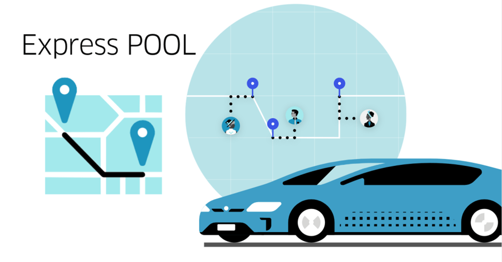
The team started sketching out a new concept called the PerfectPool -- a shared trip where multiple riders with similar start/end points travel together without any mid-route pickups or detours.
PerfectPool optimized the most important factors (duration and arrival time) but required riders to walk before and after their trip. This raised a big question -- would riders be willing to trade some walking for a faster, more reliable UberPool experience?
— — —
Step 3: Optimizing Trade-Offs
By now, the researchers knew that walking distance itself wasn’t important to riders, but at what distance would required walking make an UberPool ride unattractive?
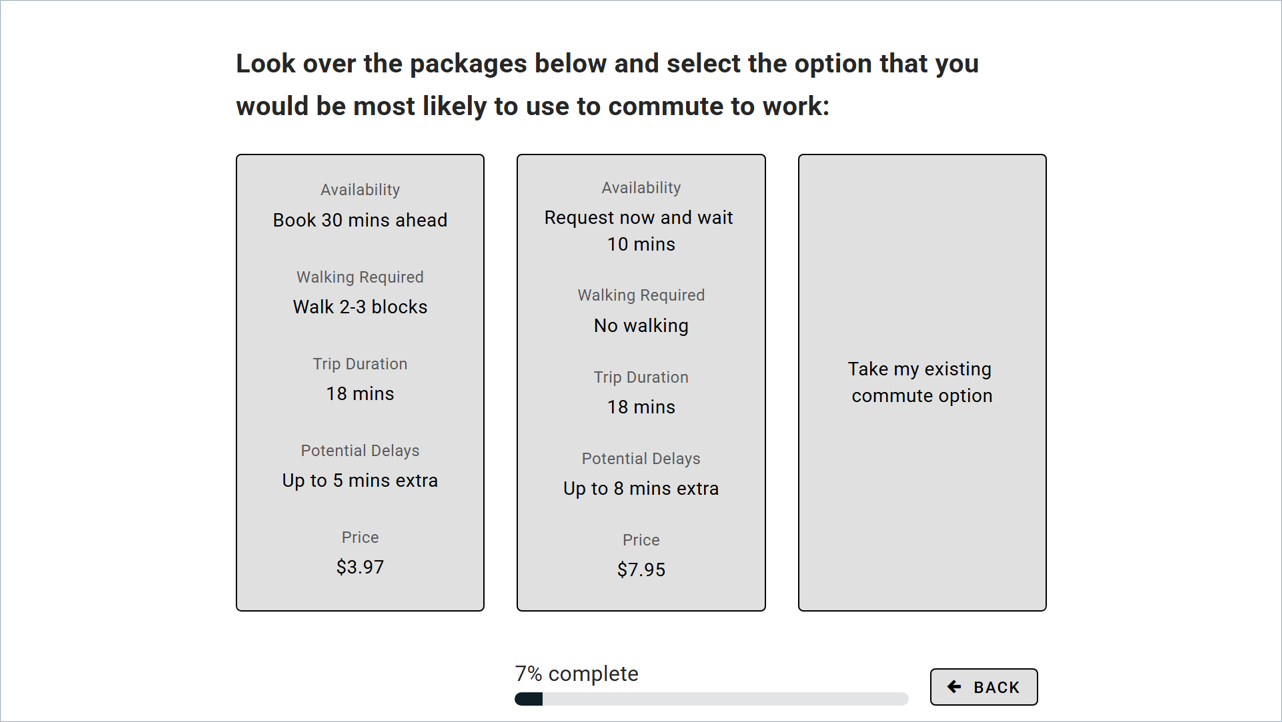
To measure this, the researchers needed a way to test different scenarios and measure how preferences shifted as walking distances increased. That’s where Conjoint Analysis comes in…
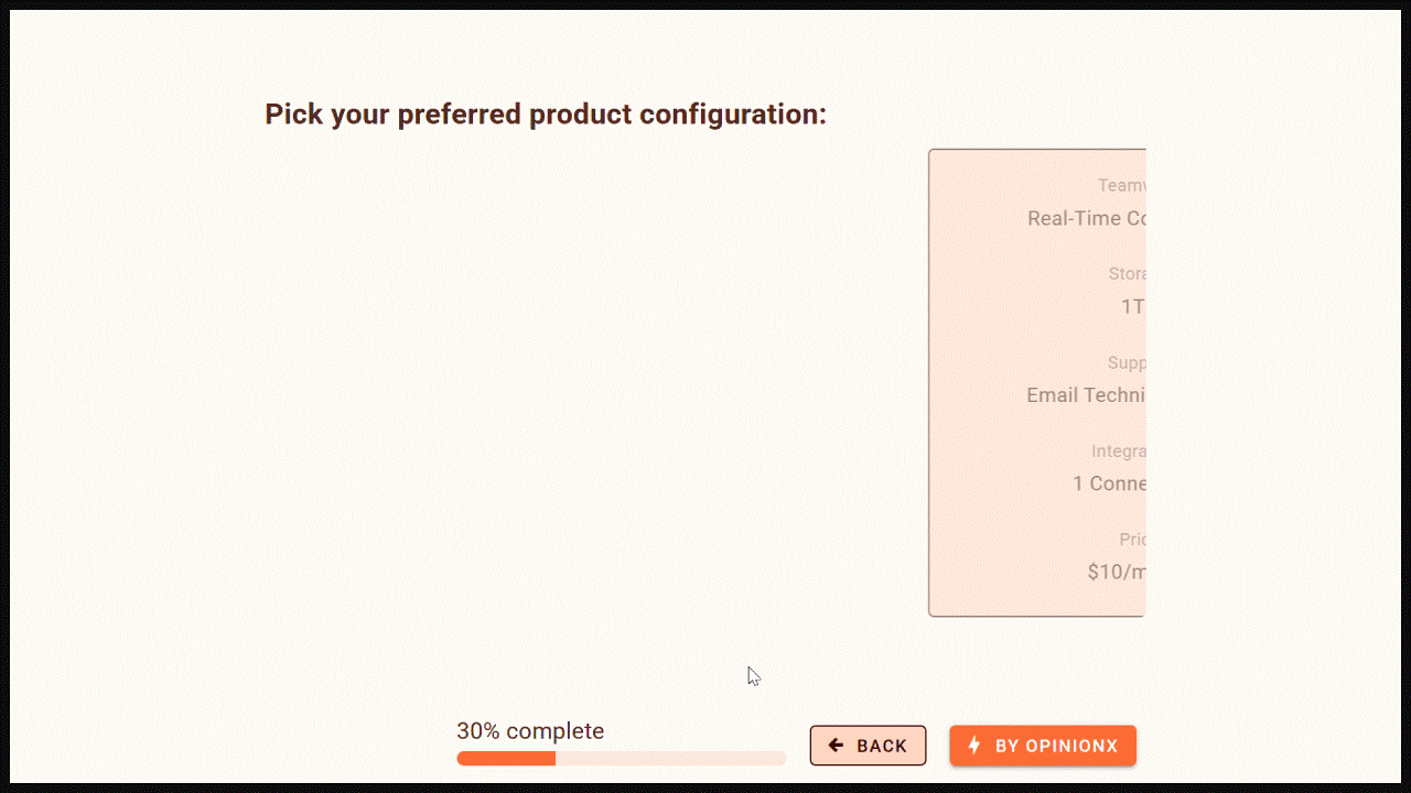
^ Example of a free Conjoint Analysis survey on OpinionX
Conjoint Analysis shows people multiple versions of a product with different combinations of features, asks them to pick their preferred version, and looks at the patterns in their choices across many votes.
For PerfectPool, the “features” they would include were Availability, Walking, Trip Duration, Potential Delay, and Price. Each of these factors contained a range of options (eg. No Walking, Walk 1-Block, Walk 2-3 Blocks). Below you’ll see an example of the inputs they added to their conjoint survey:

This table of categories and options represents most of the work that goes into building a conjoint survey. Once you’ve decided on these, you just drop them into a survey platform that supports conjoint analysis, like OpinionX (which lets you test conjoint analysis surveys for free).
After adding your categories and options, you can to make some survey design decisions like:
Profiles Per Set → Number of profiles that will appear together on screen (Uber chose 2)
Sets Per Participant → Number of times should someone pick their preferred profile before the survey moves on to the next section (Uber went with 7 sets; more advice here)
“None” Option → Allows participants to indicate they are not interested in any of the profiles (Uber included this)
Matching Rules → Set rules to prevent unrealistic combinations (Uber skipped this and allowed full random, which is best practice and makes for easier survey setup)
With 5 categories of 3-5 options each, there are 900 possible profiles that the survey tool could display to participants.
The survey went out to 18,000 UberPool riders via email on August 3rd, 2017. As an incentive, riders could win one of five $500 Amazon gift cards. When sending out invite emails, the research team linked existing rider data (city, product usage, lifetime billings, and survey variables) so they could compare the results by user segment later on.
A total of 1,934 completed the survey (10.7%) with a median completion time of 5.5 minutes. The over results showed the relative importance of each option. When they compared these scores against the “None” choice, they could see whether each option increased or decreased the likelihood that a rider would choose UberPool for their trip:

^ This chart uses wording based on internal language used by the UberPool researchers rather than the labels shown to participants on the conjoint survey, so it may look a little confusing at first, but it is very insightful!
On this graph, the slope of each line shows how much that factor influenced rider preference. As expected, price (purple line) had the biggest effect. Walking (yellow line) showed the steepest negative slope, meaning the further people had to walk, the more likely they’d reject UberPool. Meanwhile, trip variance (ie. potential delays, the blue line) had the smallest effect on ride uptake.

The curve for ETA (ie. driver availability) was especially interesting. People preferred immediate rides, but they were open to booking in advance within reason -- the red curve showed a sharp drop where preferences plummeted somewhere between 15-30 minutes of waiting time.
This insight point revealed a big opportunity -- riders could be asked to wait a bit longer upfront (within reason) in exchange for bigger discounts, giving Uber extra time to find other riders with roughly the same route that could be matched together without any mid-ride pickups.
Filtering the conjoint scores to compare different segments, they also found that:
Riders with 2+ years on Uber were less likely to opt in.
New riders were more price sensitive than veteran users.
People with short commutes were more sensitive to walking requirements.
These segmented insights were key to fine-tuning the next stage of the project -- product design and pilot launch for the newly named ExpressPool service!
Step 4: Implementing Trade-Offs
The conjoint analysis showed that extra discounts had a far greater positive effect on rider preference than the negative effect of inconveniences like walking or waiting.
Uber’s leadership team used this insight to justify mandating the UberPool team to find efficiency wins that could help deliver the lowest possible cost to riders.
i. Valuing Inconveniences
To put exact numbers on how much of a price discount was needed to offset inconveniences like walking/waiting, the team used a scenario simulator.
Scenario simulators are unique to conjoint analysis. You create two competing profiles and the simulator predicts which of them each participant would have picked, with results like “70% for Profile1 -vs- 30% for Profile2”.
This allowed the researchers to set Profile 1 as a default UberPool ride (no discount, no walking, no waiting) and Profile 2 as an ExpressPool option (10% discount, 1-block walk, 15-minute wait). Once the simulator predicted a 50/50 split, they knew the trade-offs were balanced.

^ OpinionX surveys come with an easy-to-use automated simulator for analyzing conjoint results (the screen recording above is from OpinionX).
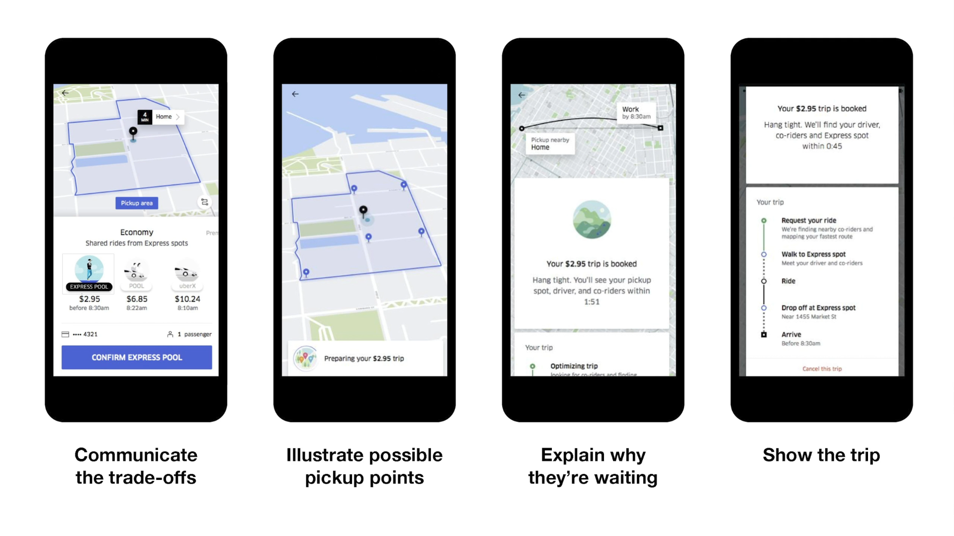
ii. Usability Testing
While Uber already displayed waiting time, showing walking distance before a ride was confirmed was a new usability challenge…
The first mockup (left) showing hypothetical pickup points on a zoomed-in map failed in usability tests when users assumed they needed to select a preferred pickup point before booking.

The second mockup’s (right) zoomed out to display was too vague and riders couldn’t judge whether the walk would be reasonable.
Both iterations failed because they gave riders less, not more, clarity and control.
After several iterations, they landed on a design with clear pickup zones and transparent info on price, wait time, and walking distance -- giving riders the ideal amount of context to decide whether ExpressPool was right for their trip.
iii. Pilot Launch
The pilot rollout in Boston and San Francisco in November 2017 quickly showed that riders canceled less, complained less, and used ExpressPool more than expected.
Within six months:
ExpressPool cancellations fell 40%.
Customer support requests dropped 17%.
Usage exceeded projections by 4.6%.
ExpressPool expanded to 6 more US locations in February 2018, followed by a full rollout to cities across four continents in summer 2018.

This data gave the team real conviction to push ahead with their expansion to other cities and to plan a splashy media launch.
ExpressPool’s tagline at launch -- “walk a little, save a lot” -- shows that the research team’s insights on trade-off preferences was central to the product’s overall strategy and positioning.
Product Research Done Right
This project is a textbook example of what great product research achieves -- bridging the gap between a company’s goals and its customers’ needs to enable win-win solutions.
The impact of this research rippled across Uber. The conjoint insights were presented at offsites, strategy sessions, and vision workshops throughout 2017 and 2018. They reinforced a simple but powerful truth that an efficient rider experience paired with the market’s lowest prices could unlock massive growth in the carpooling category.
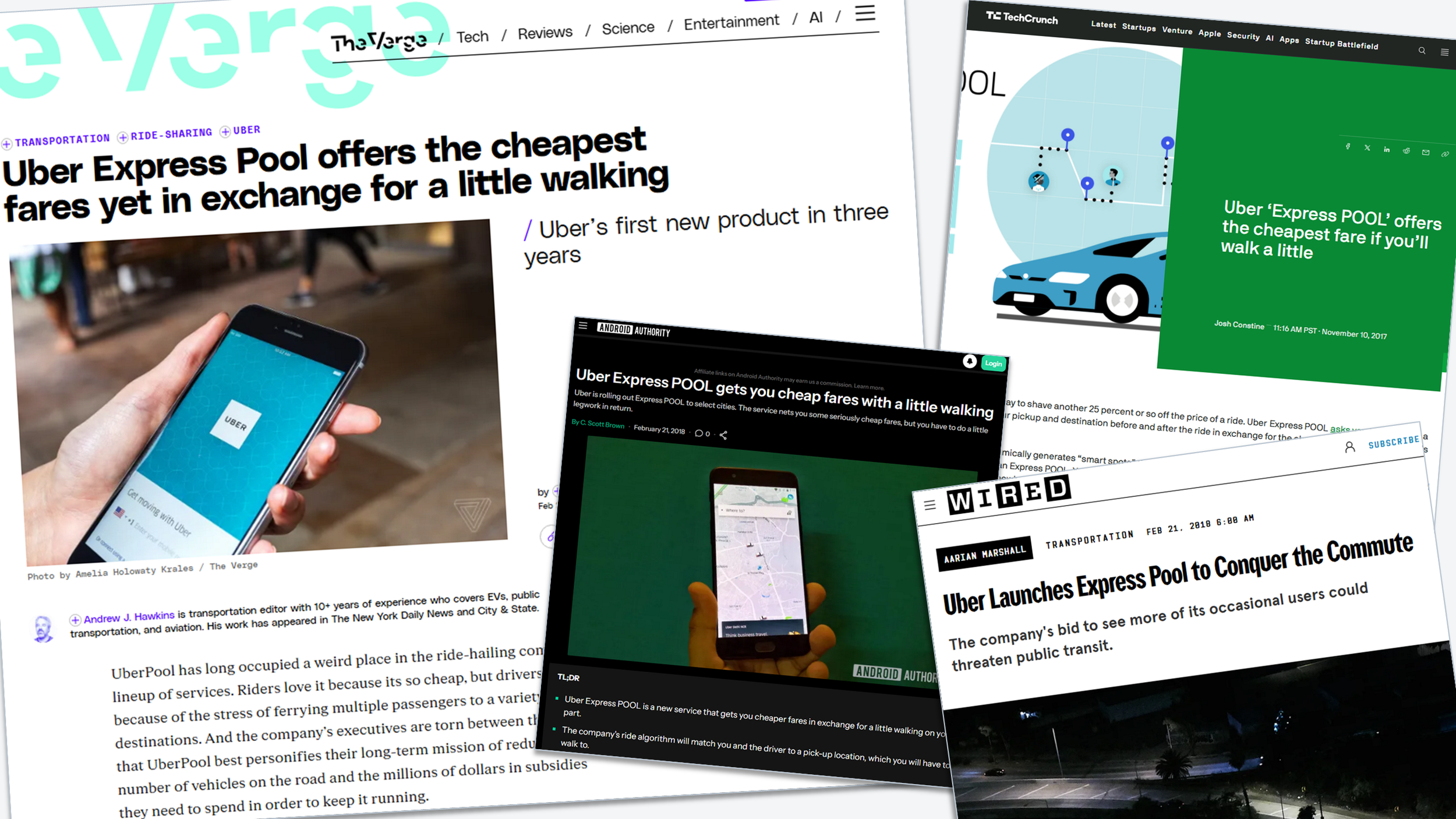
Riders quickly took noticed to the new and improved carpooling experience:

This article is only possible thanks to the researchers who led the project, Jenny Lo and Steve Morseman, who published their work in a 29-page paper back in 2018. It’s rare that researchers are able to share detailed case studies like this with real-world competitive insights.
Jenny and Steve not only achieved their mission of making carpooling more affordable and reliable, but they also inspired countless researchers to embrace survey methods like conjoint and maxdiff analysis. My hope is that this case study breakdown shows that these methods aren’t as intimidating as they might seem. Any product manager or researcher can use them with confidence.
The Full Stack Researcher newsletter exists to help more people confidently master quantitative research methods. It’s also why we built OpinionX, a survey platform that makes it way easier and cheaper to use methods like conjoint and maxdiff analysis in your own product research.
If you enjoyed reading this, subscribe for more case studies and research playbooks delivered directly to your inbox.
Until next time,
Daniel
— — —
Enjoyed this case study? Thousands of Product Managers & UX Researchers subscribe to our newsletter The Full-Stack Researcher for actionable user research advice delivered straight to their inbox:
— — —
About The Author:
Daniel Kyne is the Founder & CEO of OpinionX, the survey platform for product research. Thousands of researchers use OpinionX to measure what matters most to their most important customer segments — enabling advanced research like conjoint, maxdiff, and segmentation analysis on an easy-to-use platform.
→ Try OpinionX for free today