
What's new in OpinionX: Q3 2026 roundup (pricing research, branching, branding)
OpinionX turned into a pricing research tool this quarter. Between July and September 2026, four releases added two pricing methods, a MaxDiff simulator, random splits in branching, bigger participant limits and workspace-wide branding. Van Westendorp and Gabor Granger both landed in July, two weeks apart, and both are available on OpinionX’s free plan.
That's a lot for one quarter, and most of it expands what you can accomplish in a survey, so this roundup of OpinionX product updates goes past the list and walks you through what each feature does and when you'd reach for it (plus why it works the way it does, where that helps).
This article covers the new pricing methods, the MaxDiff Scenario Simulator, random split branching, the new limits on each plan, workspace whitelabelling, and the smaller fixes.
What were the biggest OpinionX product updates in Q3 2026?
Here's the full quarter in one table. Every feature below is live now.
| Release | What shipped | Which plan |
|---|---|---|
| 7 July | MaxDiff Scenario Simulator, Random Split branching, free plan raised to 25 participants, Analyze raised to unlimited, Number Response segmentation | All plans |
| 9 July | Van Westendorp question type, with the optional Newton-Miller-Smith extension | All plans |
| 22 July | Gabor Granger question type, Hide Back Button, branching on Van Westendorp answers, Van Westendorp auto-translation | All plans |
| 17 August | Workspace branding defaults, custom survey domains, dynamic tab titles, Gabor Granger vote count preview | Branding defaults on Accelerate, custom domains as an Accelerate add-on, the rest on all plans |
Why did OpinionX add two pricing methods in one month?
Because they answer two different questions, and most pricing projects need both.
Van Westendorp asks people to name prices, and gives you a range: the point where your product feels too cheap to trust, and the point where it feels too expensive to buy. It's the one to use when you don't yet know where your price should sit.
Gabor Granger works the other way around. It shows people prices you picked and asks yes or no, which gives you a demand curve and, from that, the price that brings in the most money. Use it once you know the rough range and need the exact price inside it.
So the natural order is Van Westendorp first, to find the range, then Gabor Granger, to pick the price. On OpinionX you can put both in the same survey, and add conjoint analysis, MaxDiff or branching next to them; nothing limits you to just one advanced method per survey.
Van Westendorp asks each participant four price questions about one product. At what price is it so cheap you'd doubt the quality? At what price is it a bargain? When does it start to feel costly? When is it too expensive to consider?
It comes prefilled with those four prompts, and you can edit them. On top of that, you add what's being priced, the currency symbol and a suffix like "per month", and you're done.
Participants answer with a slider, a number field or plus and minus buttons. The slider grows as they drag, so nobody gets stuck at a maximum you guessed wrong. OpinionX also blocks answers that break the order: if someone says $20 is a bargain, they can't then say $15 is too expensive.
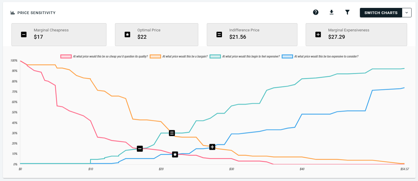
The results page draws the Price Sensitivity chart for you and marks the Optimal Price Point, the Indifference Price Point, Marginal Cheapness and Marginal Expensiveness, which together give you your range of acceptable prices.
What does the Newton-Miller-Smith extension add?
Plain Van Westendorp tells you what feels fair but not how many people would actually buy, and the Newton-Miller-Smith (NMS) extension fills that gap.
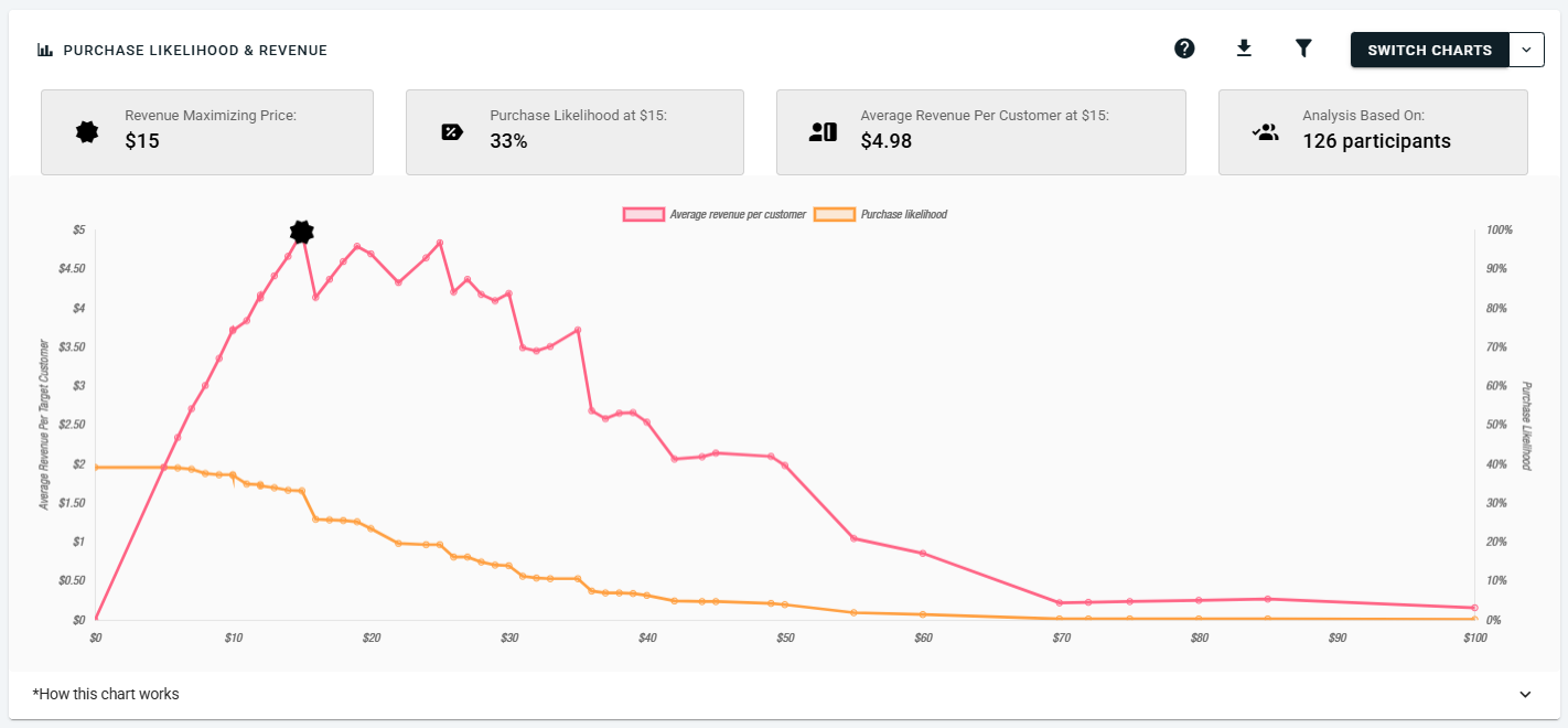
Tick "Show price elasticity questions" and each participant gets two more questions, rating how likely they'd be to buy at two of the prices they just gave. That unlocks a second chart, Purchase Likelihood & Revenue, which points to the price that earns the most.
What changed for Van Westendorp later in the quarter?
Two updates landed on 22 July. First, you can now branch on Van Westendorp answers, so you could send everyone whose "costly" answer is above $50 to a follow-up about a cheaper plan. Second, the price prefix and suffix now auto-translate in multi-language surveys, so "/seat" and "per month" come out in each language too.
Why segment Van Westendorp results?
Because one price for everyone hides who'd pay more. The sample survey prices a Stanley Cup: people who commute by bike landed on a $26 optimal price, while people who take public transport landed on $15. That’s a 73% gap inside one survey ($26 ÷ $15 = 1.73).
You get that split with the same crosstab and filter tools as every other method. Our needs-based segmentation guide makes the same point: the average rarely fits any one group.
How does the Gabor Granger question type work?
Gabor Granger shows each participant one price and asks if they'd buy at that price. Then it shows another price, higher after a yes and lower after a no, and from those answers OpinionX works out what share of people would buy at each price.
People are bad at naming a price (they lowball on purpose or pick a round one), while a yes or no at a set price is much easier to answer truthfully, which is why this method holds up.
Why does Gabor Granger need so few questions per person on OpinionX?
Most Gabor Granger survey tools either step up or down one price at a time, or jump to a random price. Both of these approaches are extremely inefficient and require survey participants to vote on an unnecessarily long list of prices.
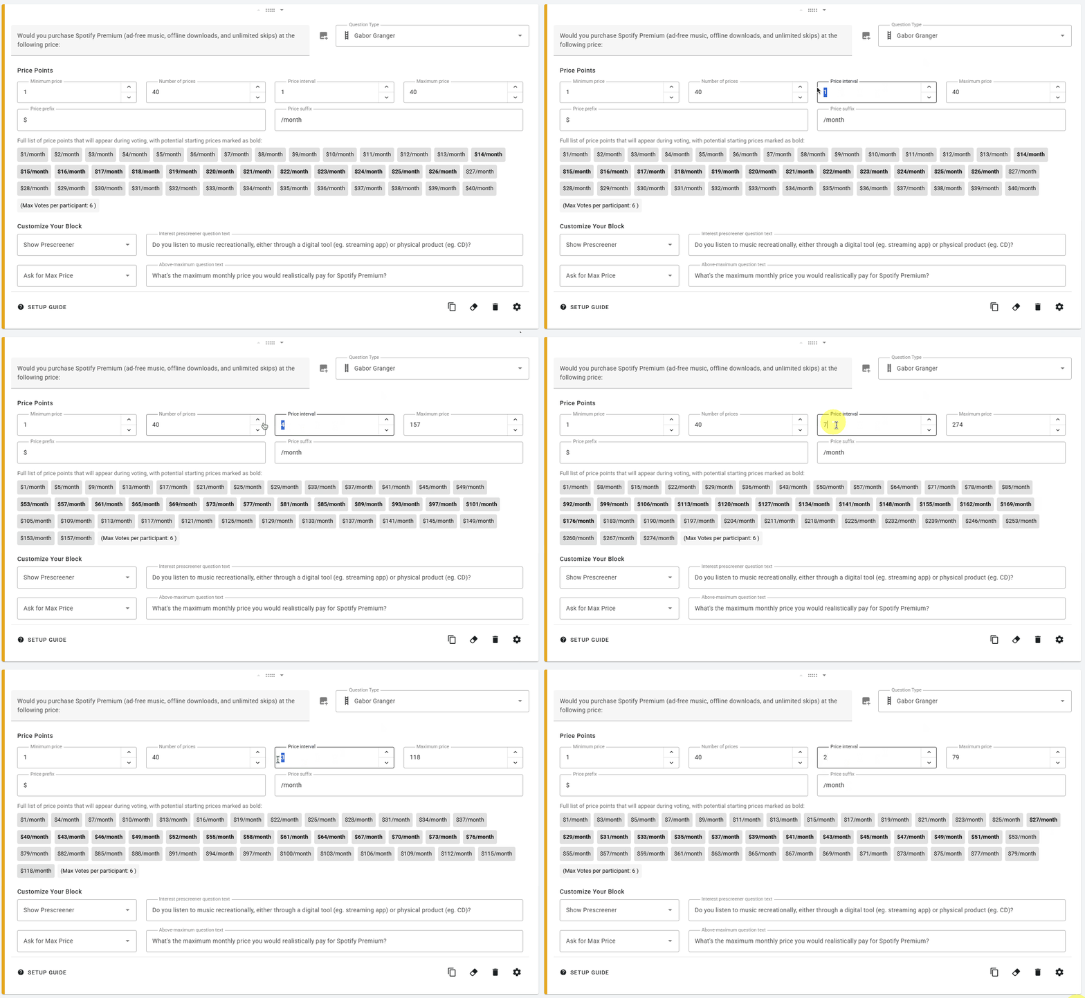
OpinionX uses a binary search approach instead. After each yes/no answer it jumps to the mid-point of the potential prices, so each answer cuts the remaining list in half. With 100 prices, the list shrinks like this after each yes/no vote: 100 remaining prices, 50, 25, 13, 7, 4, 2, 1.
Binary search is the reason why the number of votes required per person barely grows when you go from 15 prices to 1000 prices:
15 prices requires 5 votes at most
100 prices requires 8 votes at most
1,000 prices requires 11 answers at most
Since 17 August, the setup screen shows that maximum vote count live as you change your price configuration, so you can see how short the survey will be before you launch it.
Why does the starting price change for each person?
The first price anyone sees is an anchor that pulls every answer after it up or down. If everyone starts at the same price, that pull hits your whole data set in the same direction and you can't spot it.
So OpinionX picks each person's first price at random from the middle third of your range. With prices from $10 to $40, the first price lands somewhere between $20 and $30. The pull still happens, but it goes different ways for different people and mostly cancels out. It's always on, and there's no toggle for it.
How do you read the Optimal Price chart?
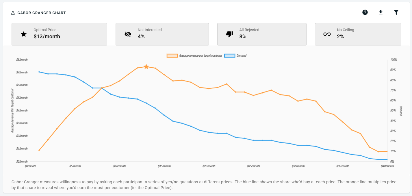
The chart has two lines. The blue line is demand, the share of people who'd buy at each price. The orange line is average revenue per person, the price times the demand at that price.
You need that second line because demand alone won't tell you which price pays best. Say 60% of people would buy at $20, which is $20 × 0.60 = $12 per person surveyed. At $30, only 35% would buy, which gives $30 × 0.35 = $10.50, so the higher price earns less. The top of the orange line is your Optimal Price.
Four boxes above the chart sum up the rest:
Optimal Price: the price at the top of the revenue line
Not Interested: people who opted out at the interest question before the prices started
All Rejected: people who said no to every price, even your minimum
No Ceiling: people who said yes to every price, even your maximum
A high No Ceiling share means your top price was too low, so add higher prices and run it again.
If you've run a conjoint analysis survey before, this is a cousin of marginal willingness to pay: conjoint tells you how much customers would pay to upgrade one feature to a higher/lower spec, while Gabor Granger calculates a price for the whole product or feature independently.
Like Van Westendorp, Gabor Granger works with segmentation filters, the side-by-side comparisons on the Compare Tab, and large-scale crosstab analysis on the Segments Tab, which is how you find the customer types that would pay more than the rest.
What does the MaxDiff Scenario Simulator do?
The MaxDiff Scenario Simulator shows how people would choose if you only offered a small set of options. You pick the set, and it tells you what percentage of people would pick each one.
To get there, OpinionX checks each participant's own MaxDiff votes, works out which option in your set they'd most likely choose, then adds up all those choices into percentages.
Why bother? MaxDiff scores are good at ranking a long list, but a boss rarely asks "rank these 20 phone features". They ask "if we can only build three, which wins?", and the simulator answers that in plain percentages. Say you test 20 smartphone features, then run battery life, camera and screen size as your set: you get a share for each, adding up to 100%.
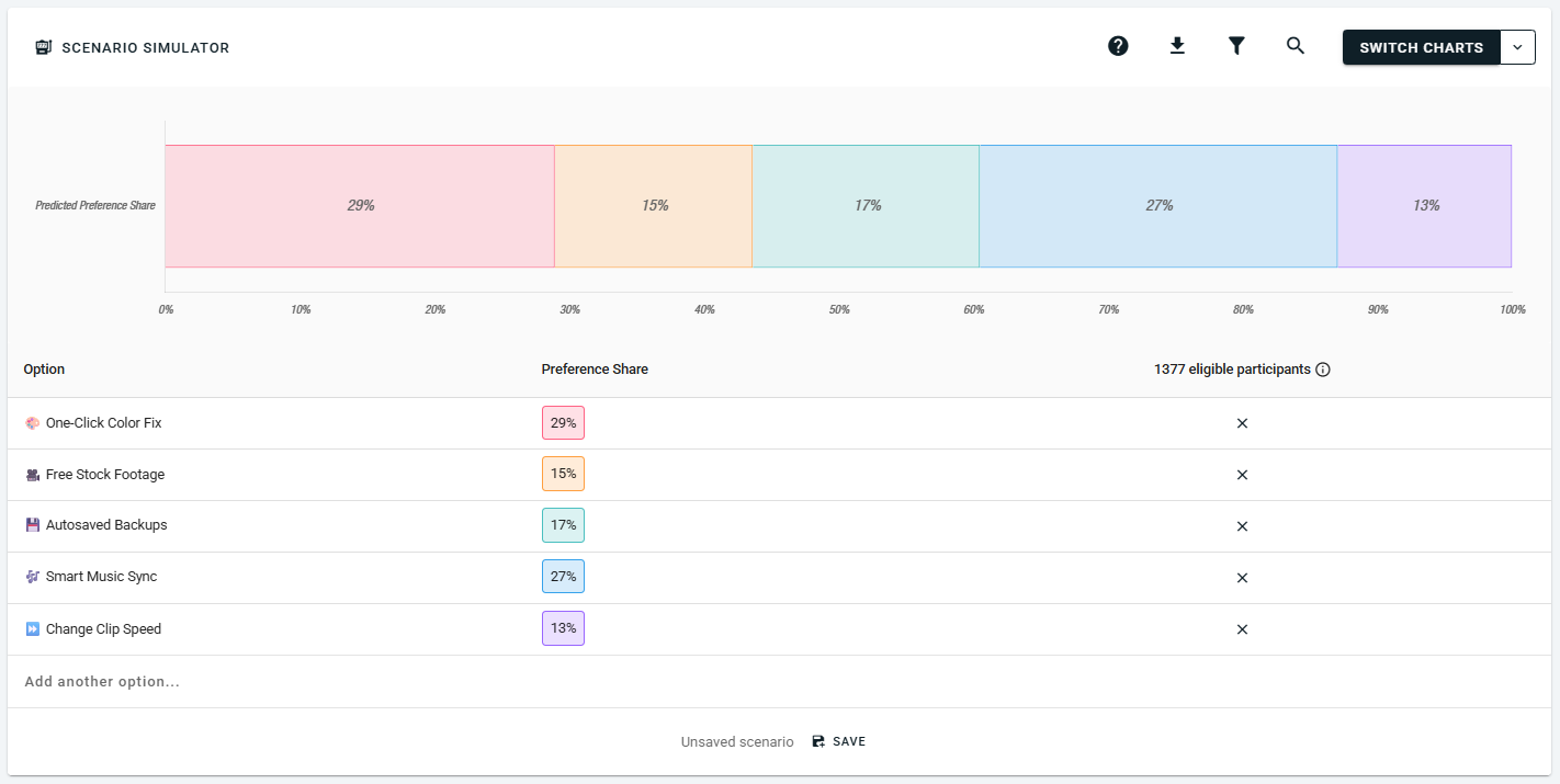
You'll find it under Switch Charts on the MaxDiff results block, on every plan, free included. An update on July 22nd added a preview image to the chart menu and moved the sample size into the column header, so it's easier to see how many people each scenario draws from.
If you've used the conjoint market simulator, this works the same way for MaxDiff. For how the scores behind it work, see how MaxDiff tools compare.
How does random split branching work?
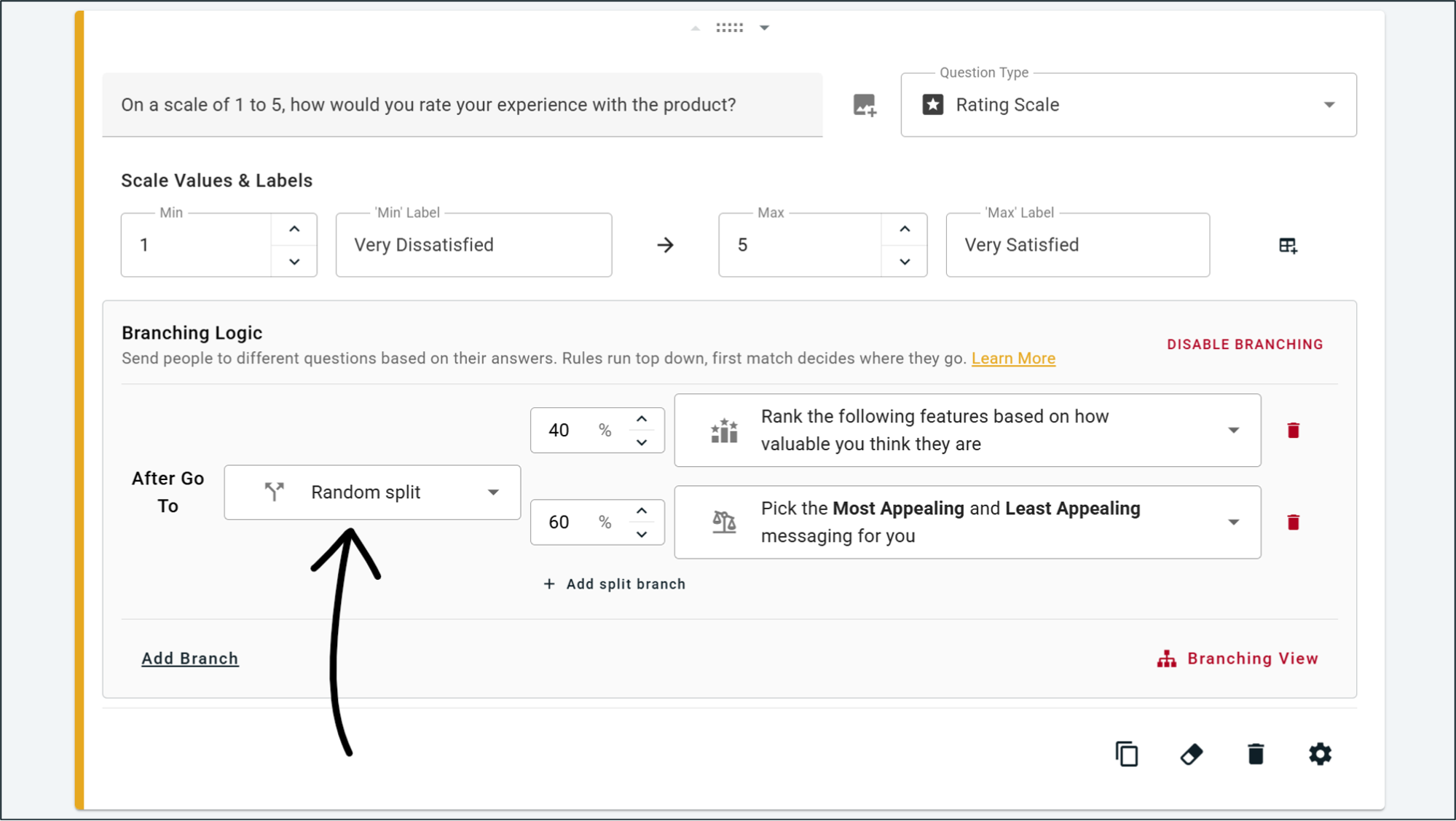
Random Split is a new destination in branching logic. You set up two or more paths and give each one a percentage chance, either even, like 50/50, or weighted, like 70/30.
It also works alongside normal branching conditions, so you can split only the people who meet a rule. For example, only people from companies with over 200 staff get split between two question blocks, and everyone else skips both.
Customers had asked for this for a long time, and it's good for:
Testing two versions of a question. Send half your people to one wording and half to the other, then compare. That's a proper A/B test inside a survey.
Testing two price ranges. Split people between two Gabor Granger blocks with different price lists, and you'll see if the range itself moved your Optimal Price.
Shorter surveys. Give each person half of a long set of blocks, so everyone answers less and you still cover all the blocks.
What else changed in the survey setup dashboard?
A few smaller changes landed too:
Hide Back Button (22 July): a toggle on the settings page that removes the Back button from participants’ survey view. Use it when first answers count most, or when going back would let people see a branch they weren't meant to see. It's handy in a forced-choice ranking study too.
Number Response segmentation (7 July): you can now segment results by answers to Number Response blocks, like company size or monthly spend. It feeds the same participant-level data as every other filter.
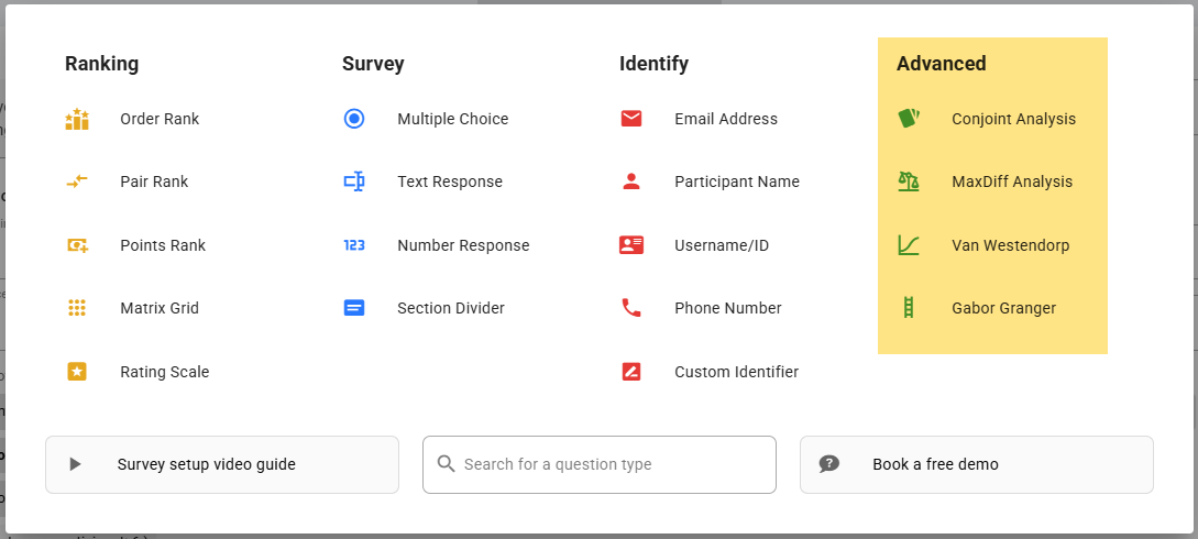
An Advanced section in the block menu (7 July): Conjoint, MaxDiff, Van Westendorp and Gabor Granger now sit together, so the research methods are easy to find.
How did the free and paid plans change?
On 7 July, the free plan went from 10 to 25 participants per survey, and the Analyze plan went from a cap of 1,000 per survey to unlimited.
This is where the plans stand today:
Free: $0, 25 participants per survey, every method and every analysis feature
Analyze: $900 a year, unlimited participants, 90 minutes of prepaid research consulting, and you can remove OpinionX branding
Accelerate: contact sales for pricing, adds private team folders, SAML SSO, two-factor sign-in and 6 hours of consulting
That includes both new pricing methods on free; OpinionX limits how many people you survey, not which methods you can use.
Fair warning though: 25 people is a pilot. It's enough to test your price list and check your questions read well before you see the charts with actual answers, but it's too few for a pricing decision. A Gabor Granger study you'd act on needs far more than 25 people, and more again if you plan to split by segment. If you're short on people, here's how to find free participants for your survey.
One more billing change: workspace admins now get an email when a subscription is set to cancel, so nobody's surprised when their plan ends.
What does workspace whitelabelling include?
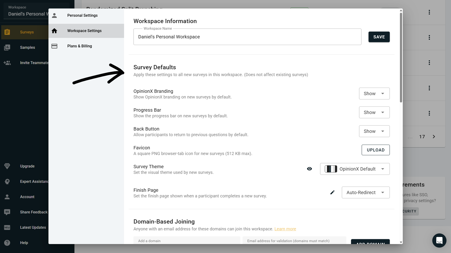
On the Accelerate plan, you can now set branding defaults for the whole workspace. Every new survey picks them up, so you stop setting the same six things on every survey:
Custom favicon: your icon in the browser tab while people take a survey
Default theme: your colours, fonts and background
Default finish page: a set finish page, or a link people go to at the end
Progress bar: shown or hidden by default
Back button: shown or hidden by default
"Powered by OpinionX" button: shown or hidden by default
You can still change any of them on a single survey, since they're defaults, not locks. This helps most where lots of surveys go out under one brand, like research agencies and in-house teams running studies every quarter.
On Analyze, you can still remove the OpinionX button and set a custom favicon survey by survey; the workspace-wide defaults are the Accelerate part.
What about custom survey domains?
Enterprise customers can now get their own subdomain for survey links, like surveys.yourdomain.com, so participants never see opinionx.co. The dashboard where you build and analyse stays at app.opinionx.co.
It's an Accelerate add-on and it isn't self-serve: you add a CNAME record on your domain that points to OpinionX, and the OpinionX team walks you through the rest.
What smaller fixes shipped in Q3?
The rest of the OpinionX product updates won't change your study design, but they'll save you some clicks:
Dynamic tab titles: your browser tab now shows the survey or results tab you're on, not just "OpinionX". Handy with five tabs open.
Auto-scroll to Next: when a question has a vote limit, like "rank your top 3 of 20", the page scrolls to the Next button once people hit the limit.
{Block Name} Templates: the old "Design Inspiration" section on empty blocks got a clearer name.
Clearer conjoint setup: new prefilled text makes a first conjoint study easier to set up. If it's your first one, read when not to use conjoint analysis before you start.
Random Split on small screens: fixed layout problems in the branching editor.
Under the hood: cleaner rating scale setup, a fixed Matrix Grid label, faster results caching and tighter identity checks on the support chat.
Want to run a pricing study on your own product? Gabor Granger and Van Westendorp are both available on OpinionX’s free plan, with 25 participants per survey and every chart included.
