
6 common mistakes in Gabor Granger studies (and how to fix each one)
Most bad results in Gabor Granger surveys come from the same six simple mistakes. Three of them happen before your survey ever launches, and the other three happen after the results chart appears.
Gabor Granger is a pricing survey that shows each person one price and asks if they'd buy at it. A yes is followed by a higher price, and a no brings a lower one. The results show how many people would buy at each price and which price earns the most. Our Gabor Granger guide covers the method in full detail, if you want to learn more.
Each of the six common Gabor Granger mistakes below are a question to ask of your own study, or of someone else's. The fix sits underneath it.
1. Did you guess your price range?
A Gabor Granger survey can only find a price inside the price range you test. If the right price is outside it, the survey won't warn you; it'll still name an optimal price, and that price will be wrong.
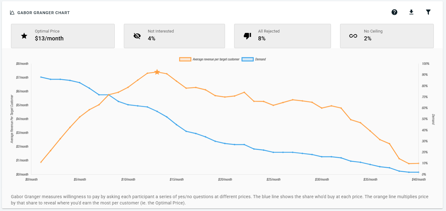
Two figures above the results chart catch this:
No Ceiling is the share of people who said yes to every price, even your maximum price.
All Rejected is the share of people who said no to every price, even your minimum price.
If either one is above 10%, your price range probably missed the answer. For example, if No Ceiling is 24%, almost a quarter of people would pay more than your maximum price. The optimal price then lands on your maximum price only because the survey had nothing higher to show.
There's one exception to check first, though. Some people tap "yes" to everything without reading, and they end up in No Ceiling too. Look at how those people answered the rest of your survey: if they gave the same answer to every other question as well, they probably weren't reading. Survey straightlining explains how to spot this, and the participant-level data shows each person's answers.
The fix: set your price range from evidence, such as a Van Westendorp study or your competitors' prices, then make it wide. Testing a lot more prices costs little on a survey tool like OpinionX, because a binary search selection model can test 100 prices with just 8 votes required per person. How to choose your Gabor Granger price points walks through it, and how a Gabor Granger survey picks the next price explains why the question count stays low.
2. Did you survey people who'd never buy?
Some people wouldn't buy your product at all. In a Gabor Granger survey, they say no to every price, which looks exactly like someone who wants the product but finds every price too high.
This mixes up two different answers, and it causes two problems. Say 60 of your 300 participants would never buy:
All Rejected reads at least 20%. That's double the 10% warning line, so you'd think your minimum price was too high and lower it for no reason.
Demand looks lower at every price. Suppose half of the 240 possible buyers would buy at $20. That's 120 people. Divided by all 300, the chart shows 40% instead of 50%.
Because the never-buyers say no everywhere, the optimal price itself doesn't move, but every figure around it is wrong.
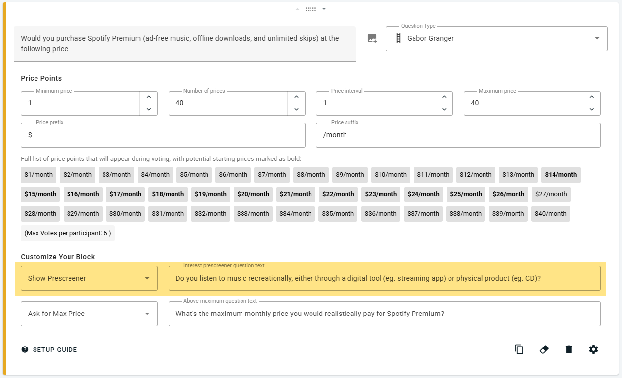
The fix: use the interest prescreener. It asks one question before any price appears: "Would you purchase our product if it were available at a reasonable price?" Anyone who says no skips the prices and shows up as Not Interested instead, so All Rejected then only counts people who wanted the product but not at your prices. On OpinionX the prescreener is on by default. Turn it off only if everyone you survey is already a likely buyer, such as existing customers of a related product.
3. Did respondents know exactly what they were considering buying?
People can only contextualise price when they know what product or service they’re meant to be considering. Answering a survey question starts with understanding it (Tourangeau, Rips and Rasinski, The Psychology of Survey Response, 2000), so if two people understand your offer differently, they're answering two different questions.
For example, say you're pricing a meal-kit box. Some people assume delivery is included, and others don't. Your demand line now mixes two offers, one with delivery and one without, and the optimal price belongs to neither of them.
The core Gabor Granger question is short: "Would you purchase [product] at the following price?" That makes the [product] part do all the work.
The fix: replace "[product]" with a clear description. Say what's included and what isn't, and add a product image. Then put the unit in the price suffix, so people see "$12 per box" instead of a bare "$12". Our free Gabor Granger template guide has copy-paste wording for the whole question set.
4. Did you only read the optimal price?
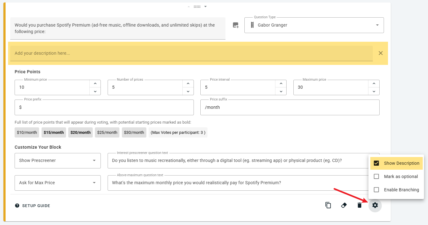
The optimal price is the top of the revenue line, but the shape around that top tells you how much the exact price counts.
Here's an example from a coffee subscription. At $18 a month, it earns $11.88 per person surveyed. At $26, it earns $11.70, so the price rises by 44%, while revenue changes by only 1.5%. That flat top means any price from $18 to $26 earns about the same.
A flat top gives you a choice: a lower price wins more customers, and a higher price earns more from each one. The chart can't make that choice for you, because it's a strategy decision. A sharp top is different, though: revenue drops fast on either side, so the exact price counts.
The fix: report the whole range of prices that earn about the same, alongside the optimal price. Then decide where in that range to land, and say why. How to read a Gabor Granger chart explains this in more detail.
5. Did you present the revenue line as a forecast?
People say they'd pay more in a survey than they really do. A meta-analysis of 77 studies found that stated willingness to pay was about 21% higher than actual willingness to pay (Schmidt and Bijmolt, Journal of the Academy of Marketing Science, 2020). An earlier review of 28 studies found stated values ran 1.35 times actual ones (Murphy et al., Environmental and Resource Economics, 2005).
The revenue line therefore sits too high. If the chart shows $11.88 per person, the actual figure will almost certainly be lower, and a revenue plan built on $11.88 will come in short.
The fix: present the price to charge and leave the revenue figures out of any forecast. Use them only to compare one price with another.
6. Did you stop at the overall result?
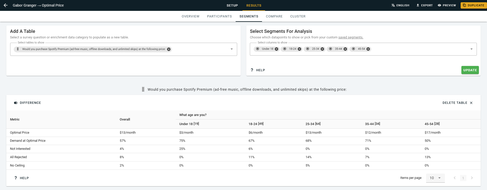
One optimal price for a whole market can hide groups who'd pay very different amounts. In one example, a language-learning app had an overall optimal price of $25 a month. Split by segment, students peaked at $15 and professionals at $40. The $25 price suited neither group.
The fix: plan your segments before launch. You can only split results by questions people answered, so add a multiple-choice question, such as "Which best describes you?", to your survey. Each segment needs at least 100 people to give a usable result. How to segment Gabor Granger results shows the full example, and the sample size calculator shows how many people you need.
Before you launch a study, or trust someone else's, check for all six Gabor Granger mistakes:
Are No Ceiling and All Rejected both under 10%?
Did a prescreener remove people who'd never buy?
Did the question describe exactly what's being priced?
Did the report show the whole range of good prices?
Did you keep the revenue figures out of any forecast?
Did you split the results by the segments you planned?
If you're ready to run your own study, every method is on OpinionX's free tier, which allows 25 participants per survey.
