
How to read a Gabor Granger chart (2 curves, 4 boxes, 1 price)
Someone hands you the results of a Gabor Granger survey and asks what price you’re going with. You’re looking at two lines on two y-axes, four callout boxes at the top, and a “revenue-maximising price” everyone keeps talking about.
Gabor Granger is a survey method that uses a series of yes/no votes and turns it into a recommended price. The only way you can confidently stand behind your Gabor Granger recommendation is if you understand how the chart works and why those prices are coming from it.
Unfortunately most guides skip over this essential explanation of the Gabor Granger chart in just one short sentence. This guide covers five things:
What each line on the chart means.
Why the revenue curve is always a hump.
What the four boxes say.
How the chart tells you if the survey was set up right.
How to explain the result to your team without going crazy.
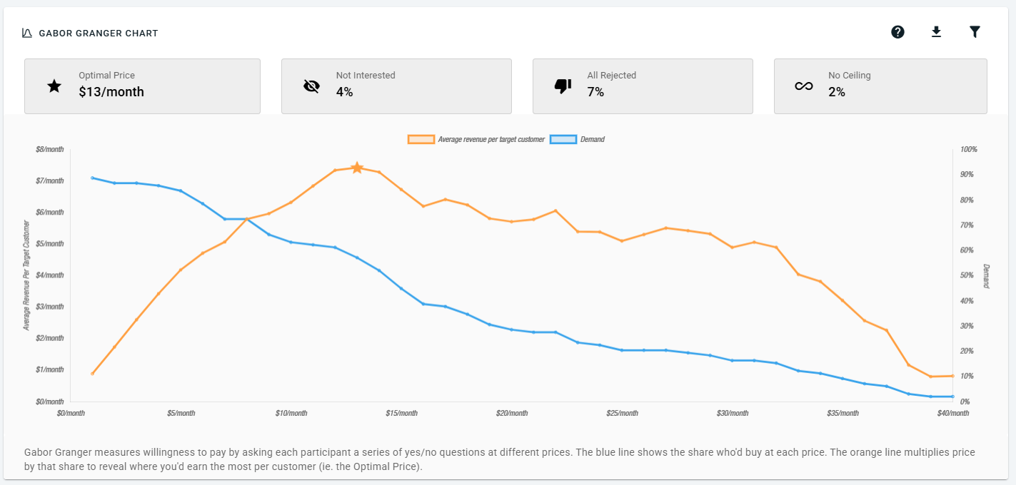
A real OpinionX result chart, from a different study. The robot vacuum example below has its own numbers and its own charts.
This guide uses one example throughout: a Gabor Granger survey for a robot vacuum, tested at eight prices from $120 to $400.
What are the two lines on a Gabor Granger analysis chart?
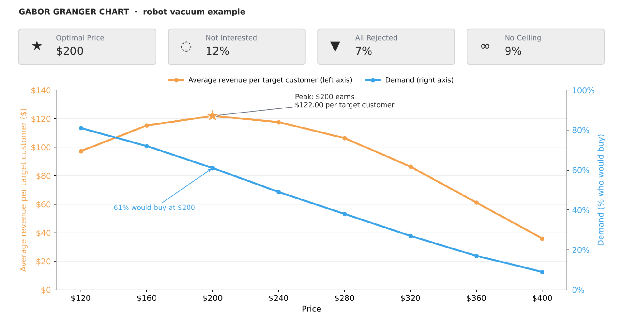
The robot vacuum example. Read the orange line against the left axis and the blue line against the right axis.
You’ve got two lines on two separate y-axes with two different units. The most common first mistake is reading a line against the wrong axis.
Demand sits on the right axis as a percentage, showing you the share of your market willing to buy the product at each price. This demand line typically falls as the price rises.
The demand line is the oldest part of the method. In the 1960s, economists André Gabor and Clive Granger studied how shoppers in Nottingham reacted to prices (Gabor & Granger, 1961). Their idea was simple: ask people if they'd buy at a set price, then count the yeses at each price.
Average revenue per target customer sits on the left axis in dollars. Each point is the price multiplied by the demand at that price.
The word “average” matters. The chart spreads the money across everyone in the survey, not only the people who said yes. Here’s why that matters, with 100 people voting on the vacuum:
At $200, 61 people say yes. They pay $12,200 in total. Spread across all 100 people, that’s $122.00 each.
At $320, 27 people say yes. They pay $8,640 in total. Spread across all 100 people, that’s $86.40 each.
Now count only the buyers. Each buyer at $200 pays $200, and each buyer at $320 pays $320. The higher price always wins, because the people who walked away drop out of the sum.
Counting everyone keeps those lost customers in the sum. That’s what makes the line rise, peak and fall.
Here are all eight prices:
| Price | Demand (right axis, %) | Average revenue per target customer (left axis, $) |
|---|---|---|
| $120 | 81% | $97.20 |
| $160 | 72% | $115.20 |
| $200 | 61% | $122.00 ⭐ |
| $240 | 49% | $117.60 |
| $280 | 38% | $106.40 |
| $320 | 27% | $86.40 |
| $360 | 17% | $61.20 |
| $400 | 9% | $36.00 |
Every value in the right-hand column comes from one sum: price × demand. That one sum is the whole of Gabor Granger analysis.
Why is the revenue curve a hump?
Every pricing decision trades charging more per customer against keeping more customers, and the hump in the Gabor Granger chart is where that dynamic flips.
At low prices, raising the price wins. Going from $120 to $160 loses 9 points of demand (81% to 72%). But each target customer brings in $18 more ($97.20 to $115.20), so revenue goes up.
Past $200, it flips. Going from $200 to $240 loses 12 points of demand (61% to 49%). Revenue per target customer drops $4.40 ($122.00 to $117.60). Each price rise now loses more customers than the extra money covers.
The top of the hump is where these two reach a balance. You can see the flip shown in the example chart below.
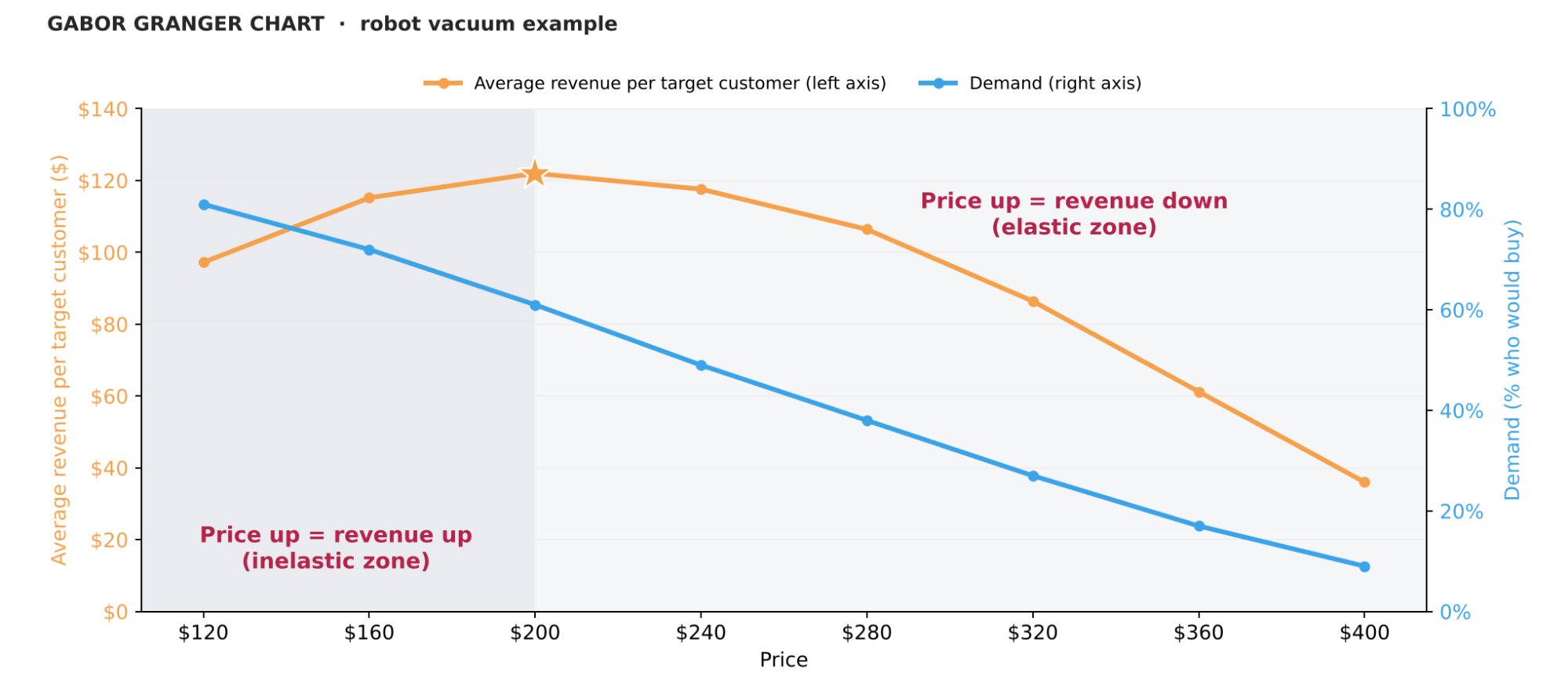
Economists have names for the two sides. Left of the peak is the inelastic zone: customers barely react to a price rise, so revenue goes up. Right of the peak is the elastic zone: customers react strongly, so revenue goes down. The peak sits where the two effects cancel out.
What do the four callout boxes tell you?
You have four boxes above the chart. Two of them are findings about your market, and the other two are diagnostics about your survey.

Findings (pink boxes)
Optimal Price. That’s the price at the peak of the curve, marked with the star icon. This is the price that generates the highest revenue per target customer. In the vacuum example, it’s $200.
Not Interested. The share of people who opted out before any price question. They said they wouldn’t want the product even at a fair price. A high number usually means you surveyed the wrong people, or nobody wants the product. In the vacuum example, it’s 12%.
Diagnostics (blue boxes)
All Rejected. The share of survey respondents who said no to every price shown in the survey, including the lowest price you allowed. If more than 10% of respondents reject all prices, then either your minimum price is too high or the offer isn't convincing anyone. In the vacuum example, it’s 7%, so the $120 minimum is fine.
No Ceiling. The share of survey respondents who said yes to every price, including your top one. If this comes out above 10%, then your maximum price is too low, which means the answer you’re looking for is somewhere above that price and you didn’t consider it.
OpinionX has a purpose-built Gabor Granger question. It can ask people who said yes to every price for the highest price they’d consider. The chart leaves these above-max prices out. They show in a table below it instead, so you can pick a better maximum price next time.
Once you launch your survey, check All Rejected and No Ceiling before the optimal price. A beautiful demand curve means nothing if 22% of people land in No Ceiling. You’d need to run the survey again with a higher maximum price, not lock in the price under the star. The guide on how to choose your price range for Gabor Granger shows how to avoid this.
Why the height of the peak is what you should trust least
The chart gives you two readings of the peak. One is where it sits on the x-axis: the price. The other is how tall it is: the average revenue per target customer. They aren’t equally reliable.
The price holds up better. If people overstate their buying by the same share at every price, every point on the curve rises together, and the peak stays at $200. The height doesn’t hold up. It comes from what people say they’d buy, and people say yes more often than they really buy.
The largest review of this gap for consumer products found that people state a willingness to pay about 21% above what they actually pay (Schmidt and Bijmolt, Journal of the Academy of Marketing Science, 2020). An earlier review of 28 studies found stated values ran a median 35% above real ones (Murphy et al., Environmental and Resource Economics, 2005).
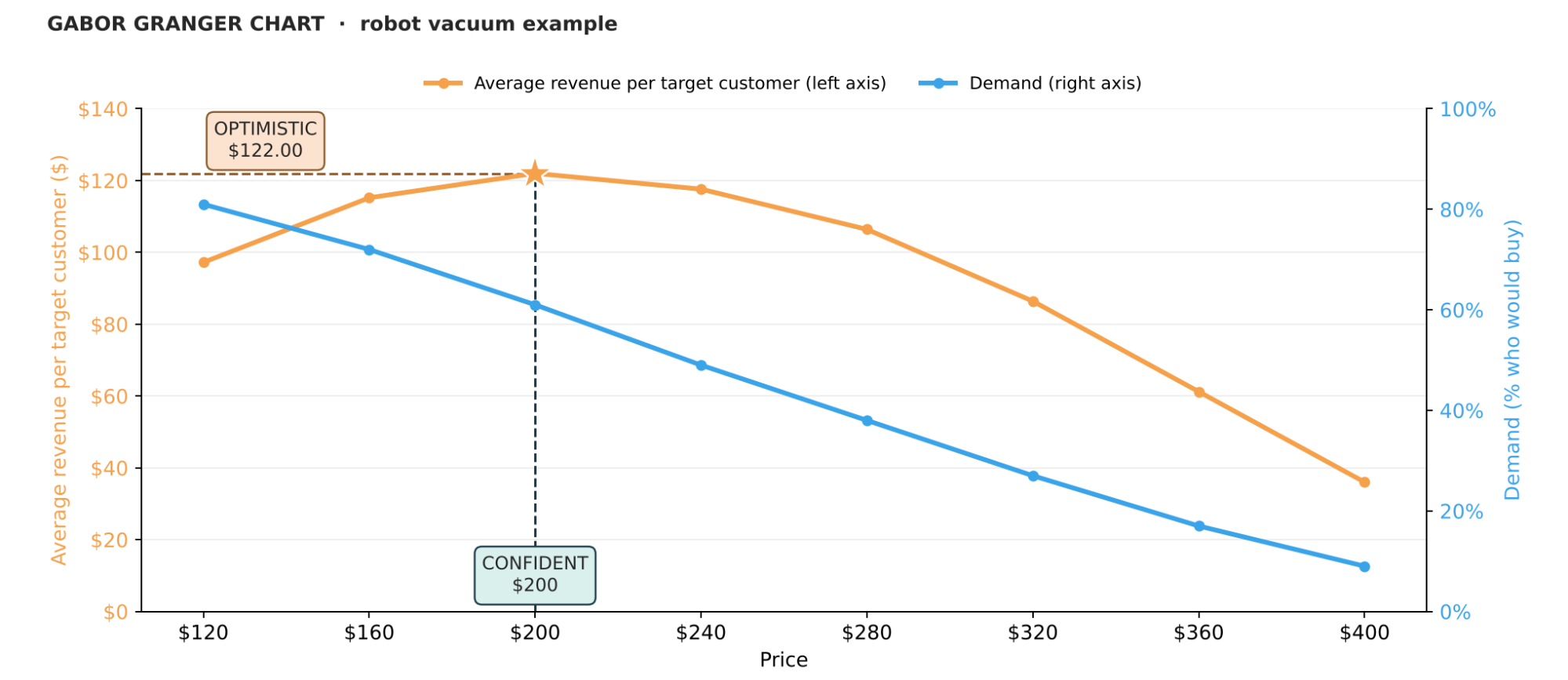
So, you should read this as "the evidence points at $200 earning the most revenue overall", not "we'll make $122 per customer if we charge that amount". If you present the revenue curve as a forecast, you'll have an awkward quarter when the actual revenue comes in lower.
What does a flat peak mean?
Look at the curve again around the top.
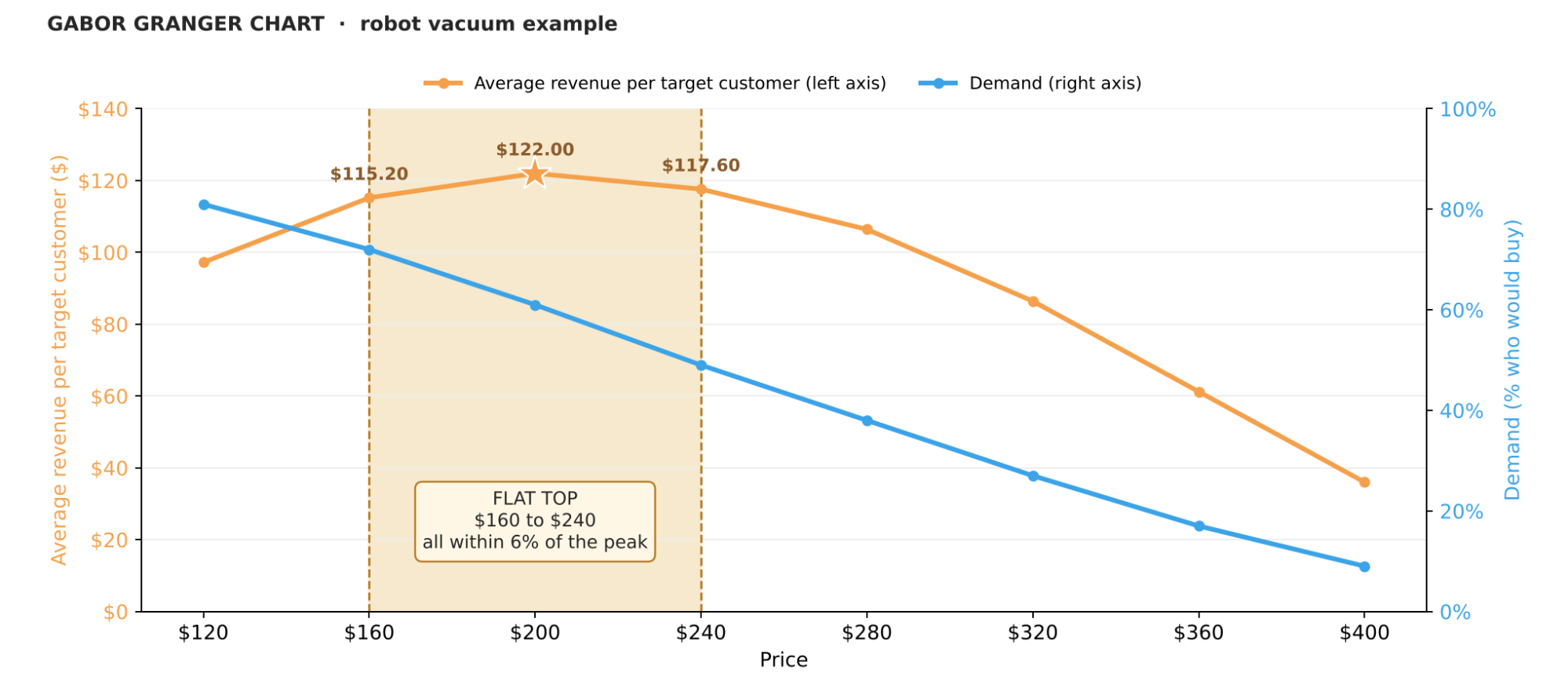
$160 earns $115.20, $200 earns $122.00, and $240 earns $117.60. All three sit within 6% of the peak.
That's a strong result, and it's the chart telling you something that the optimal price alone can't: pricing is forgiving here.
A range of prices that all result in a similar revenue outcome turns a direct choice into a more flexible strategic decision. Price at the low end and you win more customers for almost no lost revenue: 72% of the market buys at $160. Price at the high end and you earn about the same from fewer customers, who cost less to serve: 49% buy at $240.
A sharp peak says the opposite: revenue falls away fast either side, so you have less wiggle room to position and the price itself has to be right.
Gabor Granger analysis in six steps
All Rejected and No Ceiling. If either goes above 10%, rethink your survey setup.
Not Interested. Tells you whether you surveyed the right people.
The demand line. Does it fall smoothly? Steep means price sensitive, shallow means you have more room. An unusually spiky chart is worth checking against participant-level data for outliers skewing your results or segmenting to compare different groups separately.
The revenue hump. Sharp or flat, and how wide the flat band is.
Revenue peak. Quote the price under the star. Treat the revenue figure as optimistic, and say so when you present it.
Then segment. The overall result could be combining a $140 segment with a $280 segment, giving you one average price that hides this key difference. The guide on how to segment Gabor Granger results shows how to find those groups. It covers crosstab analysis and needs-based segmentation.
If the curve looks wrong, the guide to common mistakes in Gabor Granger studies covers the usual causes. The sample-size guide shows how small samples skew results. And the price search guide explains which prices each person saw, and in what order.
Learn more about how to set up your Gabor Granger survey.
Choosing between GG and Van Westendorp? Read the comparison: Van Westendorp vs Gabor Granger.
Still choosing which features to include? Use MaxDiff to rank them by importance or by most urgent problem. Already have a shortlist? Use conjoint analysis or a marginal willingness to pay study to price each feature and its limits before a Gabor Granger survey.
The comparison of the most popular Gabor Granger survey tools helps you pick the right platform.
Ready to run a Gabor Granger survey instead of reading about it? OpinionX’s free tier includes a purpose-built Gabor Granger question and other advanced research methods. No credit card or sales call needed.
